This is the third part of a series of blog posts describing what we’ve learned about the visual display of quantitative information as it relates to CLM predefined reports (continued from part 1 and part 2).
How to show data effectively in graphs
In part 1 we pointed out that effective design practices are aligned with the following steps in the report-authoring process:
1. Decide what message to convey with your data.
2. Select the best method to display your message: a table or graph.
3. Determine which type of table or graph to use.
4. Design the table or the graph to show the data effectively.
In this post we’ll discuss step 4 in the report-authoring process, as it applies to graphs: how to show data effectively in graphs.
Perception and data encoding in graphs
To recap, when people look at graphs, they are engaged in preattentive processing. Tables differ from graphs because tables present quantitative data as text. When people read text, they are engaged in attentive processing. Attentive processing is a conscious, sequential, and slower means of absorbing information than the preattentive processing that occurs when people look at the visualization encoding of quantitative information in a graph. Preattentive processing is an unconscious, rapid stage of visual perception that precedes attentive processing.
It is easier for people to preattentively compare and understand the relationships between different quantities when they are encoded by 2-D location and line length than by other attributes such as area size and color. The three visual encoding objects associated with 2-D location and line length in graphs are:
- points (dots)
- lines
- bars
Above all else, show the data
Because graphs encode data as visual objects, it is particularly important to put into practice the core principle stated by Edward Tufte, “Above all else, show the data.” The quantitative message you convey in your graph is encoded in the visual shape of the data, not in any other visual characteristics of the graph or its container.
In this post we will focus on two related and fundamental topics that apply to graphs:
- How to encode quantities accurately
- Why you should avoid using 3-D in graphs
How to encode quantities accurately
People interpret the numeric values associated with the points, lines, or bars in a graph in two ways:
- Perceptually: A bar that is twice the height of another bar is perceived to have double the numeric value.
- Quantitatively: The relative location on a numeric scale on the vertical or horizontal axis indicates quantity.
To communicate a truthful message with your data, perceptual and quantitative interpretations must be accurately aligned. The visual objects that encode quantities must correspond accurately to the numeric scale.
Graph A demonstrates design practices that communicate a false message:
- The scale on the vertical or Y axis does not start at zero. By starting at value 3466 on the Y axis instead of starting at zero, changes that are minor when quantitatively interpreted from 3466 to 3501 are extreme when perceptually interpreted in the shape of the blue line. Notice the difference in the shape of the blue line for graph B below when the Y axis starts at zero.
- The labels for tick marks on the Y axis do not represent equal numeric intervals. The tick marks from 3466 to 3498 are labeled with numbers that are two digits apart, for instance 3466 to 3468. After 3498 the tick marks are labeled with numbers that are one digit apart, for instance 3498 to 3499. Perceptually, the blue line segments from 3498 to 3502 are interpreted to have equal value to the other blue line segments in the graph, but quantitatively they are interpreted to have less value. So the blue line segments from 3498 to 3502 do not accurately reflect the quantities they are intended to represent.
- The aspect ratio of the plot area of the graph is taller than it is wide. Generally, when this happens, the presentation of dots, lines, or bars in relation to the quantitative scale is condensed. Perceptually, the visual objects are falsely interpreted as representing increases or decreases that don’t accurately correspond to the data. We have noticed this issue occurring sometimes when the aspect ratio of a graph changes when viewed in a dashboard viewlet.
Graph B demonstrates this core principle: a quantity that is visually encoded in a graph should match the actual quantity that it represents. The Y axis scale starts at zero, the labels for tick marks on the Y axis represent equal numeric intervals, and the aspect ratio of the plot area of the graph is wider than it is tall. Notice what a radically different message the blue line communicates compared to Graph A.
To summarize, the related best practices are:
- Generally, include the value zero in your quantitative scale. It is appropriate to start the scale with a value greater than zero if you need to provide a close look at small differences between large values – just alert your users when you do.
- Maintain accurate correspondence to tick marks:
The distance between tick marks on a scale should always be consistent with the difference in the quantitative values that the tick marks represent. Reporting technology usually does this automatically for you.
Conversely, when tick marks are positioned at equal distances from one another, the values used to label them should also represent equal numeric intervals. In the case of time series scales on the horizontal or X axis, the time units displayed must represent equal intervals in time for the perceptual value to be accurate.
- Be mindful that, in general, the aspect ratio of the graph’s plot area should be wider than it is tall.
Why you should avoid using 3-D in graphs
Including a third dimension in your graphs might be tempting, but it does not support the design principle, “Above all else, show the data.”
The data:pixel ratio
Edward Tufte also introduced a core concept he calls the data-to-ink ratio, which in our software context we call the data-to-pixel ratio (data:pixel ratio). This concept applies equally to graphs and tables.
Briefly paraphrased, the ideal data:pixel ratio is 1, which means that every single pixel that is used portrays meaningful data and no pixels are used for meaningless perceptual noise. If you cannot achieve a ratio of 1, you want to get as close as possible, making sure that of all the pixels that are used, as many pixels as possible portray real data.
To calculate the data:pixel ratio, first determine the total number of pixels that are used (“pixel”), and then determine what portion of those display quantitative and categorical information (“data”). Any remaining pixels that are used for nondata elements should only be for essential supporting structures such as axis lines, or for necessary supporting information. No pixels should be used for superfluous or ornamental nondata elements..
The closer that the ratio of data to pixels is to 1, the better you’ve enabled users to see the important information without perceptual distractions. The important information is clearer, easier, and faster for users to process and understand.
Create a high ratio of data to pixels by:
- Reducing the nondata pixels
– Subtract unnecessary nondata pixels
– De-emphasize the remaining, necessary nondata pixels
- Enhancing the data pixels
– Subtract unnecessary data pixels
– Emphasize the most important data pixels
Problems with 3-D in graphs
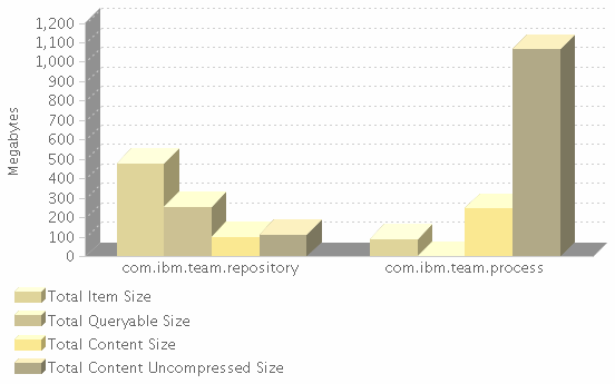
Using 3-D in graphs increases the amount of nondata pixels in the graph. In addition, the added depth makes it harder to align visual objects with the quantitative scale.
There are two forms of 3-D used in graphs:
- Data objects with 3-D depth
- Graphs with 3-D depth
Data objects with 3-D depth
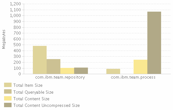
Compare the examples below to see how 2-D data objects are easier to understand than their 3-D counterparts. The extra dimension makes it more difficult to visually align the data objects with the plot area, and with each other.
Graphs with 3-D depth
Compare the examples below to see how 2-D graphs are easier to understand than their 3-D counterparts. In the 3-D graph, notice how, apart from it being harder to associate data objects and their quantitative values, it is actually impossible to ascertain what the quantitative value is for a few data objects.
Summary
Above all else, show the data. Create a high ratio of data to pixels by:
- Reducing the nondata pixels
- Emphasizing the data pixels
Two fundamental principles apply only to graphs:
- Encode quantities to correspond accurately to the visual scale:
- Keep the distance between tick marks on a scale line consistent with the difference in quantitative values that they represent.
- Generally include the value zero in your quantitative scale, and alert your viewers when you don’t. Always start the quantitative scale at zero when you use bars to encode the values.
- Ensure the aspect ratio of the graph’s plot area is wider than it is tall.
- Avoid 3-D displays of quantitative data.
To learn more, refer to chapter 9 of Stephen Few’s book Show Me the Numbers.
In addition to these practices, the various data and nondata components of the graph can be designed to show data effectively. We’ll discuss how to do this in a future post.
Your thoughts
Was this post helpful? Did the information make sense to you? How do you make decisions when you design graphs and tables?
Additional resources
Guidelines
The initial version of the graph and table design guidelines for Jazz predefined reports is available on the Jazz.net wiki. The next iteration of these guidelines is in progress and all feedback is welcome.
Further reading
- We highly recommend Stephen Few’s book Show Me the Numbers, which presents a practical and thorough examination of graph and table design in business reporting. Stephen’s website Perceptual Edge focuses on the tools and techniques of visual business intelligence.
- Edward Tufte’s book The Visual Display of Quantitative Information is broader in scope and a fascinating though more theoretical read. It is considered a modern classic, one of the best books on the subject. Stephen Few acknowledges this work as foundational for his book Show Me the Numbers.
Report authoring
- The Reports Component home page on the Jazz Team wiki provides documentation, FAQs, and reference links to assist you with report authoring.
- The Reports Central page, also on the Jazz Team wiki, provides examples, samples, and reports that demonstrate answers to questions from the newsgroup, community-contributed reports, and other content that we think might be interesting to the community at large.
Authors
The contributors to this blog post are:
- Karen Gosciminski, User Experience
- James Moody, Technical Lead – CLM Reporting, RRDI, Rational Insight, Rational Publishing Engine
- David Steinmetz, Information Developer – Editing Lead
- Linda Watson, User Experience / Visual Design
You must be logged in to post a comment.


Nice Post.
This Is Very Helpful For Me.
Thanks for the feedback nanno5455. We were excited to learn about the best practices – glad you found them helpful.