Throughout the early development of Jazz and Rational Team Concert we realized that, although we were accustomed to creating tables and graphs to manage milestones, we had little or no exposure to design practices that optimize their effectiveness. Many people who produce CLM reports might find themselves in the same circumstances. This post (and others that may follow) describes what we learned about the visual display of quantitative information as it relates to the design of tables and graphs. We consider ourselves fellow users, not experts, so we welcome all feedback.
Much of our foundation came from the work of subject matter experts such as Edward Tufte and Stephen Few. Through the application of this knowledge, trial and error, and feedback from users, we learned more about the type of information that is useful to a CLM customer, and how best to present that information to communicate the important messages clearly and effectively.
The purpose of a report is to communicate a message. For the most part, these messages are conveyed through numbers in tables and graphs: the message conveys quantitative information. Ultimately, the messages that the tables and graphs convey for your development life cycles contribute to the collective understanding of how well your team, project, product, or business is performing. Applying effective design practices consistently to each graph or table can affect the health of the entire reporting system.
Effective design practices are aligned with key decision points in the report authoring process. Here is a breakdown of the process:
- Decide what message to convey with your data.
- Select the best method to display your message: a table or graph.
- Determine which type of table or graph to use.
- Design the table or the graph to show the data effectively. Communicating quantitative information is primarily a function of visual perception. The scientific study of visual perception and information visualization provides several best practices for showing data effectively.
How numbers and messages relate to tables and graphs
This post focuses on the first two steps in the process; it presents the basic constructs involved in conveying a message with quantitative information, and provides guidance on selecting a table or a graph for your message.
Future posts will delve deeper into graph design and table design.
Numbers and messages
Quantitative information is the language of reports; reports communicate messages by presenting quantitative information. Quantitative information consists of two types of data: quantitative and categorical. Numbers are the quantitative data that tell how much, by measuring various attributes of the software development life cycle. Categorical data tells what by grouping the things being measured. The groupings can be descriptive units, such as teams and work items, or they can be time units, such as dates or milestones.
TIP: Not all numbers represent quantitative data (for example, work item identification numbers). Units of time are sometimes confused with quantitative data because they contain sequences of numbers, but in tables and graphs, units of time are always categorical data. Quantitative data is data on which you can perform mathematical operations, such as addition, subtraction, multiplication, and division.
Tables and graphs are the two primary methods for structuring and communicating quantitative information. The specific type of table or graph that you use depends on your message. Quantitative messages are always about relationships that are important to you and your business goals.
The message that you want to convey always contains a relationship that defines the message. Here are some examples of quantitative data, categorical data, messages, and relationships from the CLM predefined reports:
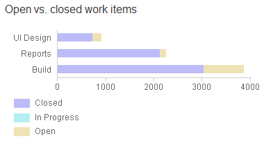
Example 1
In Example 1, the quantitative data is the number of work items that are open and closed. The categorical data is the grouping of work items by teams. The relationship that defines the message is the status of work items related to the teams.
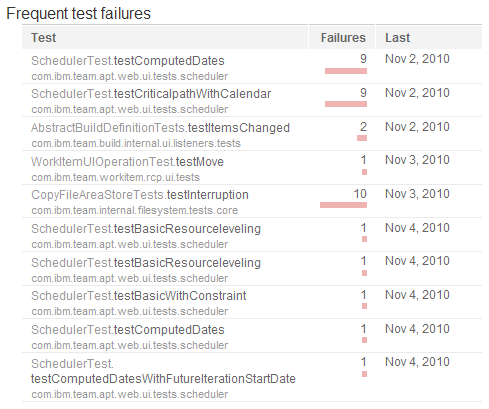
Example 2
In Example 2, the quantitative data is the number of failures per test. The categorical data is the grouping by test name and date. The relationship that defines the message is the frequency of test failures for tests in a given timeframe.
To summarize, deciding which message to convey with the data involves determining the following constructs:
- The quantitative values, that is, the numbers that measure something related to the development life cycle (for example, numbers of requirements, work items, builds, or test failures)
- The categories that identify what the quantitative values measure (for example, work item states, owners, or time)
- The relationship that defines the message
These features perform different roles in tables and graphs. The next section explains some of the high-level role differences. Future blogs will describe how relationships influence the specific type of table or graph to use.
When to choose a table
Tables make it easy to look up values. The simple structure of rows and columns is optimal for displaying simple relationships between quantitative and categorical data so that people can locate and consider individual values.
Use a table when any of the following conditions applies:
- People will look up individual values
- People will compare individual values
- The information contains precise values
- The information involves multiple sets of data that are expressed in different units of measure. By comparison, a graph usually contains a single quantitative scale with a single unit of measure.
Tables differ from graphs because tables present quantitative data as text. When people read text, they are engaged in attentive processing. Attentive processing is a conscious, sequential, and slower means of absorbing information than the pre-attentive processing that occurs when people look at the visual encoding of quantitative information in a graph. Pre-attentive processing is an unconscious, rapid stage of visual perception that precedes attentive processing.
When to choose a graph
Because they are visual, graphs present the overall shape of the data. Text, as in tables, can only display a collection of individual values. The power of graphs is their ability to reveal the patterns in the data, by displaying relationships among multiple quantitative values.
Use a graph in the following situations:
- The message is contained in the shape of the values
- People will look for relationships among multiple values
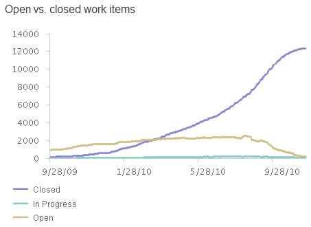
In the Example 3 graph below, messages are conveyed in the shape and patterns of the data. A desirable x-shaped visual pattern is formed as open work items decrease and closed work items increase over time. Each line in the graph displays a relationship among multiple quantitative values. For instance, the line that represents closed work items displays a positive upward trend relationship among multiple quantitative values over time. At a glance, you perceive the messages conveyed by the individual lines, the lines in comparison to one another, and the overall pattern formed by all the lines.
Example 3
Summary
Quantitative information
- Quantitative information consists of two types of data:
- Quantitative
- Categorical
- Tables and graphs are the two primary methods for structuring and communicating quantitative information
- The specific type of table or graph to use depends on your message
- Quantitative messages are defined by relationships
Tables
- Encode values as text
- Engage attentive processing
- Make it easy to look up and compare values
- Excel at displaying simple relationships between quantitative and categorical data
Graphs
- Encode values visually
- Engage pre-attentive processing
- Show the shape of the data
- Reveal relationships among multiple values
After you decide the message to convey and whether to use a table or a graph, you must decide which type of table or graph to use. Focusing on graph design first, in the next blog post that we contribute we will show how different types of quantitative relationships require different forms of graphs.
Your thoughts
Was this post helpful? Did the information make sense to you? How do you make decisions when you design graphs and tables?
Additional resources
Guidelines
- Version 1.0 of the graph and table design guidelines for CLM predefined reports is available on the jazz.net wiki: https://jazz.net/wiki/bin/view/Main/ReportsAboutTheGuidelines
- Version 1.1 is in progress and all feedback is welcome.
Further reading
- We highly recommend Stephen Few’s book Show Me the Numbers, which presents a practical and thorough examination of graph and table design in business reporting. Stephen’s website focuses on the tools and techniques of visual business intelligence: www.perceptualedge.com.
- Edward Tufte’s book The Visual Display of Quantitative Information is broader in scope and a fascinating though more theoretical read. It is considered a modern classic, one of the best books on the subject. Stephen Few acknowledges this work as foundational for his book Show Me the Numbers.
Report authoring
- The Reports Component home page on the Jazz Team Wiki provides documentation, FAQs, and reference links to assist you with report authoring.
- The Reports Central wiki page provides examples, samples, reports that demonstrate answers to questions from the newsgroup, community-contributed reports, and any others that we think might be interesting to the community at large.
Also, watch for an upcoming blog on report authoring from the Reports Component team.
Authors
The co-authors of this blog post are:
Kelvin Chan, User Experience – Visual Design
Kevin Grignon, User Experience
James Moody, Lead – CLM Reporting and RTC Reporting
Linda Watson, User Experience – Visual Design
We work with Rational report authors on the predefined reports for the Collaborative Lifecycle Management (CLM) products.
You must be logged in to post a comment.


Very interesting post! I love the reporting in Team Concert. Are there any thoughts on including Kanban reports? Many manufactures use kanban reports to optimize lead and cycle times. This helps them identify when work items get “stuck” in a certain state for too long.
Great post, learn a lot though I still have a lot of questions.
@Benjamin – thanks for the feedback. We currently have Burndown and Cumulative Value Flow reports. What other reports would you like to see added?
Great info, Linda, thanks. Ref: Step 1 “Decide what message to convey with your data” … I think of this somewhat differently in the context of software and systems lifecycle management. The big question is “What measures are worthwhile paying attention to? (and “paying” is a good word for it, since each report, chart, etc. incurs a cost to an organization associated with creating, interpreting, and maintaining it). That’s why I’m happy to see on our wiki [1] that we are planning to deliver even more carefully-chosen, out-of-the-box reports in the next CLM release.
[1] https://jazz.net/wiki/bin/view/Main/CALMReportingOOTBReports
====
Daniel Moul
Rational Offering Strategy and Delivery
Daniel, I think what would be nice if we could map the reports back to the Performance Measurement Practices that are included in Insight (see the Help menu in Insight’s Cognos Connections UI). These provide so-called value traceability trees that map common business objectives down to development goals to development practices to control metrics/reports. In there you can navigate in both directions, i.e. from a metric up to which goal achievement it can support measuring via which development practice, as well as down from the goals to strategies suggesting practices and control metrics for these practices.
Thanks for having time for sharing this information, it was excellent and very useful to me. It?s my first time that I visit your blog. I found a lot of informative stuff in your article. Keep it up. Thank you