This is the second part of a series of blog posts describing what the coauthors have learned about the visual display of quantitative information as it relates to the design of graphs and tables (continued from part 1).
How to determine which type of graph to use
In part 1 we pointed out that effective design practices are aligned with the following steps in the report-authoring process:
- Decide what message to convey with your data.
- Select the best method to display your message: a table or graph.
- Determine which type of table or graph to use.
- Design the table or the graph to show the data effectively.
We then discussed steps 1 and 2. If you haven’t read part 1, you might find it helpful to do so before proceeding; several of the concepts presented here were explained in detail in that post.
In this post we’ll discuss step 3 in the report-authoring process, as it applies to graphs: how to determine which type of graph to use.
Numbers, messages, quantitative data and categorical data
To recap, the purpose of a business report is to communicate a message through the use of numbers that are usually structured in graphs or tables. Numbers are quantitative data, and this kind of data is the language of reports. Quantitative messages are always about relationships that are important to you and your business goals. Quantitative messages also contain categorical data, the text label categories that describe what the numbers measure.
How to choose the right graph
Different types of quantitative relationships require different types of graphs, and each graph type uses specific visual encoding objects. We were really excited to discover that we could determine the right graph to use from a simple set of graph design patterns that more than met our CLM reporting needs: three types of visual encoding objects and seven graph types.
Three types of visual encoding objects
The two visual attributes that are proven most effective in encoding quantitative data in graphs are 2-D location and line length. When people look at graphs, they are engaged in preattentive processing. Preattentive processing is an unconscious, rapid stage of visual perception that precedes attentive processing such as reading text in a table.
For most business reporting contexts, it is easier for people to preattentively compare and understand the relationships between different quantities when they are encoded by 2-D location and line length than by other visual attributes such as area size and color. Best practices discourage the use of pie charts and area graphs, because in most cases bars and lines provide alternatives that are easier for the eye to measure and comprehend. For a more in-depth discussion of these principles, see Stephen Few’s article, Save the Pies for Dessert.
The following three visual encoding objects are associated with 2-D location and line length in graphs:
- points (dots)
- lines
- bars
The next section provides examples that show which of these objects work best with the seven different graph types.
Seven graph types
Business reporting typically uses seven graph types. Each graph type is defined by the quantitative relationship it encapsulates:
- nominal comparison
- ranking
- time series
- part-to-whole
- deviation
- distribution
- correlation
Familiarity with these seven graph types and the visual encoding objects best suited to each makes it easier to determine which type of graph to use.
1. Nominal comparison
The purpose is to show how two or more name (nominal) categories relate to one another. There is no particular order to the categories. Bars (horizontal or vertical) are the only visual encoding objects used for this graph type.
A few of the CLM predefined reports use nominal comparison graphs; for example this graph type is used when making comparisons between owners of work items.
2. Ranking
Like the nominal comparison graph, the purpose is to show how two or more name (nominal) categories relate to one another, but in addition the ranking graph displays the relationships in an ordered sequence. Bars (horizontal or vertical) are the only visual encoding objects used for this graph type. To highlight high values, sort the bars in descending order. To highlight low values, sort the bars in ascending order.
Here is the nominal comparison graph example converted to a ranking graph by sorting the bars in descending order:
3. Time series
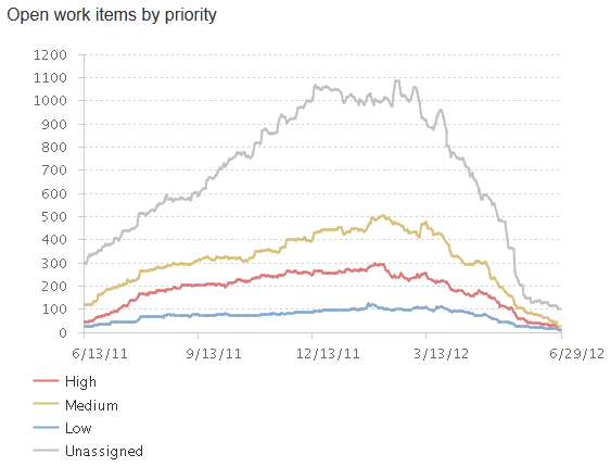
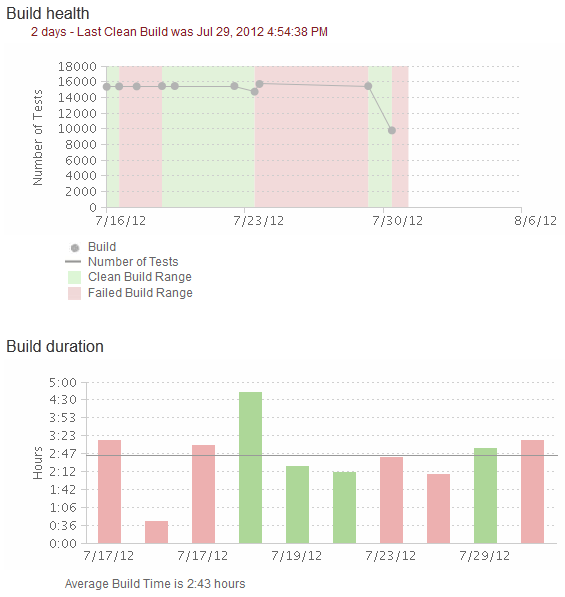
The purpose is to show the relationships between multiple instances of one or more measures taken at equidistant points in time. The time series graph is the most commonly used graph in business reporting. Use lines to emphasize overall patterns. Use bars to emphasize individual values. Use points connected by lines to slightly emphasize individual values while still highlighting the overall pattern. Always place time on the horizontal axis.
The vast majority of graphs in CLM predefined reports are time series graphs. They are the go-to solution for measuring progress and trends throughout the development project lifecycle. Here are some examples that demonstrate the use of lines, points connected by lines, and bars:
4. Part-to-whole
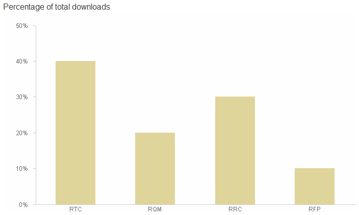
The purpose is to show the relationships between measures of individual categorical subdivisions as ratios to the whole. Bars (horizontal or vertical) are the only visual encoding object used for this graph type. Use stacked bars only when you must display measures of the whole as well as the parts.
Currently there are no CLM predefined reports that use the part-to-whole graph with bars, so the following example was created to illustrate this graph type.
However, some CLM predefined reports do use stacked bars to display measures of the whole as well as the parts:
Normally, stacked bars present a disadvantage, because it is difficult to determine at a glance what quantity each group in the stack represents. This format only shows the total quantity associated with the top of the bar and the quantity associated with the first group. Despite these disadvantages, using stacked bars is justified when you want to display the whole using an actual unit of measure other than ratios, as you might for quantities of work items, and also provide some sense of the relative size of its parts, such as the severity attributes.
5. Deviation
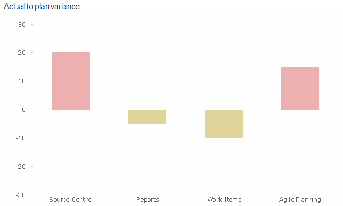
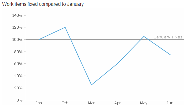
The purpose is to show the relationships between categorical subdivisions of a measure compared to a reference measure, expressed as the differences between them. Use lines to emphasize the overall pattern only when displaying deviation and time series relationships together. Use points connected by lines to slightly emphasize individual data points while also emphasizing the overall pattern when displaying deviation and time series relationships together. Use bars to emphasize individual values, but limit them to vertical bars when a time-series relationship is included. A reference line is essential in these graphs; it enables comparison between the measures of deviation.
Currently there are no CLM predefined reports that use deviation graphs, but the following mocked-up examples show this graph type:
6. Frequency distribution
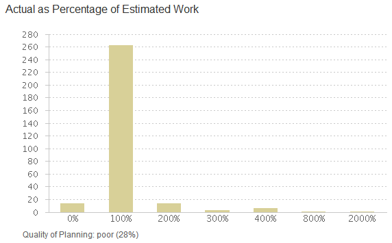
The purpose is to show the relationships between counts of something in categorical subdivisions that represent intervals of a quantitative range. For example, the CLM bar graph below shows counts of work items by percentile quantitative range intervals for the percentage of actual over estimated work.
Use vertical bars to emphasize individual values (called a histogram). Use lines to emphasize the overall pattern (called a frequency polygon).
Distribution graphs are, so far, rarely used in CLM reports; here is the CLM histogram example mentioned above:
Currently there are no CLM predefined reports that use distribution polygon graphs. See the example below that was created to illustrate this graph type:
7. Correlation
The purpose is to compare how two paired sets of measures relate to one another, to determine whether if one set goes up, the other set goes up or down in a corresponding manner, and to what degree. Use points and a trend line in the form of a scatter plot.
Currently there are no CLM predefined reports that use correlation graphs, but the following example was created to show this graph type:
Summary
To determine which type of graph to use, you can choose from the set of graph design patterns typically used for business reporting. We have briefly introduced these patterns – three types of visual encoding objects and seven graph types. To learn more, refer to Chapter 5 of Stephen Few’s book Show Me the Numbers.
In your development project lifecycle, most often a time series graph will meet your needs. Nominal comparison and ranking graphs are handy when you want to make comparisons between teams, owners, or similar named groupings in your project. When you need to see percentages, use part-to-whole bar graphs, or use stacked bars when you want to roughly convey the size of the parts for nonratio units of measure. Use distribution graphs when you need to compare quantities for intervals of a quantitative range. Use a deviation graph when you have a point of reference and want to see whether items are greater or less than the point of reference. When you want to compare two paired sets of measures, use a correlation graph.
Deviation and correlation graphs are currently not used in the CLM predefined reports. Let us know if a predefined report with these graph types would be useful to you.
After you decide which type of graph to use, you must decide how to design the graph to show the data effectively. In a future post, we will explain why maintaining visual correspondence to quantity and avoiding 3-D effects are important design practices for graphs.
Your thoughts
Was this post helpful? Did the information make sense to you? How do you make decisions when you design graphs and tables?
Additional resources
Guidelines
- Version 1.0 of the graph and table design guidelines for CLM predefined reports is available on the Jazz.net wiki.
- Version 1.1 is in progress and all feedback is welcome.
Further reading
- We highly recommend Stephen Few’s book Show Me the Numbers, which presents a practical and thorough examination of graph and table design in business reporting. Stephen’s website, Perceptual Edge, focuses on the tools and techniques of visual business intelligence.
- Edward Tufte’s book. The Visual Display of Quantitative Information, is broader in scope and a fascinating though more theoretical read. It is considered a modern classic, one of the best books on the subject. Stephen Few acknowledges this work as foundational for his book Show Me the Numbers.
Report authoring
- The Reports Component home page on the Jazz Team wiki provides documentation, FAQs, and reference links to assist you with report authoring.
- The Reports Central page, also on the Jazz Team wiki, provides examples, samples, and reports that demonstrate answers to questions from the newsgroup, community-contributed reports, and other content that we think might be interesting to the community at large.
Authors
The coauthors of this blog post are:
- James Moody, Technical Lead – CLM Reporting, RRDI, Rational Insight, Rational Publishing Engine
- David Steinmetz, Information Developer – Editing Lead
- Linda Watson, User Experience – Visual Design
We work with Rational report authors on the predefined reports for the CLM products.
Kelvin Chan (User Experience, Visual Design) and Kevin Grignon (User Experience) also contributed to this blog post as former members of the CLM Reporting team.





You must be logged in to post a comment.