We test a lot. The primary reason for this is because we have so much to test. As you can imagine, a product as large as our Collaborative Lifecycle Management (CLM) solution – with many millions of lines of code – requires a gargantuan test effort moving from release to release while maintaining the level of quality we expect.
Our fairly traditional – and manual – approach to test served us well while we were on a yearly major release cycle. This year however we produced four major releases and we were able to do this by dramatically increasing our use of automation … primarily in the areas of test system provisioning, product install and configuration.
To get to even more frequent releases while maintaining and increasing quality we realize we must move automation up the value chain into function test where a majority of effort is still manual and very time consuming. Since we all agree this is necessary, the next decision is where to start. One approach we are using to help answer this question is to focus automation effort on hotspots – areas with relatively high defect generation rates.
We have a good system in place to collect defects and, in particular, customer pain points over time and across releases. Its fairly easy to mine this data and create various types of reports. One intuitive way we have found to present this data visually is by using heatmaps. These maps take several forms but the basic idea is to use color to represent information.
Heat maps have become an extremely popular way to present relative financial performance information like the following Futures table. This table (from FinViz.com ) illustrates relative one-day performance by employing a spectrum of color from bright red (poor performance) to bright green (good performance).
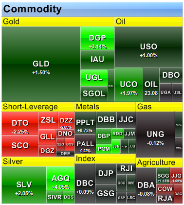
A variation on this basic heatmap is to add another variable and represent it with rectangle area. The following map (also from Finviz.com) represents commodity fund performance with color, as before, and then conveys relative market activity – in terms of dollar volume – with size.
We seem able to more quickly grasp important relationships, patterns and meaning when relative information is presented graphically in a form like this rather than viewing raw numeric values.
With that quick diversion lets now get back to the really exciting stuff: defect analysis and test automation! We’ve seen that heatmaps are very good at presenting relative data in a visual manner and we can use similar maps to inform decisions regarding placement of test automation effort.
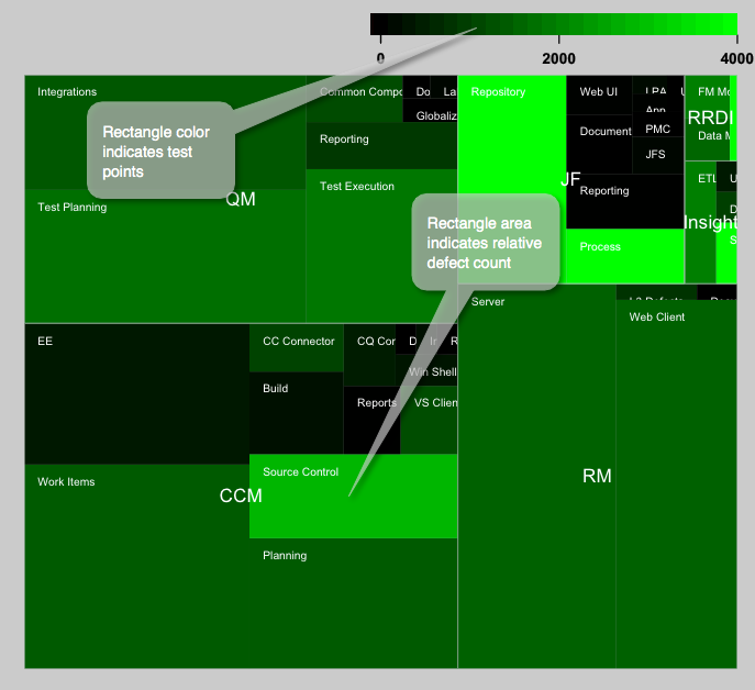
One particular example we have used recently is a map that reflects both relative defect generation and also existing test effort in 2013. The CLM solution is made up of a number of products including Rational Team Concert (RTC), Rational Quality Manager (RQM) and Rational Requirements Composer (RRC). These products are built from shared applications that each provide different types of capabilities. For example, the Change and Configuration Management (CCM) application provides tracking (work items), planning, source control, build, etc. while the Quality Management (QM) application provides test management and the Requirements Management (RM) application provides requirements capabilities. The following map splits the CLM solution into these applications. It also splits each application into its high level software components (making this a treeMap variant of heatmap). Rectangle size represents relative defect production (bigger means more defects) and color reflects the current amount of functional test effort for the component (brighter means more test energy).
When we look at the information this way a few things pop out immediately. For example, if resources are limited (and they always are) then it probably makes most sense to apply those resources to the “big” boxes. These are the ones producing the most customer pain in terms of problem reports. Another interesting point is that small and bright boxes might indicate areas that could afford to lend resources to higher defect producing areas.
There are a few things to keep in mind when reviewing this type of information. First, although rectangle size definitely means more defects in a relative sense, it is not necessarily bad. One thing that drives defect arrival rate is usage hours. You might easily have the highest tested component generating the most defects if it is also the most popular and heavily used.
Generating maps like these is not difficult and this last example was generated with the statistical and graphics environment called “R”. There is a quick tutorial on using R for this purpose on FlowingData.com
Kevin Williams
Test Architect – Rational Software
You must be logged in to post a comment.


Very cool, thank you for posting. Any chance of a follow-on piece where you walk through how you exported the data and consumed it using R? Also, how difficult would it be to factor in severity? Seven critical defects isn’t quite the same situation as 21 cosmetic ones.
Hi Millard,
Thanks for your feedback. Here is some more detail regarding my use of “R” to generate the map.
You’ll need to download and install “R” which is explained well in the FlowingData article I reference at the end of the blog. I manually produced a csv file from various queries against our change management system. Eventually we may want to automate this step.
The first few lines of the csv file look like this:
comp,apars,tested,category
# CCM Data
Build,12,270,CCM
CC Connector,7,1060,CCM
CQ Connector,5,450,CCM
Doc UA CQ Connector,1,0,CCM
EE,49,380,CCM
Next you need to install and then load the “portfolio” library. From the “R” console your whole session to install and load the portfolio library, load the csv file and create a HeatMap (TreeMap) might look like this:
>install.packages(“portfolio”)
.
.
>library(portfolio)
.
.
>data <- read.csv("CLM APARs 1 level.txt") . . > map.market(id=data$comp, area=data$apars, group=data$category, color= data$tested, lab = c(“group”=TRUE, “id”=TRUE),main=”CLM APARS”)
Regarding severity … right! I have thought about this too! For this first go I based the rectangle size purely on defect count. A better way might be to weight individual defects by severity and then add the total weighted values to drive component size in the map.