
You might have noticed a new look to the Rational Team Concert Web UI login screen and banner in recent weeks. These changes are a step toward an updated look for a number of user interface elements that will help to unify the presentation of our Jazz-based Rational web products. As we take steps toward greater integration between the products within Collaborative Application Lifecycle Management, the need to have a common look (a familial resemblance) and common behavior for similar user interface elements (a familiar feel) has increased.
The images to follow give you a taste of some of the style changes to come. They do not reflect all that component and product teams will ultimately offer in their releases, or the final details in all cases, but do give an idea of the convergence of style on some of the higher level UI elements. These include:
Login screen: The Jazz Team Server login screen takes on the Rational teal blue visual style, and offers more specific context login information, e.g., you will now see what product you are logging into.
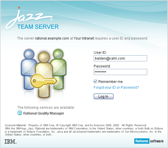
Login screen example
Server setup wizard: With the new color for the login and banner, all setup wizards, including the Jazz Team Server Setup, will inherit a new blue look in the banner area. This update is part of a larger underlying facelift to a common Jazz Foundation component called “StyledBox”. The StyledBox provides the base for a number of box-type elements, including wizards, dialogs, and viewlets, to name a few.

Jazz Team Server Setup wizard example
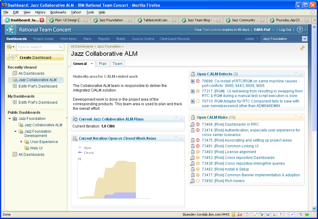
Banner color scheme: In the Rational Team Concert and Jazz Team Server cases, the shift is from green to blue. Other Rational web products will make a similar shift from what was their product-specific color to the new blue.

Common banner examples for multiple products
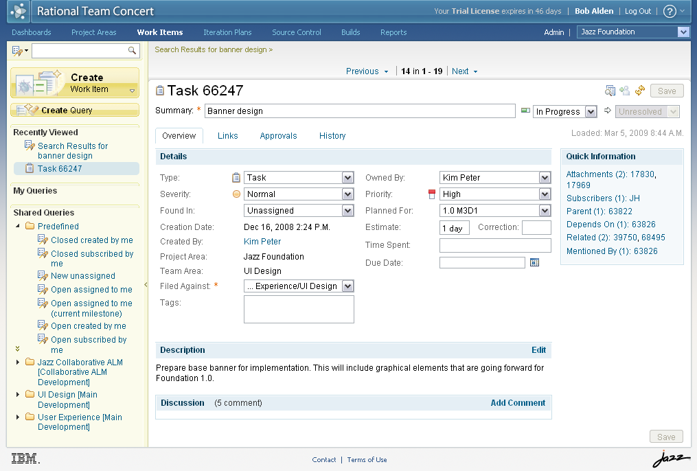
Common banner example showing the full Rational Team Concert context
Personal Dashboard or Home button in the banner: The “Dashboards” link that was on the product navigation bar is taking a new more prominent location on the banner, to the left of the product name.
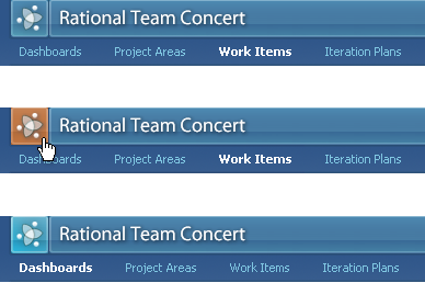
Dashboard button example
Dashboard viewlet style: Along with other StyledBox variations in the UI, the new viewlet look has been updated with a light 3-dimensional header that is more stylistically in line with other UI elements, a softer outline to allow the content to advance and not compete with the rendering of the box, and a light gradient at the bottom to give it a “lift” off the page background.
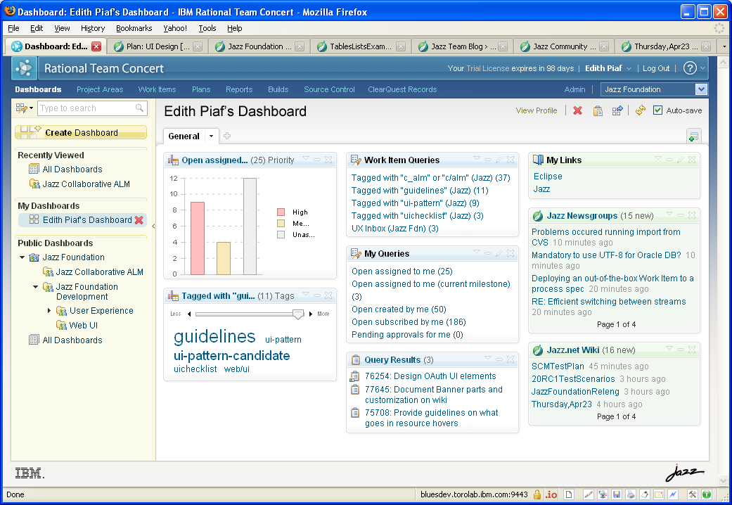
Dashboard viewlet style example, showing a Personal Dashboard
Dashboard viewlet style example, showing a Team Area Dashboard
Read more about Dashboards and other Jazz Foundation updates in the Jazz Foundation 1.0 M3 New & Noteworthy.
Your comments are welcome.
—
Kimberley Peter
Jazz UI Design Team
 (No Ratings Yet)
You must be logged in to post a comment.
Authors
 Adam Archer (1)
 Adam Neal (1)
 Adrian Cho (15)
 Alice Connors (3)
 Amy Silberbauer (24)
 Andrew Hans (1)
 Andy Lapping (15)
 Anindita Basu (3)
 Anthony Hunter (1)
 Benjamin Pasero (5)
 Benjamin Williams (3)
 Bernie Coyne (6)
 Beth Zukowsky (2)
 Bhawana Gupta (10)
 Bianca Jiang (3)
 Bill Higgins (2)
 Boris Kuschel (2)
 Brent Barkman (2)
 Brian Bryson (1)
 Brian King (4)
 Brian Lang (2)
 Brian Massey (3)
 Brian Sanders (2)
 Bruce MacIsaac (2)
 Carlos Ferreira (1)
 Carolyn Pampino (10)
 Catherine Burrows (1)
 Chandra Venkatapathy (1)
 Chris Daly (1)
 Chris Trobridge (1)
 Christophe Cornu (3)
 Christophe Elek (5)
 Christophe Telep (14)
 Clara Forero (1)
 Clare Carty (4)
 Dan Barbour (1)
 Dan Griffin (5)
 Dan Leroux (2)
 Daniel Berg (2)
 Daniel Moul (27)
 Daniel Toczala (4)
 Darin Swanson (1)
 Darrel Rader (1)
 Dave Thomson (7)
 David Brauneis (1)
 David Hodges (1)
 Dejan Glozic (2)
 Denise Cook (1)
 Derek Baron (8)
 Dibbe Edwards (3)
 Dirk Baeumer (1)
 Don Yantzi (1)
 Doron Ben-Ari (3)
 ELM Engineering (42)
 Eran Gery (1)
 Erich Gamma (5)
 Erik Craig (1)
 Ernest Mah (1)
 Evan Hughes (3)
 Fariz Saracevic (16)
 Frederic Fusier (1)
 Gary Cernosek (1)
 George DeCandio (4)
 Gili Mendel (1)
 Ginny Ghezzo (1)
 Graham Bleakley (5)
 Grant Covell (1)
 Greg Gorman (1)
 Guy Slade (1)
 Hadar Hawk (2)
 Heidi Stadel (1)
 James Branigan (2)
 James Moody (2)
 Jan Wloka (2)
 Jared Pulham (7)
 Jean-Michel Lemieux (23)
 Jeanette Deupree (1)
 Jim Amsden (1)
 Jim D'Anjou (2)
 Jim Ruehlin (1)
 Johannes Rieken (2)
 John Kellerman (2)
 John Vasta (1)
 John Whitfield (2)
 John Wiegand (1)
 Jozef deVries (1)
 Kai-Uwe Maetzel (6)
 Kalena Kelly (1)
 Karen Gosciminski (1)
 Kate Draper (2)
 Kate Hauser (1)
 Kevin Williams (2)
- Kim Peter (10)
 Kiran M N (1)
 Kit Lo (1)
 Kourken Aroyan (1)
 Kumaraswamy Gowda (15)
 Lauren Hayward Schaefer (15)
 Lawrence Mandel (2)
 Linda Watson (3)
 Liz Bonesteel (1)
 Luc Hatlestad (1)
 Lucinio Santos (1)
 Maneesh Mehra (3)
 Manoj Panda (1)
 Mario Maldari (1)
 Mark Guertin (2)
 Martha Andrews (3)
 Mary Yost (1)
 Masabumi Koinuma (1)
 Mats Gothe (1)
 Matt Lavin (1)
 Michael Fiedler (1)
 Michael Halder (2)
 Michael Valenta (3)
 Millard Ellingsworth (3)
 Miran Badzak (1)
 Monica Luke (5)
 Moshe Cohen (1)
 Nadra Rafee (1)
 Nathan Bak (5)
 Neil Leblanc (3)
 Nick Crossley (3)
 Nithya Rajagopalan (3)
 Palak Sheth (1)
 Patrick Streule (1)
 Paul Ellis (1)
 Paul Strachan (1)
 Paul Tasillo (2)
 Peter Haumer (1)
 Peter Steinfeld (1)
 Phil Vogel (3)
 Priyadarshini Gorur (3)
 Rahul Choudhary (4)
 Reuben Varzea (12)
 Richard Bone (3)
 Richard Watson (13)
 Rishikesh Agam (2)
 Robbie Minshall (1)
 Robin Bater (5)
 Roger LeBlanc (1)
 Rolf Nelson (16)
 Rosa Naranjo (1)
 Rosalind Radcliffe (1)
 Ryan Manwiller (4)
 Sandeep Kohli (1)
 Sandeep Somavarapu (1)
 Sanjesh Nair (1)
 Scott Rich (13)
 Sean Babineau (1)
 Seth Packham (11)
 Sharoon Shetty Kuriyala (1)
 Sreerupa Sen (5)
 Sridevi Sangaiah (1)
 Steve DiCamillo (2)
 Steven Beard (1)
 Subramanya Pilar (6)
 Sujan Surendrananitha (2)
 Suneel Santharam (2)
 Susan Yeshin (1)
 Tim Feeney (7)
 Tod Creasey (1)
 Tom Hollowell (4)
 Ubaidu Peediakkal (3)
 Vaibhav Srivastava (1)
 Vandana Shenoy (1)
 Vatsalkumar Parmar (2)
 Virginia Lovering (1)
 Will Streit (1)
Nice work! Your design team is doing great stuff. Very fresh designs. And you make it look effortless when I know that it took a ton of thought.
Nice
Seth and Dino. Thanks :-)
Nice new look!
By the way: does our tools interface also allow customization? I have some customers that need to adapt our tools to a look for their enterprise.
Felipe – Thanks!
> By the way: does our tools interface also allow customization? I have some customers that need to adapt our tools to a look for their enterprise.
This is in the works for Jazz Foundation 1.0.0.1, which is planned for early Fall of this year. You might want to keep an eye on this work item: https://jazz.net/jazz/resource/itemName/com.ibm.team.workitem.WorkItem/75859, and the related wiki page where Matt Jarvis plans to document how branding works.