
Note: Since this entry was written, some of the linked dashboards have changed substantially, having little resemblance with the pictures below. Jazz.net is a living, breathing repository and this is to be expected. Consider this entry ‘a snapshot in time’ rather than a lasting verdict.
For a while I was toying with the idea of writing a blog entry about Dashboards. Being a Dashboard component team lead, I definitely have a lot to say (whether you would want listen or not is a different question :-). Luckily for all of us, dashboards are covered in the Jazz online help, sparing me the obligation to start from the top.
Instead, I decided to browse around Jazz.net in search of interesting, quirky and otherwise unusual dashboards created by the Jazz development teams. Dashboards are very flexible, easy to customize and abuse. Mix in people creativity and occasional miscommunication on how Dashboards ought to be used and unexpected results happen. Here are the results (drumroll…) of the first Jazz.net Dashboard Beauty Pageant:
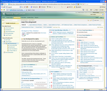
The Most Tab-Happy Dashboard Award: RTC Development
During the endgame of the Rational Team Concert 1.0 Erich Gamma kept adding tabs to the point that I was afraid the dashboard would burst at its seams. Luckily the dashboard held and it is now back to a more sane 10 tabs, but is still a winner in this category.
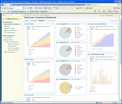
Andy Warhol Pop-Art Chart Award: ClearCase Connector
There is no shortage of dashboards with one or more ‘chart wall’ tabs, but ClearCase Connector ‘got me at hello’ with colorful flags clamping a column-full of pie charts:
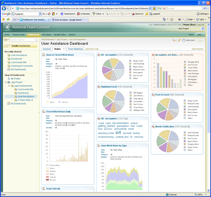
The competition was unusually tight – it would be unfair not to mention User Assistance for their free-style charts:
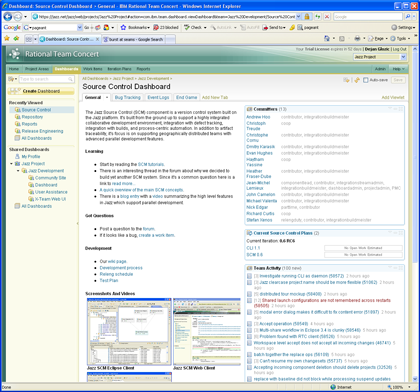
The Most Liberal Use of Raw HTML Viewlet Award: Source Control
When our friends from the Source Control team found out they could create a viewlet with raw HTML tags AND turn the viewlet rendering off, they quickly decided to claim the entire left column of their dashboard for just that – free-form HTML. Not exactly what we intended but works great:
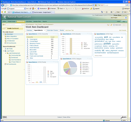
The Most Mileage from a Viewlet Award: Work Items
We have seen dashboards where viewlets were used in multiple configurations to better show the data off, but Work Items dashboard is our poster child for using the Work Item Statistics viewlet to the max. They use it in all permutations (bar chart, pie chart, tag cloud, table) all on the same page. We could not have done it better ourselves:
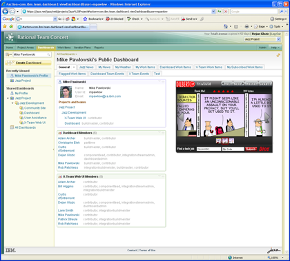
The Most Ambitious Personal Profile Award: Mike Pawlowski
While most developers on the team were perfectly happy with a template-generated profile, Mike Pawlowski, a member of the Dashboard team decided to throw in weather info, news feeds, Twitter feeds, everything related to his own work and the obligatory Dilbert of the Day widget, all that in a number of tabs rivalling our ‘Tab-Happy’ category winner:
So there you have it. While the winners are now enjoying the post-ceremony party, note that dashboards are fluid and change daily. It may not be long until new winners emerge and old ones are dethroned from being too complacent.

 (13 votes, average: 4.62 out of 5)
Authors
 Adam Archer (1)
 Adam Neal (1)
 Adrian Cho (15)
 Alice Connors (3)
 Amy Silberbauer (24)
 Andrew Hans (1)
 Andy Lapping (15)
 Anindita Basu (3)
 Anthony Hunter (1)
 Benjamin Pasero (5)
 Benjamin Williams (3)
 Bernie Coyne (6)
 Beth Zukowsky (2)
 Bhawana Gupta (11)
 Bianca Jiang (3)
 Bill Higgins (2)
 Boris Kuschel (2)
 Brent Barkman (2)
 Brian Bryson (1)
 Brian King (4)
 Brian Lang (2)
 Brian Massey (3)
 Brian Sanders (2)
 Bruce MacIsaac (2)
 Carlos Ferreira (1)
 Carolyn Pampino (9)
 Catherine Burrows (1)
 Chandra Venkatapathy (1)
 Chris Daly (1)
 Chris Trobridge (1)
 Christophe Cornu (3)
 Christophe Elek (5)
 Christophe Telep (14)
 Clara Forero (1)
 Clare Carty (4)
 Dan Barbour (1)
 Dan Griffin (4)
 Dan Leroux (2)
 Daniel Berg (2)
 Daniel Moul (27)
 Daniel Toczala (4)
 Darin Swanson (1)
 Darrel Rader (1)
 Dave Thomson (7)
 David Brauneis (1)
 David Hodges (1)
- Dejan Glozic (2)
 Denise Cook (1)
 Derek Baron (8)
 Dibbe Edwards (3)
 Dirk Baeumer (1)
 Don Yantzi (1)
 Doron Ben-Ari (3)
 ELM Engineering (42)
 Eran Gery (1)
 Erich Gamma (5)
 Erik Craig (1)
 Ernest Mah (1)
 Evan Hughes (3)
 Fariz Saracevic (16)
 Frederic Fusier (1)
 Gary Cernosek (1)
 George DeCandio (4)
 Gili Mendel (1)
 Ginny Ghezzo (1)
 Graham Bleakley (5)
 Grant Covell (1)
 Greg Gorman (1)
 Guy Slade (1)
 Hadar Hawk (2)
 Heidi Stadel (1)
 James Branigan (2)
 James Moody (2)
 Jan Wloka (2)
 Jared Pulham (7)
 Jean-Michel Lemieux (23)
 Jeanette Deupree (1)
 Jim Amsden (1)
 Jim D'Anjou (2)
 Jim Ruehlin (1)
 Johannes Rieken (2)
 John Kellerman (2)
 John Vasta (1)
 John Whitfield (2)
 John Wiegand (1)
 Jozef deVries (1)
 Kai-Uwe Maetzel (6)
 Kalena Kelly (1)
 Karen Gosciminski (1)
 Kate Draper (2)
 Kate Hauser (1)
 Kevin Williams (2)
 Kim Peter (10)
 Kiran M N (1)
 Kit Lo (1)
 Kourken Aroyan (1)
 Kumaraswamy Gowda (15)
 Lauren Hayward Schaefer (15)
 Lawrence Mandel (2)
 Linda Watson (3)
 Liz Bonesteel (1)
 Luc Hatlestad (1)
 Lucinio Santos (1)
 Maneesh Mehra (3)
 Manoj Panda (1)
 Mario Maldari (1)
 Mark Guertin (2)
 Martha Andrews (3)
 Mary Yost (1)
 Masabumi Koinuma (1)
 Mats Gothe (1)
 Matt Lavin (1)
 Michael Fiedler (1)
 Michael Halder (2)
 Michael Valenta (3)
 Millard Ellingsworth (3)
 Miran Badzak (1)
 Monica Luke (5)
 Moshe Cohen (1)
 Nadra Rafee (1)
 Nathan Bak (5)
 Neil Leblanc (3)
 Nick Crossley (3)
 Nithya Rajagopalan (3)
 Palak Sheth (1)
 Patrick Streule (1)
 Paul Ellis (1)
 Paul Strachan (1)
 Paul Tasillo (2)
 Peter Haumer (1)
 Peter Steinfeld (1)
 Phil Vogel (3)
 Priyadarshini Gorur (3)
 Rahul Choudhary (4)
 Reuben Varzea (12)
 Richard Bone (3)
 Richard Watson (13)
 Rishikesh Agam (2)
 Robbie Minshall (1)
 Robin Bater (5)
 Roger LeBlanc (1)
 Rolf Nelson (16)
 Rosa Naranjo (1)
 Rosalind Radcliffe (1)
 Ryan Manwiller (4)
 Sandeep Kohli (1)
 Sandeep Somavarapu (1)
 Sanjesh Nair (1)
 Scott Rich (13)
 Sean Babineau (1)
 Seth Packham (11)
 Sharoon Shetty Kuriyala (1)
 Sreerupa Sen (5)
 Sridevi Sangaiah (1)
 Steve DiCamillo (2)
 Steven Beard (1)
 Subramanya Pilar (6)
 Sujan Surendrananitha (2)
 Suneel Santharam (2)
 Susan Yeshin (1)
 Tim Feeney (7)
 Tod Creasey (1)
 Tom Hollowell (4)
 Ubaidu Peediakkal (3)
 Vaibhav Srivastava (1)
 Vandana Shenoy (1)
 Vatsalkumar Parmar (2)
 Virginia Lovering (1)
 Will Streit (1)
You must be logged in to post a comment.