Something I’ve learned in working as a user interface (UI) designer on an agile development team, as with the Jazz Project, is that you don’t so much prescribe design as you iterate on it.
Ideally you first consider what the viable design options are, and having chosen the best known path, you start with a sound design and blueprint for construction before time is invested in the code, but with concurrent development across multiple teams, it is often not possible to do this before implementation gets underway. It is a necessity of scale then that iterative design cycles get initiated from two directions: either they start with the design or they start with the implementation.
As a result, a number of different and sometimes conflicting UI patterns can emerge. This has its challenges — particularly if you want to achieve a certain level of consistency and quality across the UI — but as time goes by and you can take regular steps back to look at the system as a whole, you can see what’s working in and of itself, what things that have similarity converge nicely, and what areas diverge unnecessarily. This has been the case in the design and development of Rational Team Concert. At a certain point in the maturity of the product development cycle, exemplary interaction and presentation patterns have come to the fore, and become the ones we point to for inspiration or copy when the use case begs the same approach. Others emerge and we fine-tune them as we go. This is one technique we use to refine the user interface.
If you are interested in seeing some of these patterns, one way of course is to play with Rational Team Concert directly and discover them in a free form way, such as Edit-on-Demand in the Web client and Progressive Disclosure patterns in the both the Web and Eclipse clients.

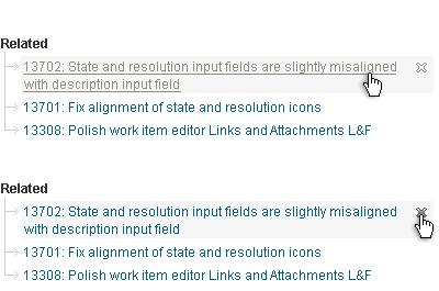
Example 1. Edit-on-Demand in the Web client showing the dynamic presentation of the “Remove” action on the Work Items Links page. This function is available only in parts of the Web UI but will be available more pervasively soon.

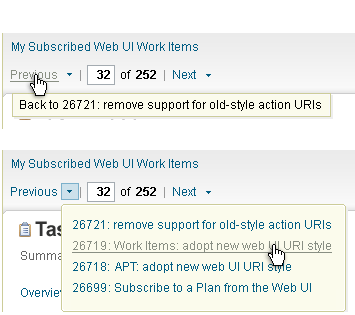
Example 2. Progressive Disclosure on the Web client showing a hover with live links to allow drilling down within a results page. We use hovers in the Eclipse client for similar types of drill down.
The other route is to look at what we have captured so far in our UI checklists: The User Interface Checklist for the Jazz Eclipse Client is published under the Learn section on Jazz.net, and the User Interface Checklist & Style Guide for the Jazz Web Client is in the works on the Jazz.net wiki. Neither of these is complete, but they should give you a taste of some of the underlying principles and patterns you will encounter as you work with the product.
I also plan to use the Jazz Team Blog to feature some of the patterns and related UI elements at various stages, so watch for those posts and feel free to add comments on what you see.
This leads me to another aspect of refining the UI: feedback. On the Jazz Project team, we provide feedback to one another along the way through Work Items, reviews, and informal discussion. We also rely on, and greatly appreciate, feedback from the many of you who are registered with Jazz.net and using Rational Team Concert. Your hands-on experience with the product can help us make incremental improvements to the user experience. If you have questions or comments related to the UI, the Jazz Forum is one way to have a voice and engage in discussion. Another is by filing Work Items. And finally, I look forward to getting your feedback here on the various UI-themed posts to come.
—
Kimberley Peter
Jazz UI Design Team
You must be logged in to post a comment.


> you don’t so much prescribe design as you iterate on it
One very basic example among many others: https://jazz.net/jazz/resource/itemName/WorkItem/20190
The interaction between graphic artists / designers / developers / users often occurs around a work item. The work item hosts the discussion. Graphic artists can attach their new icons for the developer. Developer’s changes are referenced by the work item. Developer can also easily take screenshots of the work in progress and provide feedback to the graphic artists.
Iterations can be done daily – artists and developers rapidly converge to something reasonable. Other teams get to try the new UI and provide feedback when they get these changes with the next weekly integration build. When the feature makes it into the milestone build one or two months later, more users will be exposed to it and able to orient the future iterations. Then we try to forget the convoluted path that lead us to the current UI so we can sleep at night and keep a fresh eye for the next day ;-)
Those are good additions about the process Chris. And indeed, sometimes it can be a convoluted path to simple solutions. An example that comes to mind is in Source Control where we needed to show the conflict types in the Pending Changes view. We tried many graphical solutions only to arrive at a simple textual solution appended to the end of the item in the tree. It seems to work well.