
Beginning with ELM 7.0, we embarked on a journey to modernize the user experience across the solution, driving greater consistency in terms of visual style as well as function, and simplified workflows for both end users and administrators. In 7.0 and 7.0.1, our focus is on the visual style while also progressing designs to deliver more impactful updates. To be sure, with these two releases we have just gotten our feet wet, but our intention is to communicate our vision, get some early feedback and dive in!
ELM 7.0
In 7.0, we began our visual refresh conservatively, providing updates to the login screen and the banners. We also delivered updated UIs for Report Builder and My Stuff to bring them in line with the rest of the ELM solution in terms of a simplified color palette.
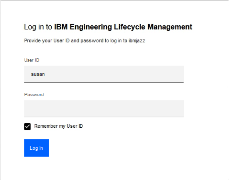
Login
The changes to the login screen are basic: modernized look and feel and simplified color palette:
Banners
Updates to the banner are somewhat more significant.

One key change is the display of the product name. As part of the modernization effort, we also rebranded our products in 7.0 and the banners now show product names, rather than the application names. For example, instead of Change and Configuration Management (on the Rational Team Concert banner), we now display IBM Engineering Workflow Management. A relatively minor update, perhaps, but one key benefit is that end users can easily see which product they are in and use social media to learn more about it by searching for the product name. In the past, this was complicated by the fact that product names were not prominently displayed.
Other obvious changes include the color of the banner and the replacement of the “Home Menu” with a “Hamburger Menu” in the top left corner. There are no functional changes in the banners in ELM 7.0.
Report Builder & My Stuff
Two features in ELM with much different visual style than the rest of the solution are updated in 7.0: Report Builder and My Stuff, as shown in the images below. Note that Document Builder is similarly updated in 7.0.1.
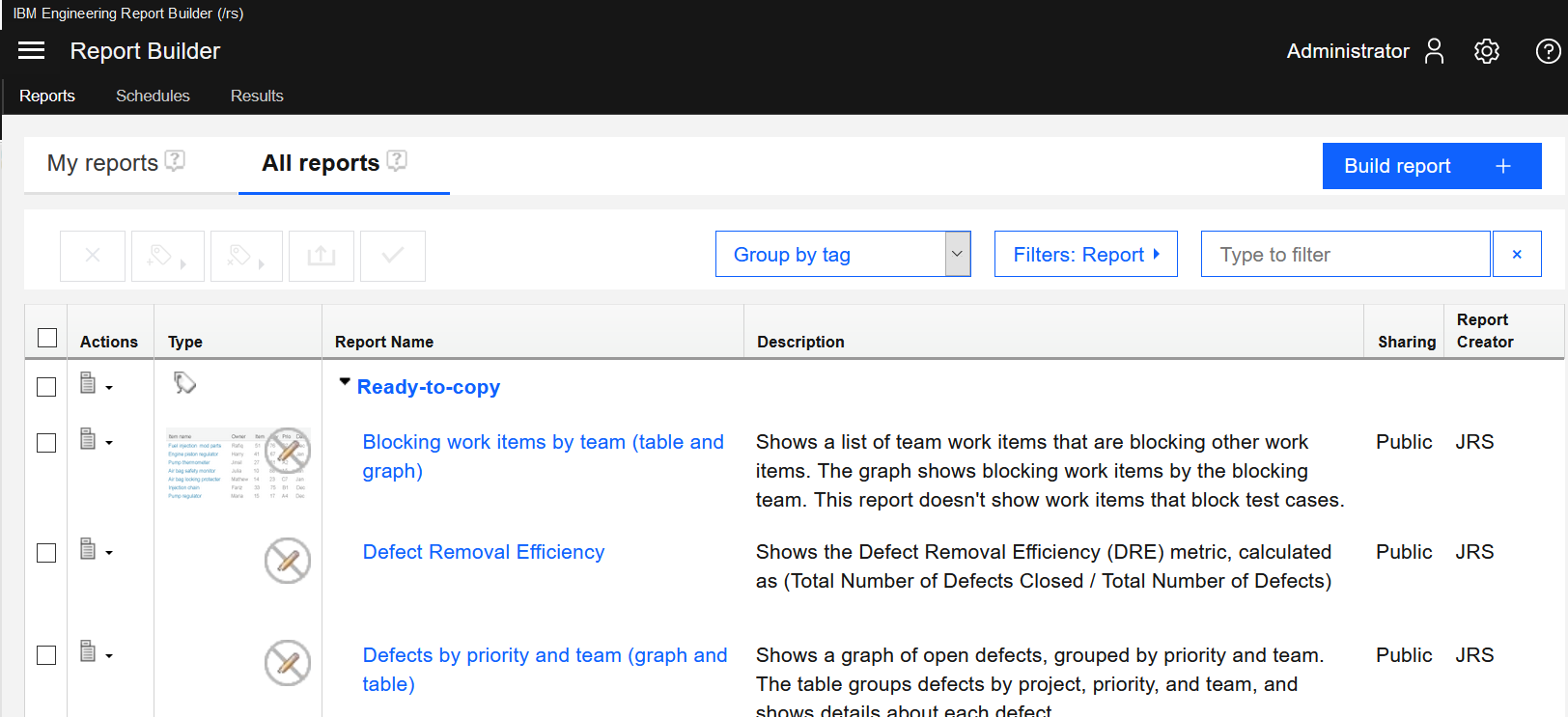
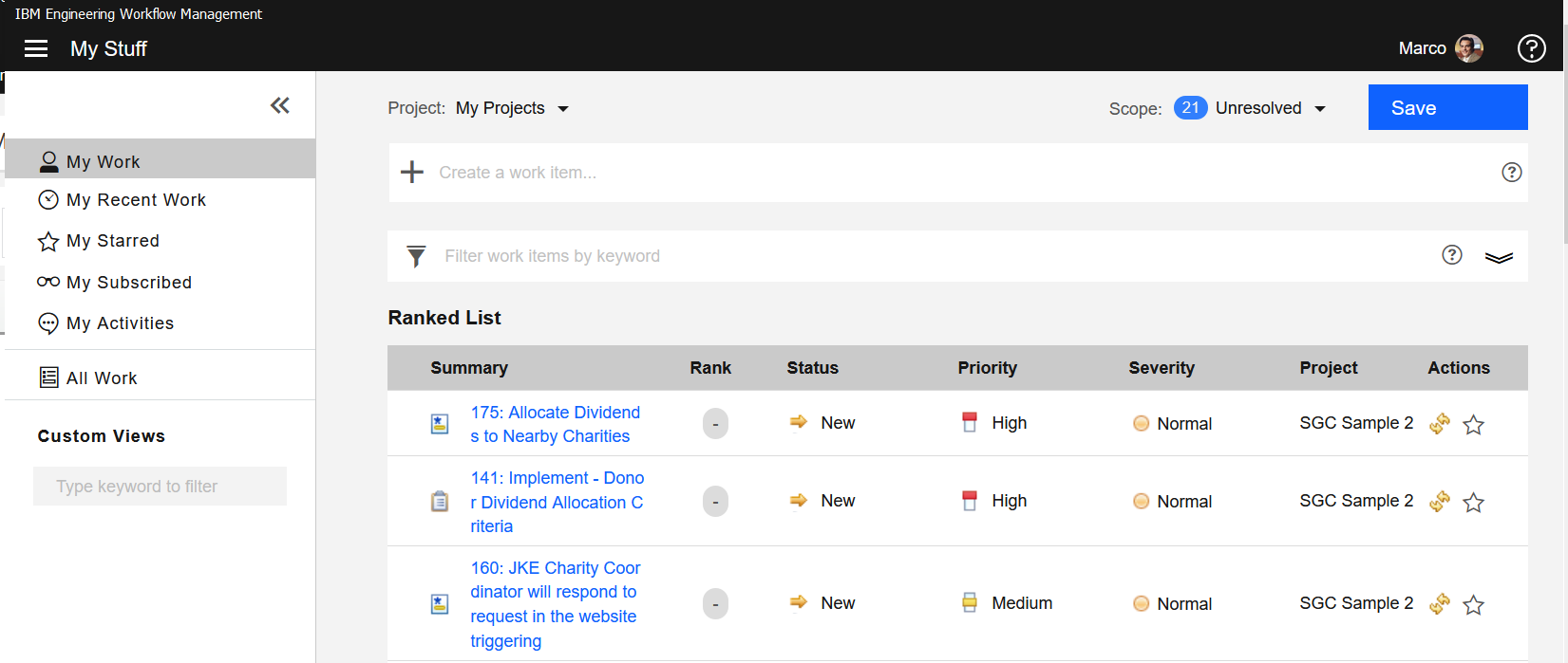
As with the banner updates, there are no functional changes to these applications in 7.0.
ELM 7.0.1
In 7.0.1, we progressed the visual refresh focusing on component updates, including buttons, tabs, breadcrumbs, links and modal dialogs. In the full page example below, you can see the culmination of those changes.

Let’s dig into the specific component-level changes.
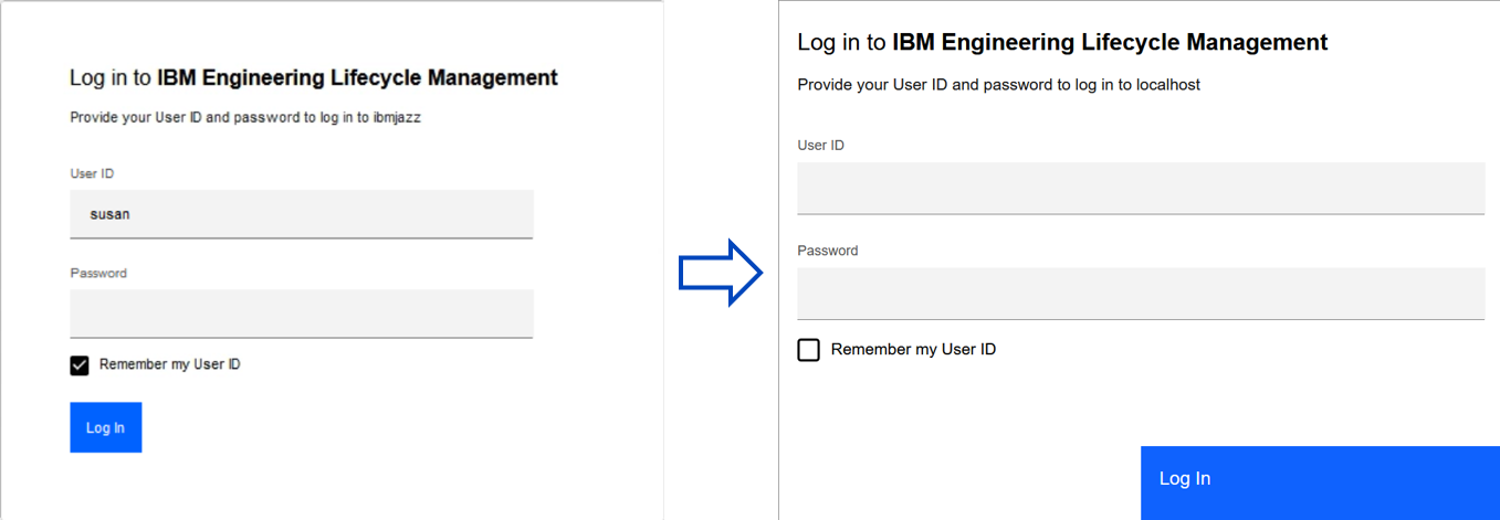
Buttons
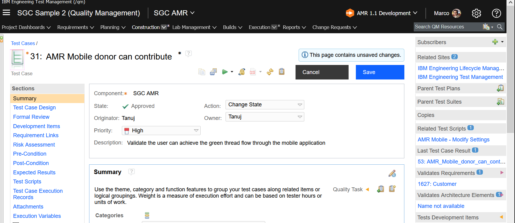
Perhaps the most obvious visual update is the buttons, but there is more to this change than meets the eye. Across ELM, the buttons are not only more prominent and based on the simplified color palette, but they also are consistently positioned and convey a meaning. For example, there is always one primary button per page or modal dialog. Generally, there is only one secondary button, which conveys the opposite action of the primary button. For example, Save would be primary and Cancel would be secondary. All other buttons are tertiary, for example helper buttons for fields. Positioning of these buttons is consistent across the solution so that the meaning of them is well-understood in any context.
As an example, look at the difference between the login dialog in 7.0 and what you will see in 7.0.1:
And here we see a typical artifact edit page showing the changes to the primary and secondary buttons.
Modal Dialogs
Modal dialogs are simplified in terms of visual style and button treatment.
Here we see a danger dialog, which includes the prominent red button calling attention to the data destruction that will result from this action:

Another example is a typical dialog in which some action is being performed. There are some style changes to note here that are consistent across ELM (in addition to the obvious button updates):
- The primary button is now always on the right
- Full-bleed buttons provide large, consistent landing targets
- All dialogs include the x in the top right corner to enable you to close the dialog
Tabs, Links & Breadcrumbs
Finally, let’s look at before and after images that highlight tabs, links and breadcrumbs.
This first image shows a dashboard in 7.0 and then in 7.0.1. Notice the link and breadcrumb use consistent colors, so that you always know when something is clickable. Also, the tabs no longer look like a file folder, the border or outline on tabs has been removed.

In this second image, you’ll notice the same visual style on a page other than a dashboard, demonstrating that updates to tabs, links and breadcrumbs is consistent everywhere.
If you’d like to learn more about our process for transforming the user experience anchored on design thinking and Carbon design patterns, visit the IBM Design Language and Carbon Design System web sites for background.
As always, we value your feedback and would love to hear what you think about these updates so far. While our modernization effort progresses in the next release, you will see incremental updates that begin to address more of the functional consistency and simplified workflows with each milestone driver. Details will be captured in the New & Noteworthy documents so be sure to follow us along this journey!
Amy Silberbauer
IBM Engineering Offering Management
 (No Ratings Yet)
 Loading...
You must be logged in to post a comment.
Authors
 Adam Archer (1)
 Adam Neal (1)
 Adrian Cho (15)
 Alice Connors (3)
- Amy Silberbauer (24)
 Andrew Hans (1)
 Andy Lapping (15)
 Anindita Basu (3)
 Anthony Hunter (1)
 Benjamin Pasero (5)
 Benjamin Williams (3)
 Bernie Coyne (6)
 Beth Zukowsky (2)
 Bhawana Gupta (11)
 Bianca Jiang (3)
 Bill Higgins (2)
 Boris Kuschel (2)
 Brent Barkman (2)
 Brian Bryson (1)
 Brian King (4)
 Brian Lang (2)
 Brian Massey (3)
 Brian Sanders (2)
 Bruce MacIsaac (2)
 Carlos Ferreira (1)
 Carolyn Pampino (9)
 Catherine Burrows (1)
 Chandra Venkatapathy (1)
 Chris Daly (1)
 Chris Trobridge (1)
 Christophe Cornu (3)
 Christophe Elek (5)
 Christophe Telep (14)
 Clara Forero (1)
 Clare Carty (4)
 Dan Barbour (1)
 Dan Griffin (4)
 Dan Leroux (2)
 Daniel Berg (2)
 Daniel Moul (27)
 Daniel Toczala (4)
 Darin Swanson (1)
 Darrel Rader (1)
 Dave Thomson (7)
 David Brauneis (1)
 David Hodges (1)
 Dejan Glozic (2)
 Denise Cook (1)
 Derek Baron (8)
 Dibbe Edwards (3)
 Dirk Baeumer (1)
 Don Yantzi (1)
 Doron Ben-Ari (3)
 ELM Engineering (42)
 Eran Gery (1)
 Erich Gamma (5)
 Erik Craig (1)
 Ernest Mah (1)
 Evan Hughes (3)
 Fariz Saracevic (16)
 Frederic Fusier (1)
 Gary Cernosek (1)
 George DeCandio (4)
 Gili Mendel (1)
 Ginny Ghezzo (1)
 Graham Bleakley (5)
 Grant Covell (1)
 Greg Gorman (1)
 Guy Slade (1)
 Hadar Hawk (2)
 Heidi Stadel (1)
 James Branigan (2)
 James Moody (2)
 Jan Wloka (2)
 Jared Pulham (7)
 Jean-Michel Lemieux (23)
 Jeanette Deupree (1)
 Jim Amsden (1)
 Jim D'Anjou (2)
 Jim Ruehlin (1)
 Johannes Rieken (2)
 John Kellerman (2)
 John Vasta (1)
 John Whitfield (2)
 John Wiegand (1)
 Jozef deVries (1)
 Kai-Uwe Maetzel (6)
 Kalena Kelly (1)
 Karen Gosciminski (1)
 Kate Draper (2)
 Kate Hauser (1)
 Kevin Williams (2)
 Kim Peter (10)
 Kiran M N (1)
 Kit Lo (1)
 Kourken Aroyan (1)
 Kumaraswamy Gowda (15)
 Lauren Hayward Schaefer (15)
 Lawrence Mandel (2)
 Linda Watson (3)
 Liz Bonesteel (1)
 Luc Hatlestad (1)
 Lucinio Santos (1)
 Maneesh Mehra (3)
 Manoj Panda (1)
 Mario Maldari (1)
 Mark Guertin (2)
 Martha Andrews (3)
 Mary Yost (1)
 Masabumi Koinuma (1)
 Mats Gothe (1)
 Matt Lavin (1)
 Michael Fiedler (1)
 Michael Halder (2)
 Michael Valenta (3)
 Millard Ellingsworth (3)
 Miran Badzak (1)
 Monica Luke (5)
 Moshe Cohen (1)
 Nadra Rafee (1)
 Nathan Bak (5)
 Neil Leblanc (3)
 Nick Crossley (3)
 Nithya Rajagopalan (3)
 Palak Sheth (1)
 Patrick Streule (1)
 Paul Ellis (1)
 Paul Strachan (1)
 Paul Tasillo (2)
 Peter Haumer (1)
 Peter Steinfeld (1)
 Phil Vogel (3)
 Priyadarshini Gorur (3)
 Rahul Choudhary (4)
 Reuben Varzea (12)
 Richard Bone (3)
 Richard Watson (13)
 Rishikesh Agam (2)
 Robbie Minshall (1)
 Robin Bater (5)
 Roger LeBlanc (1)
 Rolf Nelson (16)
 Rosa Naranjo (1)
 Rosalind Radcliffe (1)
 Ryan Manwiller (4)
 Sandeep Kohli (1)
 Sandeep Somavarapu (1)
 Sanjesh Nair (1)
 Scott Rich (13)
 Sean Babineau (1)
 Seth Packham (11)
 Sharoon Shetty Kuriyala (1)
 Sreerupa Sen (5)
 Sridevi Sangaiah (1)
 Steve DiCamillo (2)
 Steven Beard (1)
 Subramanya Pilar (6)
 Sujan Surendrananitha (2)
 Suneel Santharam (2)
 Susan Yeshin (1)
 Tim Feeney (7)
 Tod Creasey (1)
 Tom Hollowell (4)
 Ubaidu Peediakkal (3)
 Vaibhav Srivastava (1)
 Vandana Shenoy (1)
 Vatsalkumar Parmar (2)
 Virginia Lovering (1)
 Will Streit (1)
thanks for sharing this