
Normally the term “polish” makes me wince a little. For a long time now I have equated that term with the pejorative notion or belief that user interface design, often specifically visual design, is something that you can stick on at the end. However, as the Jazz Project team recently finished Beta 3, its third major end-of-cycle round for Rational Team Concert, I have come solidly around to understanding the value and purpose of “polish” as a way to refine the product UI — quickly.
What has changed my thinking is the realization that so much can be done in this phase. It doesn’t trump any of the more intensive design and development work done in the regular milestones, but it does provide an opportunity to take care of a number of niggling things that were on the wish list but got supplanted by more significant development pieces.
The following lists represent a sample of the polish items completed or underway. Some are arguably not polish in that they involve more significant code changes but, big or small, all represent refinements we have deemed important and doable for the first release and are being handled in this last push before we finalize.
Some of the Eclipse-based UI changes include:
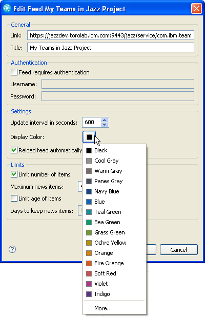
- Updating the color palette for feeds in Team Central so there are more colors to choose from, each having been tested to work well as a foreground color. This palette was previously composed of the core system colors, which are not all ideal, or aesthetically pleasing, as foreground colors. To access this new palette to color code your feeds, choose “Configure…” from any feed section’s local menu, then select a feed item from the list and choose “Edit…”. This will surface the following dialog with the updated color options:
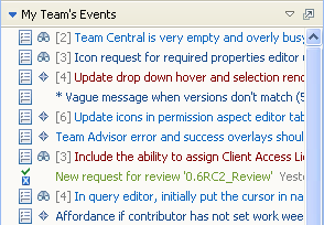
Here is an example of a section with feed items that have been color-coded with the new palette:
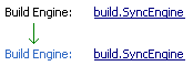
- Using adaptable color labels in form-based editors so they change with the OS theme. This is something the Work Item editor does already. It allows for a nice visual distinction between what is a label and what is content, as well as being accessible across all themes, including high contrast. These were updated recently in the CQ editors and will also eventually be updated in the Builds editors:
- Improving consistency between the Quick Filter bar instances in My Work view, Iteration Plan editor, Work Items explorer, and Search view. This included mainly icon updates so far, ensuring all use the same ‘Filter’ scope icon and the same ‘Close’ control. You can access the Quick Filter bar using Ctrl + F from any of these UI contexts.
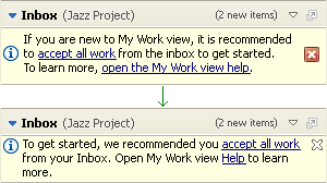
- Refining the Getting Started message areas in the My Work view, Iteration Plan editor, and User editor. The updates here included adjustments to the message wording, what words were hyperlinks, the alignment of the ‘Information’ icon and ‘Close’ control to the top instead of centered, the use of Eclipse-style ‘Close’ control instead of the more agressive OS-based one, and refinement of the graphical rendering of the message box. The following example is from My Work view:
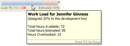
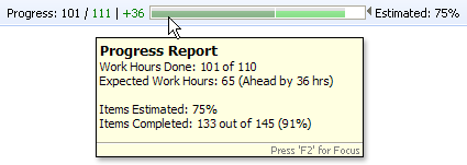
- Improving the presentation of, and distinction between, “Load” and “Progress” bars in Iteration Plans. Previously the coloration and labeling of these two bars was very similar — they both had green and red colors and used “Hours” as the initial label. Now the color for Load shows as blue on the left for hours booked and red on right if the team member is overbooked. The Progress bar continues to use green on the left side to show progress. When ahead the bar on the right is green, and when behind the bar on the right is red. The labels for each of the bar types is now explicitly called out with “Load” and “Progress”, respectively. In both cases, more detailed information about the nature of the content in each bar is available on hover, as shown here:
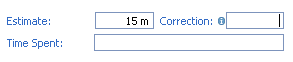
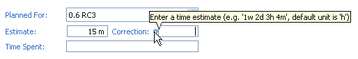
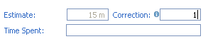
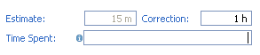
- Improving the input experience on estimate controls in Work Items and Iteration Plans. The polish updates included refining the look and position of the overlay image; adding more information to the tooltip text for clearer guidance on how time units can be input, e.g., showing an example with 1w, 2d, 3h, 4m, where w = week, d = day, h = hour, and m = minute, and noting the “h” is the default time unit; and adding the default “h” if the field is left without a unit having been input, as in the example below. Also, now with the automatic input of the default time unit, errors are only shown if there is an obvious input error, not if a time unit has been left out. This is a friendlier approach and means most times errors should not show on these estimate controls:
- Showing validation markers for required fields only after ‘Save’ in the Build Definition editor. The following screen is a snapshot of how the markers previously showed on first interaction with the editor, but now these markers only show on ‘Save’ — a pattern we try to follow in editors, dialogs, and wizards:

- Using the “Show More” action link in dialogs with long lists, such as the Baseline dialog and History view in Source Control, to allow for expanding the list incrementally on demand
- Reordering and sizing of the default column in the History view to aid its discoverability
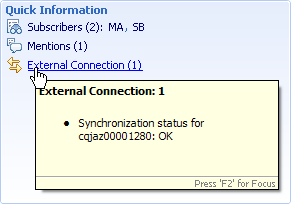
- Adding the CQ Synchronization status to the Quick Information area of work items that are synchronized with the CQ Connectors:
- Adding or replacing a number of UI graphics (icons and wizard graphics) that were either missing or needed improvement. Of course I keep coming across more to do! ;-)
Some of the Web UI changes include:
- Improving navigation between Project Areas; the regular application pages like Dashboards, Work Items, Iteration Plans, Reports, and Source Control; and Admin. These improvements included making “Project Areas” a first-class page on the global navigation bar for ready access to all Project Areas from any point in the UI. It also included introducing a Project Areas switcher on the far right of the banner, that is scoped to “My” project areas to allow for quick access to the project areas you are part of:

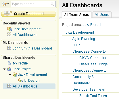
- Adding quick navigation to “All Dashboards” from the left sidebar. We’ve long had the challenge of how to show all the Team Areas within a project with the potentially deep levels of nesting on the left sidebar. Showing them all was overwhelming and difficult to navigate through, particularly in such a constrained space. The “one-link” solution here removes the hierarchy from the sidebar, replacing it with a single link that when clicked, shows the full content on the right in the main page area. So simple, and yet it took a few tries to arrive at. We have a similar approach in Iteration Plans with the break down of plans into “My”, “Current”, and “All”, and will reuse this approach in other components over time where there are deep hierarchies:
- Introducing breadcrumbs in Dashboards and other components to aid context and traversal of paths to and from a given artifact:

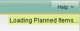
- More consistent load and busy indication across the UI. Previously we had a mix of graphical animation and text used in different ways and in different locations across components. Most loading or busy indication now uses a text-based “Loading …” information string either in-line or at the page-level in the upper-right corner, as shown in this example of loading an iteration plan:
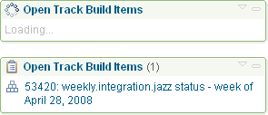
The exception is in Dashboards where we continue to use an animation in the title bar in a couple of ways: First to provide an additional layer of feedback as the viewlet is loading, and second, when there is content already in the viewlet and we need a place to show that additional information is coming in. This example shows the first case of the loading viewlet, then that same viewlet once the content is in. The animation was recently updated from a bar-style to the circular one shown here:
- Moving away from dialog-based error messages in favor of contextual in-page messages for issues that occur at the page level. If you do encounter a page-level error, such as a ‘Save’ problem in the Work Item editor due to a required field not being filled in, it will now show in the editor header area, much like on the Eclipse client. These in-page messages are also used in the Jazz Team Server Setup wizard, and in the Admin area with the Web UI.
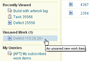
- Introducing an “Unsaved Work” section in the Work Items sidebar to support an unlimited number of new and modified work items. This image shows one new unsaved Defect:
- Adding Quick Search type-ahead in Work Items and Dashboards, so far. This example shows type-ahead for Connectors in the Dashboards area:

- Tweaking some layout and color issues in Work Items, Reports, and Iteration Plans, including updating the color of static titles in the Overview pages of Iteration Plans so the text doesn’t look clickable and adjusting the spacing of the Quick Information area within the Work Item editor so it is easier to read
(You might also have noticed an evolving look and feel in the Web UI, most notably in the banner and global navigation areas. I’ll tell you more about these and related changes in an upcoming blog post.)
The most recent New & Noteworthy for M6a and Beta 3 will also showcase some UI polish items mixed in with a great many more recent implementation updates. If you want to see these changes live, the Rational Team Concert Beta 3 client download is available, as is the same level of the product’s Web UI.
Once you’ve had a chance to check out some of the changes, I’d be interested in hearing what changes you find useful, what you don’t find useful, and even what you are indifferent to. And if you have any niggling UI points of your own to make, don’t hesitate to let me know about those as well! We might not be able to tend to them immediately but they are likely to get on the polish list in one of the post 1.0 cycles to come.
—
Kimberley Peter
Jazz UI Design Team

 (7 votes, average: 4.71 out of 5)
 Loading...
You must be logged in to post a comment.
Authors
 Adam Archer (1)
 Adam Neal (1)
 Adrian Cho (15)
 Alice Connors (3)
 Amy Silberbauer (24)
 Andrew Hans (1)
 Andy Lapping (15)
 Anindita Basu (3)
 Anthony Hunter (1)
 Benjamin Pasero (5)
 Benjamin Williams (3)
 Bernie Coyne (6)
 Beth Zukowsky (2)
 Bhawana Gupta (10)
 Bianca Jiang (3)
 Bill Higgins (2)
 Boris Kuschel (2)
 Brent Barkman (2)
 Brian Bryson (1)
 Brian King (4)
 Brian Lang (2)
 Brian Massey (3)
 Brian Sanders (2)
 Bruce MacIsaac (2)
 Carlos Ferreira (1)
 Carolyn Pampino (10)
 Catherine Burrows (1)
 Chandra Venkatapathy (1)
 Chris Daly (1)
 Chris Trobridge (1)
 Christophe Cornu (3)
 Christophe Elek (5)
 Christophe Telep (14)
 Clara Forero (1)
 Clare Carty (4)
 Dan Barbour (1)
 Dan Griffin (5)
 Dan Leroux (2)
 Daniel Berg (2)
 Daniel Moul (27)
 Daniel Toczala (4)
 Darin Swanson (1)
 Darrel Rader (1)
 Dave Thomson (7)
 David Brauneis (1)
 David Hodges (1)
 Dejan Glozic (2)
 Denise Cook (1)
 Derek Baron (8)
 Dibbe Edwards (3)
 Dirk Baeumer (1)
 Don Yantzi (1)
 Doron Ben-Ari (3)
 ELM Engineering (42)
 Eran Gery (1)
 Erich Gamma (5)
 Erik Craig (1)
 Ernest Mah (1)
 Evan Hughes (3)
 Fariz Saracevic (16)
 Frederic Fusier (1)
 Gary Cernosek (1)
 George DeCandio (4)
 Gili Mendel (1)
 Ginny Ghezzo (1)
 Graham Bleakley (5)
 Grant Covell (1)
 Greg Gorman (1)
 Guy Slade (1)
 Hadar Hawk (2)
 Heidi Stadel (1)
 James Branigan (2)
 James Moody (2)
 Jan Wloka (2)
 Jared Pulham (7)
 Jean-Michel Lemieux (23)
 Jeanette Deupree (1)
 Jim Amsden (1)
 Jim D'Anjou (2)
 Jim Ruehlin (1)
 Johannes Rieken (2)
 John Kellerman (2)
 John Vasta (1)
 John Whitfield (2)
 John Wiegand (1)
 Jozef deVries (1)
 Kai-Uwe Maetzel (6)
 Kalena Kelly (1)
 Karen Gosciminski (1)
 Kate Draper (2)
 Kate Hauser (1)
 Kevin Williams (2)
- Kim Peter (10)
 Kiran M N (1)
 Kit Lo (1)
 Kourken Aroyan (1)
 Kumaraswamy Gowda (15)
 Lauren Hayward Schaefer (15)
 Lawrence Mandel (2)
 Linda Watson (3)
 Liz Bonesteel (1)
 Luc Hatlestad (1)
 Lucinio Santos (1)
 Maneesh Mehra (3)
 Manoj Panda (1)
 Mario Maldari (1)
 Mark Guertin (2)
 Martha Andrews (3)
 Mary Yost (1)
 Masabumi Koinuma (1)
 Mats Gothe (1)
 Matt Lavin (1)
 Michael Fiedler (1)
 Michael Halder (2)
 Michael Valenta (3)
 Millard Ellingsworth (3)
 Miran Badzak (1)
 Monica Luke (5)
 Moshe Cohen (1)
 Nadra Rafee (1)
 Nathan Bak (5)
 Neil Leblanc (3)
 Nick Crossley (3)
 Nithya Rajagopalan (3)
 Palak Sheth (1)
 Patrick Streule (1)
 Paul Ellis (1)
 Paul Strachan (1)
 Paul Tasillo (2)
 Peter Haumer (1)
 Peter Steinfeld (1)
 Phil Vogel (3)
 Priyadarshini Gorur (3)
 Rahul Choudhary (4)
 Reuben Varzea (12)
 Richard Bone (3)
 Richard Watson (13)
 Rishikesh Agam (2)
 Robbie Minshall (1)
 Robin Bater (5)
 Roger LeBlanc (1)
 Rolf Nelson (16)
 Rosa Naranjo (1)
 Rosalind Radcliffe (1)
 Ryan Manwiller (4)
 Sandeep Kohli (1)
 Sandeep Somavarapu (1)
 Sanjesh Nair (1)
 Scott Rich (13)
 Sean Babineau (1)
 Seth Packham (11)
 Sharoon Shetty Kuriyala (1)
 Sreerupa Sen (5)
 Sridevi Sangaiah (1)
 Steve DiCamillo (2)
 Steven Beard (1)
 Subramanya Pilar (6)
 Sujan Surendrananitha (2)
 Suneel Santharam (2)
 Susan Yeshin (1)
 Tim Feeney (7)
 Tod Creasey (1)
 Tom Hollowell (4)
 Ubaidu Peediakkal (3)
 Vaibhav Srivastava (1)
 Vandana Shenoy (1)
 Vatsalkumar Parmar (2)
 Virginia Lovering (1)
 Will Streit (1)
Excellent overview of some of the polish items. Great work, team!
Kim, this all looks fantastic! Great improvements and your usual subtle artfullness.
Wrt your opening comments, I always think of it as “fit and finish”. When a house is built, there is much design that occurs all along the process. But the last touches that the craftsmen make around fit and finish go a huge way to making that first “wow” impression when you walk in the door. The tiles well chosen, fitted perfectly, the walls smooth, the paint even, hardwood gleaming, the doors fit nicely in the jams… If that polish isn’t there, a well designed house just won’t come across at all and the good design was for naught. By the same token, the polish won’t turn a badly designed house into something of value. They’re both needed for the object to be fully realized as something worth wanting.
Wonderful overview Kim. Congratulation to the design team. Have fun at RSDC this week!
In reply to #1
Thanks Jen. “Great work, team!” indeed. We have both observed and participated in the UI becoming more refined over the last several milestones. It is gratifying to see it come together for our first release.
In reply to comment #2
Kevin, thank you for the food for thought on “fit and finish”. I like the analogy to building a house and the craftspersons’ finishing touches. I would add that this phase of construction is possible through coordination between the craftspeople and the person overseeing the project, such as the general contractor. Time is built into the cycle to put that finish on. On the software side of the analogy, I am thankful we have the opportunity to prioritize polish items with our technical lead and the component team leads. And I suppose, like the house, there will be renovations to come in the form of future releases that give us the opportunity to rethink the spaces we’ve built or fine tune them further to fit the needs and preferences of the people who inhabit or, more aptly, who “use” them .
In reply to comment #3
Thanks Andree. RSDC was fantastic. It was a great opportunity to connect with colleagues, business partners and customers, and most importantly to get peoples’ thoughts on what they see in this first release of Rational Team Concert and how they would like to use it. Among the different sessions set up to gather input directly, specifically the Users First lounge, Jazz Live! event, and the Jazz Cafe, I particularly enjoyed hearing the questions and comments that came from audience members during the Jazz team talks.