
If there’s one question that we ask ourselves frequently in software development, it’s “how are we doing?”. All stakeholders, from first-line developers to project managers, from executives to customers, have a keen interest in the progress. The development process, especially on a larger team, produces a lot of information about work items, source control, builds and planning which, to the trained eye, conveys crucial tidbits about the trends, successes and failures of the team or the entire project. Acting on this information, making appropriate course corrections where necessary, can help ensure the future success of a project – the challenging bit is actually distilling this wisdom from the avalanche of data. Here’s where the Jazz Team Reports component, included in Rational Team Concert, can help.
The Team Reports component consists of two parts, which I’ll mention briefly to give you a feel for how we collect and present the data you see in reports. The first of these, the data warehouse, is a storage facility for aggregated, historical data. Automated snapshot tasks collect information periodically from the Jazz repository about various artifacts, including work items, change-sets and build results, and store it in the data warehouse. By doing this, we have access to historical information that wouldn’t be possible by simply querying the repository. The second part consists of the reporting engine, which visualizes a wide range of reports in the web UI, in the dashboard, and in the rich client, using information from the data warehouse as a data source.
With Team Concert beta 3 upon us, let’s use some of these reports to try to understand our progress since beta 2.
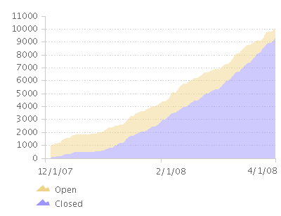
In the several milestones between beta 2 and beta 3, we closed more than 9000 work items. During that time, the backlog of planned open items seemed to range from about 1000 to close to 2000, although it converged nicely towards the end of beta 3 development:
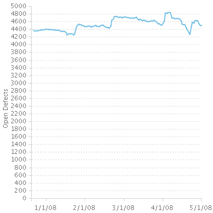
The previous chart is only part of the story, however, because it only shows those work items which are planned for one of the iterations. The defect backlog report gives us a better look at all of the open defects, whether they are planned for one of these iterations or not. This is important because even unplanned defects represent real problems and real work. This chart shows generally steady fixing, followed by upward spikes in the backlog. The upward spikes correspond with, respectively, our deployment weeks for M5D1, M5, M6 and RC1, when we test extensively. It’s also important to point out that our efforts to decrease the backlog in RC1 far exceeded any progress we had made during M5 or M6. However, the chart still reflects that there are more than 4000 open defects, so we still have work to do:
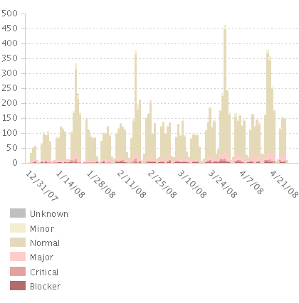
The rate of incoming work items, with each bar representing one day, reflects a few things about our regular rhythm. First, we saw a lull in the second half of December as many developers took vacation. Second, it shows an expected cycle each week with little work taking place on the weekends, and the majority of work items reported near the middle of the week, when our builds are usually ready for testing. Last, we see noticeable spikes in logged work items during the weeks corresponding with the end of each of our iterations (the four largest spikes are, chronologically, during M5D1, M5, M6 and RC1 deployment weeks). These patterns are reassuring because it shows work in the expected places and no surprises:
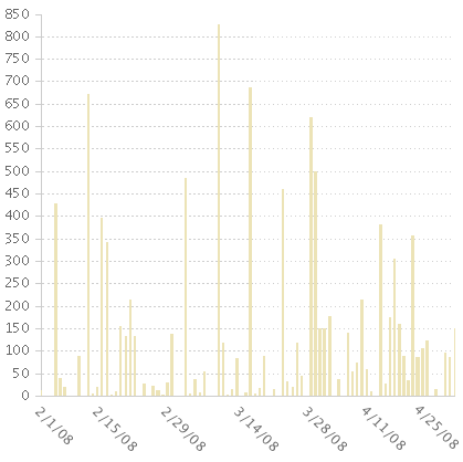
The activity in our Weekly Integration stream bears a bit of explanation. Until M6, continuous integration took place in a separate stream, and the weekly integration truly was “weekly” – that is, on Monday each team delivered that week’s contribution to the weekly stream, followed by patches and fixes as needed. Starting with M6, however, the Jazz development team decided that it would be better in the end game to do continuous integration only. At that point we started using the Weekly Integration stream for continuous integration, and deprecated the use of the other stream. These trends are brought out in the chart below – in the first half, we see big spikes of activity on Mondays followed by a lull; in the second half, we see more even activity in the weekly stream throughout the week.
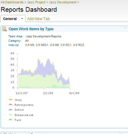
There are many other reports we use frequently to track such things as our build progress, the size trends of our repository and data warehouse, and work item trends related to planning estimates. For those ones we refer to frequently, the integration into the dashboard is a great feature which gives us at-a-glance access to the information we need to make informed decisions about our project:
You can see these reports, and many more, on the reports page on Jazz.net, which displays information about our own self-hosting. This data shows the progress of the Jazz Project gleaned from our own instance of Rational Team Concert. You can also use all of these reports on your own project. See the Getting Started page for Reports for more information.
—
James Moody
Jazz Reports Team Lead

 (7 votes, average: 4.86 out of 5)
Authors
 Adam Archer (1)
 Adam Neal (1)
 Adrian Cho (15)
 Alice Connors (3)
 Amy Silberbauer (24)
 Andrew Hans (1)
 Andy Lapping (15)
 Anindita Basu (3)
 Anthony Hunter (1)
 Benjamin Pasero (5)
 Benjamin Williams (3)
 Bernie Coyne (6)
 Beth Zukowsky (2)
 Bhawana Gupta (10)
 Bianca Jiang (3)
 Bill Higgins (2)
 Boris Kuschel (2)
 Brent Barkman (2)
 Brian Bryson (1)
 Brian King (4)
 Brian Lang (2)
 Brian Massey (3)
 Brian Sanders (2)
 Bruce MacIsaac (2)
 Carlos Ferreira (1)
 Carolyn Pampino (10)
 Catherine Burrows (1)
 Chandra Venkatapathy (1)
 Chris Daly (1)
 Chris Trobridge (1)
 Christophe Cornu (3)
 Christophe Elek (5)
 Christophe Telep (14)
 Clara Forero (1)
 Clare Carty (4)
 Dan Barbour (1)
 Dan Griffin (5)
 Dan Leroux (2)
 Daniel Berg (2)
 Daniel Moul (27)
 Daniel Toczala (4)
 Darin Swanson (1)
 Darrel Rader (1)
 Dave Thomson (7)
 David Brauneis (1)
 David Hodges (1)
 Dejan Glozic (2)
 Denise Cook (1)
 Derek Baron (8)
 Dibbe Edwards (3)
 Dirk Baeumer (1)
 Don Yantzi (1)
 Doron Ben-Ari (3)
 ELM Engineering (42)
 Eran Gery (1)
 Erich Gamma (5)
 Erik Craig (1)
 Ernest Mah (1)
 Evan Hughes (3)
 Fariz Saracevic (16)
 Frederic Fusier (1)
 Gary Cernosek (1)
 George DeCandio (4)
 Gili Mendel (1)
 Ginny Ghezzo (1)
 Graham Bleakley (5)
 Grant Covell (1)
 Greg Gorman (1)
 Guy Slade (1)
 Hadar Hawk (2)
 Heidi Stadel (1)
 James Branigan (2)
- James Moody (2)
 Jan Wloka (2)
 Jared Pulham (7)
 Jean-Michel Lemieux (23)
 Jeanette Deupree (1)
 Jim Amsden (1)
 Jim D'Anjou (2)
 Jim Ruehlin (1)
 Johannes Rieken (2)
 John Kellerman (2)
 John Vasta (1)
 John Whitfield (2)
 John Wiegand (1)
 Jozef deVries (1)
 Kai-Uwe Maetzel (6)
 Kalena Kelly (1)
 Karen Gosciminski (1)
 Kate Draper (2)
 Kate Hauser (1)
 Kevin Williams (2)
 Kim Peter (10)
 Kiran M N (1)
 Kit Lo (1)
 Kourken Aroyan (1)
 Kumaraswamy Gowda (15)
 Lauren Hayward Schaefer (15)
 Lawrence Mandel (2)
 Linda Watson (3)
 Liz Bonesteel (1)
 Luc Hatlestad (1)
 Lucinio Santos (1)
 Maneesh Mehra (3)
 Manoj Panda (1)
 Mario Maldari (1)
 Mark Guertin (2)
 Martha Andrews (3)
 Mary Yost (1)
 Masabumi Koinuma (1)
 Mats Gothe (1)
 Matt Lavin (1)
 Michael Fiedler (1)
 Michael Halder (2)
 Michael Valenta (3)
 Millard Ellingsworth (3)
 Miran Badzak (1)
 Monica Luke (5)
 Moshe Cohen (1)
 Nadra Rafee (1)
 Nathan Bak (5)
 Neil Leblanc (3)
 Nick Crossley (3)
 Nithya Rajagopalan (3)
 Palak Sheth (1)
 Patrick Streule (1)
 Paul Ellis (1)
 Paul Strachan (1)
 Paul Tasillo (2)
 Peter Haumer (1)
 Peter Steinfeld (1)
 Phil Vogel (3)
 Priyadarshini Gorur (3)
 Rahul Choudhary (4)
 Reuben Varzea (12)
 Richard Bone (3)
 Richard Watson (13)
 Rishikesh Agam (2)
 Robbie Minshall (1)
 Robin Bater (5)
 Roger LeBlanc (1)
 Rolf Nelson (16)
 Rosa Naranjo (1)
 Rosalind Radcliffe (1)
 Ryan Manwiller (4)
 Sandeep Kohli (1)
 Sandeep Somavarapu (1)
 Sanjesh Nair (1)
 Scott Rich (13)
 Sean Babineau (1)
 Seth Packham (11)
 Sharoon Shetty Kuriyala (1)
 Sreerupa Sen (5)
 Sridevi Sangaiah (1)
 Steve DiCamillo (2)
 Steven Beard (1)
 Subramanya Pilar (6)
 Sujan Surendrananitha (2)
 Suneel Santharam (2)
 Susan Yeshin (1)
 Tim Feeney (7)
 Tod Creasey (1)
 Tom Hollowell (4)
 Ubaidu Peediakkal (3)
 Vaibhav Srivastava (1)
 Vandana Shenoy (1)
 Vatsalkumar Parmar (2)
 Virginia Lovering (1)
 Will Streit (1)
You must be logged in to post a comment.