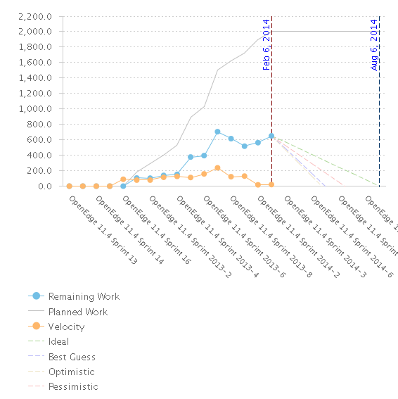
What exactly is the new release burndown showing?


One answer
I have a few problems with this chart as well, but I believe I figured out at least that the blue dots represent the remaining work at the beginning of the sprint. So if you want to see where you are when you finish your last sprint (presumably the point), then there has to be an extra data point on the x axis.
I believe the old chart (though I haven't verified) actually chose to put an extra bar at the front labeled Start, i.e. the points represented Remaining Work at the end of each iteration, so it didn't have an extra at the end.
As far as point totals, I don't really know, but basics would be to double check the iterations and teams you're including in the chart match the plan view you're looking at (I'm guessing you did that already, but worth mentioning).
Different, but maybe of interest, here's my question on weirdness around the "Now" point and the x axis: https://jazz.net/forum/questions/162663/advanced-release-burndown-now-point-causing-incorrect-x-axis-scale
Good luck!