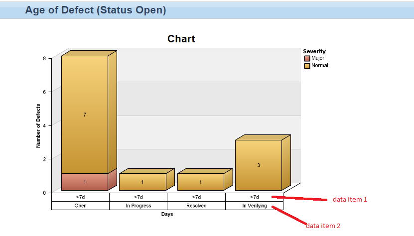
JRS: display 2 data items on axis or chart

Accepted answer
Hello Don,
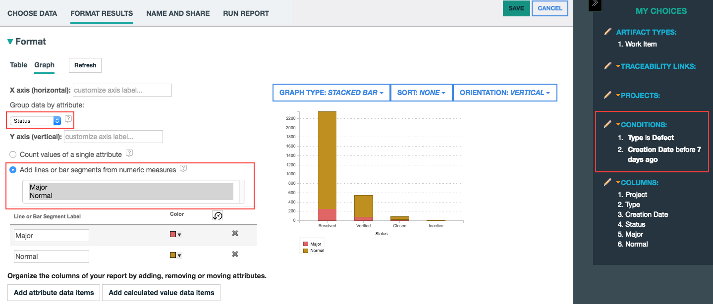
We can recreate the semantics of the chart you display, but it won't look exactly the same. Essentially it's a stacked bar chart of defects that are older then 7 days old (base conditions). Then the x-axis is grouped by Status and you have calculated columns that count the number of Major and Normal work items that represent the segments of the stacked bar.
Here is the configured graph that I created that replicates the semantics of the chart you pasted above:
Hope that helps,
-Steve