Trend and Aging Reports in Jazz Reporting Service Report Builder 6.0.3
This article continues the discussion in Introducing Historical Trend Reporting in Jazz Reporting Service Report Builder 6.0.1. Trend and aging reports are critical to evaluating progress because you can see how data changes over time. This capability is considerably evolved in the 6.0.3 release by introducing new metrics, providing the ability to trend custom data, and giving more control over graph configuration.
Improved aging reports
An aging report gives you a summary of artifacts grouped by dates. Then you can see patterns in how artifacts are grouped, such as relative age since creation and resolution of work items. In previous releases you had to create calculated columns where you could do a count of all artifacts based on a date range comparison of a date attribute (such as creation date). This approach was a bit cumbersome if you wanted to look at numerous date ranges, because you needed to create a new calculated column for each date range. You couldn’t use a time series report because the time ranges become segments or individual bars in the graph rather than entries on the X-axis.
Date scale: Show a time series with current data
The following graph configuration uses calculated columns to create an aging report where you can see how many defects are older than 3 months, between 1 and 3 months, and less than a month old.
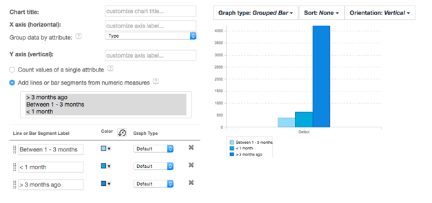
To create this graphic report you need to add three calculated columns with a limited range on the Creation Date. This approach is still useful if want to show a set of ranges in broad strokes or you have irregular intervals for ranges.
If you want to represent this same data in a time series report, you can use the new ability to group any date field by week, month, or year. Before 6.0.3, you could use the Date Scale drop-down list when creating a graphical historical trend report. This functionality has been expanded for any graph report that uses a date field as the primary group on the X-axis. Now you can define a creation aging report where you can view the age of open defects based on their creation date.
First, create a regular Work Item report and then add Creation Date as one of the columns of the report:

Then choose the Graph tab and set the Group data by attribute field to Creation Date. The default graph will likely be flat at first because creation date includes the time, so each date value is seen as unique, giving it a different entry on the X-axis. To see more interesting results, you can change the date scale to be weeks, months or years.
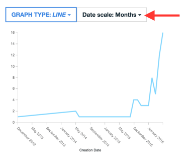
The date values are now grouped by that scale and you can see the aging report for work items based on the conditions that you’ve set.
Date scale: Interpret no value as zero
In aging reports you are looking at a trend over time. There might be conditions on that trend that restrict the amount of data being visualized so that no data is available at certain times. For instance, you might want a trend report of defects created by certain person. Just create a work item report and then add a condition for the Creator and add Creation Date as a column.
The problem in this case is that, for days when no value is returned from the query, how do you interpret this in a chart? It can be correctly interpreted in two ways – either ignore the value or consider the value a zero result. If the value is ignored, the line merely connects the previous day’s values with the next day’s values. This interpretation is right if you want to ignore certain days or if no data was collected on some days. Otherwise, it should be possible to interpret this missing data as a zero result.
Consider the following report that shows the trend of work item creation for a particular person over the last three months:
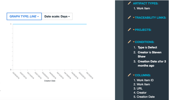
This developer typically logs a defect possibly every week, but definitely not every day. In this case the report provides a flat list for the daily trend, since the gaps are ignored. To get an accurate daily view of defects created you need to consider gaps as being a zero value. Now you open the Date scale menu and choose Fill in gaps with zero value.
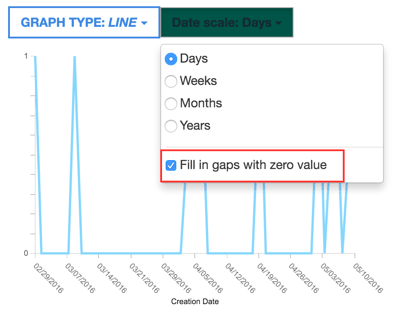
The graph fills in those date gaps with a zero value and you can accurately compare when defects were logged to when they were not logged.
Custom trend reports using work item history
Rational Team Concert (RTC) stores a complete history of work item changes that is synchronized into the data warehouse in the Work Item History table. This table was exposed previously in Report Builder but wasn’t useful except to dump data or look at the work item state on a particular day. Now, with the introduction of the more flexible data range functionality that exposes date scale, you can harness this table to do custom trend reports. In addition, you can treat this table and the Work Item Status History table as trend tables and customize the work flow for them just like the other trend tables.
Consequently, you will notice that these artifact tables have been moved from the Current Data section to their more logical location in the Historical Trends section of Report Builder.
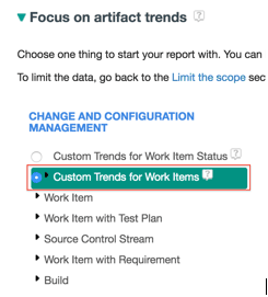
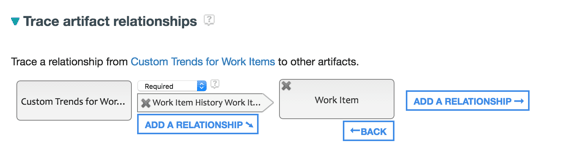
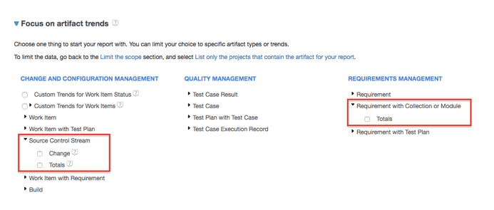
In the Focus on artifact trends section you see new entries for Custom Trends for Work Items and Custom Trends for Work Item Status. Selecting one of these artifacts changes the flow to add the Traceability section in addition to the Set time range section.
By adding traceability to the current work item you can facilitate drill-down to actual artifacts in the final report. Otherwise, drilling down would discover the set of work item history records for a particular date range rather than the list of relevant work item records. Here’s how to set it up:
After setting the time range and adding conditions such as Planned For or Filed Against, you can continue to the Format results section.
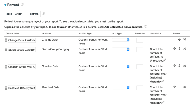
In this section the X-axis is automatically grouped by the Change Date, which is when the baseline of the work item history was captured each day by the Data Collection Component (DCC) DataMart jobs. At this point it works like a regular graph report in that you need to add attribute data items to group by or add calculated columns that can be visualized in the graph. It might be easier to switch to the table view of the report to ensure that all the data you need for the graph has been added as columns there.
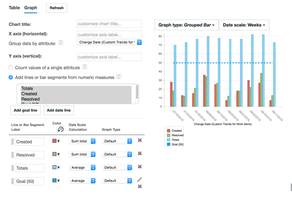
As an example, you can create a graph report that compares the total number of work items with how many work items were created or resolved on a particular day. First, you need to create some calculated columns for those metrics. Switching to the table view you can see that some calculated columns were added by default for convenience so you can visualize the totals on a given date. The added columns are useful if you’re simply looking for work item totals with conditions you added on the Choose Data tab. You can remove them and instead add calculated columns for the count of unresolved work items, and for creation date and resolution date. If you add a limit on a date field, for trend reports the Today value is relative to the trend day where the data is captured. Consequently, you can compare counts where a date field is equal to or close to the day for a trend (the number of creations or resolutions on a particular day). If the DataMart synchronization from DCC is scheduled for early in the morning, you might need to select Yesterday so that changes from the previous working day are included. Otherwise, choosing Today might only capture changes from 1 a.m. to the job run, which may not be the most active time for changes.
Based on this function, you can add calculated columns that measure the total unresolved work items, number of created work items, and number of resolved work items for each trend day. The table configuration should look like the following table when you’ve added them (and removed the other default columns).
Switching back to the Graph view, these calculated columns are available to add as dimensions in the graph by selecting the Add lines or bar segments from numeric measures radio button. If you change the date scale to Weeks and then modify the date scale calculation for the creation and resolved metrics to Sum total, you can see weekly totals for creation and resolution beside the weekly average for the total. Adding a goal line for the desired total defect goal, you get a graph configuration that looks like this:
Hybrid charts (with bar and line dimensions on the same chart)
You might find it useful to differentiate data dimensions from each other if they have different meanings. Now it is possible to combine line and bar chart dimensions in the same chart report.
To create a hybrid chart, use the new Graph Type column in the graph configuration table and select the graph type for a particular dimension. This graph type assumes the default graph type of the report, unless you lock it to a specific graph type such as bar, line, or dashed line.
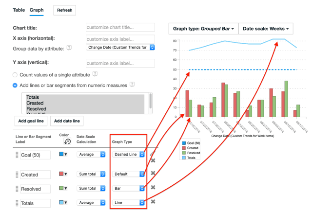
In the same example, the goal line defaults to a dashed line since it’s a special case. Created is set as Default so it assumes the Grouped Bar type that is the default for the report. Resolved is explicitly a bar chart type, so it is always shown as a bar regardless of the default type of the report. Finally, Total Open is set as a line and likewise it is always shown as a line.
Curved goal lines
Goal lines are a useful way to show a target value or state for a report. Previously you could add goal lines when using the historical trend capability. The goal could be a horizontal line shown in both line and bar charts. Now you can add goal lines to any time series report and, with the introduction of hybrid reports, you can control how to visualize the goal line – as a dashed line, straight line, or even a bar. Further, you can now use angled lines, curved lines, or S-curve lines, whatever works best for your report. Click the Add goal line button when you are using the Add lines or bar segments from numeric measures option for graph reports.
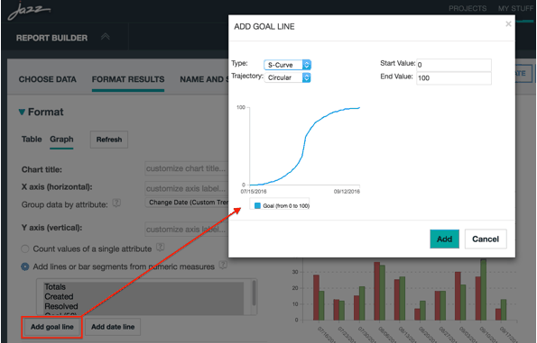
In this dialog box you can select the type of goal line – linear, curved in or out, or a combination of curves called the S-curve. You can also control the steepness of the curve and the starting and end values.
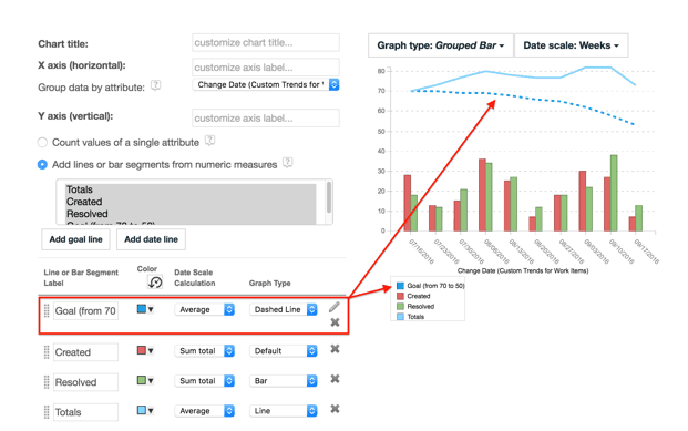
In the example you could use this functionality to create an idealized trajectory for defect resolution such as a curve in towards the goal of only 50 defects remaining. You can edit the values and type of the existing goal line by clicking the pencil icon to the right of the goal line configuration entry. Since totals start at 70, you can add a curved-in line from 70 to 50 as the eventual goal.
Vertical date lines
A date line is a vertical line that aligns to a relative or specific date. Use date lines to target or highlight specific dates, such as the beginning or end of an iteration or other milestone dates. If you are tracking a release or iteration you can add a specific date to the report that will extend the time series to that date.
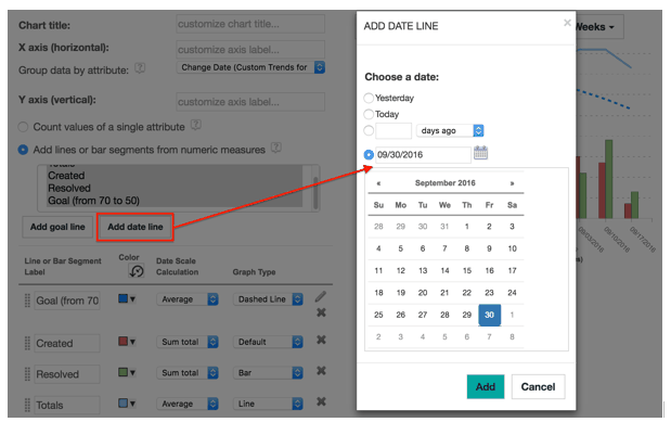
In the same example you can see that the goal line extends to the date line, giving a clear view of whether the projected dates will be met.
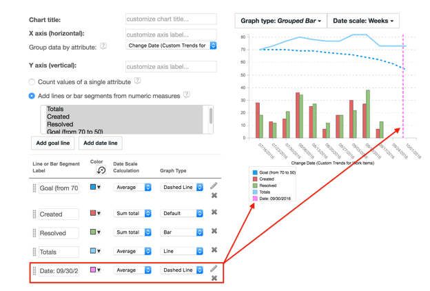
Now you have a very powerful release status report that gives an indication of the trend for creation and resolution of defects and the corresponding impact on the total number of open defects. You can then compare this trend to the overall goal and how it is progressing towards the release or milestone date.
New historical trend metrics
Three new historical trend reports are now available.
File stream report (source control metrics)
New historical trends are now available for source control stream artifacts in RTC such as change sets and source files. With these trends you can develop reports based on metrics for the total number of source files, the number of new source files, and many others. You can also compare the number of change sets added with the number of source files.
If you select the Change trend above and then add measures for Change Set Additions and File Additions, you can develop reports like this:
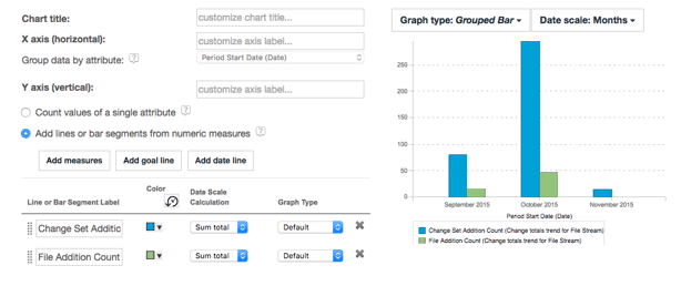
In this report, you can track by month how many files and change sets were added. Here you can see that October was a particularly productive month for source changes and additions.
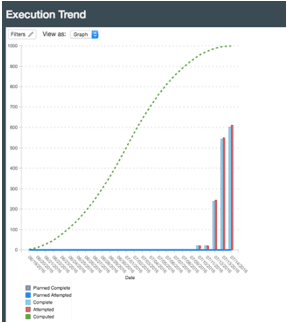
Execution Trend report
A new ready-to-copy report called Execution Trend is available now. This report can be duplicated and modified to meet specific needs or used as is by setting the runtime filters. It will show the actual and planned test execution progress based on test case weight (points complete and attempted).

Here is an example of the report after setting the appropriate filters for project and iteration:
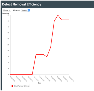
Defect Removal Efficiency report
A new ready-to-copy report called Defect Remove Efficiency (DRE) is now available. This report can be duplicated and modified to meet specific needs or used as is by setting the runtime filters. The metric is calculated as the total number of defects closed divided by the total number of defects.

Here is what the report looks like after setting the appropriate filters for project and iteration:
Conclusion
Using the historical trends demonstrated in this article can help you understand the progress of your development teams. Whether it is the aging of defects or the relative efficiency of defect resolution and its impact on totals, this information allows you to make mid-course adjustments and ensure that the trend moves toward the goal trend you are aiming for. With the Jazz Reporting Service you can co-locate all these trend reports on a single dashboard and get an instant snapshot of how development is progressing.
Copyright © 2017 – IBM Corporation