Gaining insights into CLM Data with Watson Analytics and the Jazz Reporting Service
This article describes how you can integrate Rational Collaborative Lifecycle Management (CLM) reports by using the Jazz Reporting Service (JRS), with Watson Analytics, to gain insights into your internal lifecycle (Change, Test, Requirements, and Architecture) data.
Watson Analytics is a public cloud offering hosted by IBM that can process a lot of data quickly, and will help you explore your data as well as identify correlations that are not obvious. It currently does not support analyzing disparate sources of information to correlate them together, but rather takes a single data set that will be processed for exploration. Other solutions, such as Watson Explorer (WEX), or Watson Content Analytics, can be used in advanced cases like this (these tools are a topic for another article). Of course you could also just copy and paste multiple sources of data into a single spreadsheet.
JRS has an easy to use interface for CLM users to create reports on the lifecycle data that span multiple domains (Change, Test, Requirements, and Architecture).
This article walks you through the following steps:
- Creating a report that reflects the data that you want to analyze
- Import that report into Watson Analytics
- Use Watson Analytics to explore and visualize the data
Generating a report
Currently the integration between CLM and Watson Analytics requires an export and import step. Though in the future we intend to tighten this integration by allowing users to push data directly into Watson Analytics.
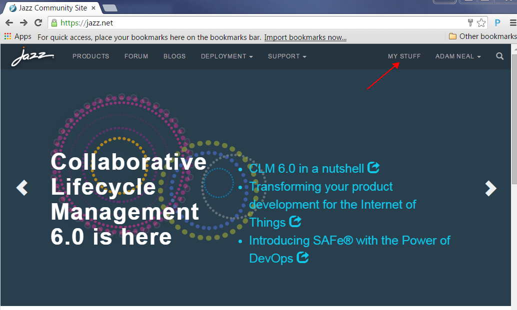
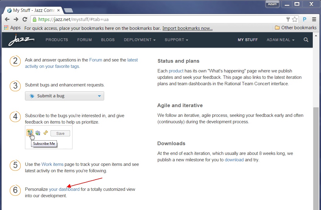
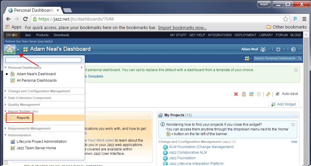
In this example we use the data available at http://jazz.net, which contains all the lifecycle data collected by the multiple Jazz teams using this server as their self-host environment. We start by going to the JRS.
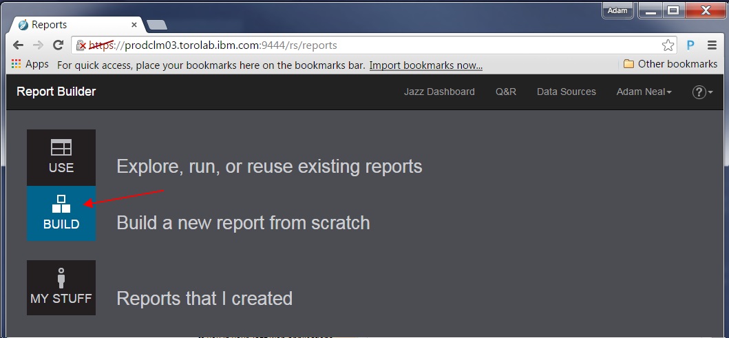
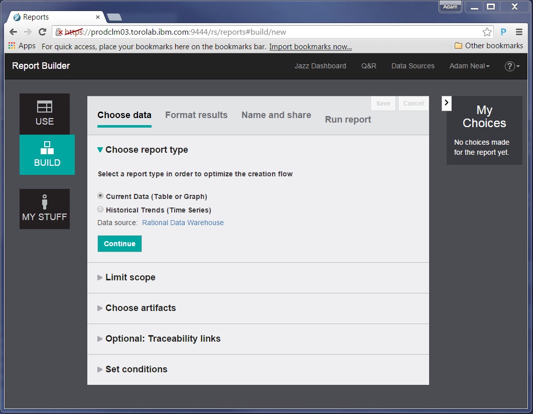
Now we can create a report that gathers the data we want to analyze. It helps to have a question in mind that you want to answer or a problem to investigate.
Let’s look at some statistics from our test teams based on the current CLM version 6.0.1 milestone release. The functionality mentioned here will also work with the current general availability release, version 6.0.
We want to know how many defects result in code changes in the product versus defects that do not affect production code. The creation and resolution of defects that do not affect production code cost testers and developers time. We want to understand what the relationship between code change and non-code change defects are. Hopefully there are many more code change defects being resolved than non-code change. If not, then we want to determine how we can reduce the number of non-code change defects that are created.
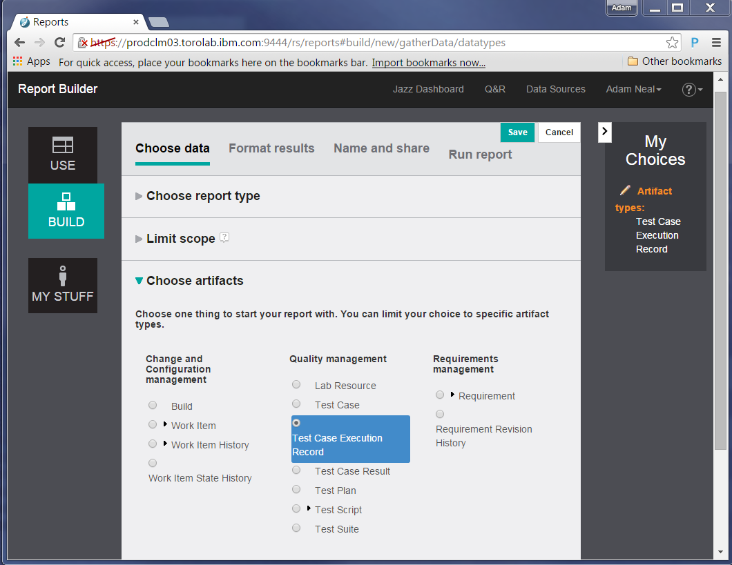
To build this query, you should understand the artifacts involved and how they are related. We spoke with some test architects to ensure we had the proper understanding of the relationships that we use in the http://jazz.net data. Here is an overview of the artifacts:
- Test Plan: Container of test cases. Test plans are typically created per test team, per release.
- Test Case: A scenario to test. This is can be reused across releases.
- Test Case Execution Record: An instance of a test case that runs in a specific test environment (e.g. operating system, database, web browser)
- Test Result: The status (pass/fail/blocked/etc.).
- Work Item: This is another term for change request
Now we can build our query:
First, we chose to look at all test data from all test teams, therefore we wanted to find all Test Case Execution Records. This helps us answer “What are all the instances of tests that have been run?”
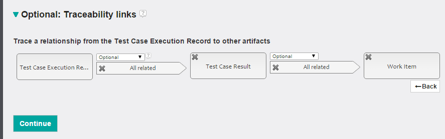
Next, we define the traceability links. In CLM, test artifacts have relationships, which are OSLC links, to other test artifacts, change requests, or requirements. These links are considered traceability links, and by setting them, the report shows related artifacts of that type.
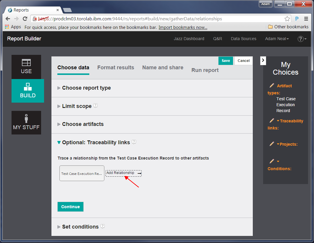
In the data at http://jazz.net, Test Case Execution Records refer to Test Case Results, and these results might have work items associated with them. With this information lets report on the following traceability links:
Next, we make sure the report includes only results from a specific release. Let’s add a condition on the Test Case Execution Record to include only those whose iteration is from the 6.0.1 release.
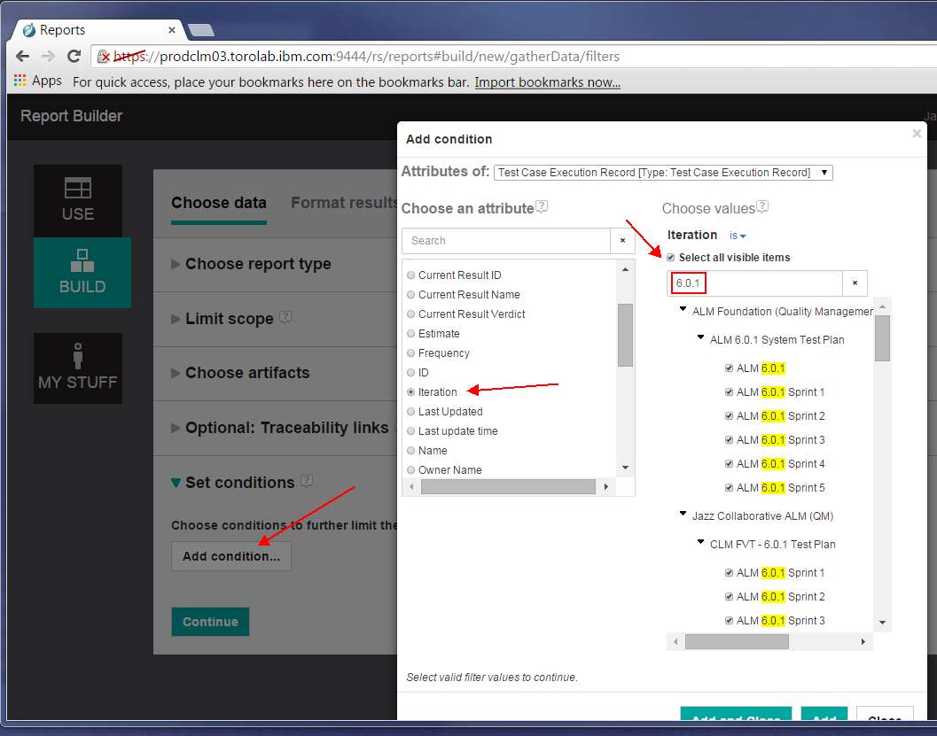
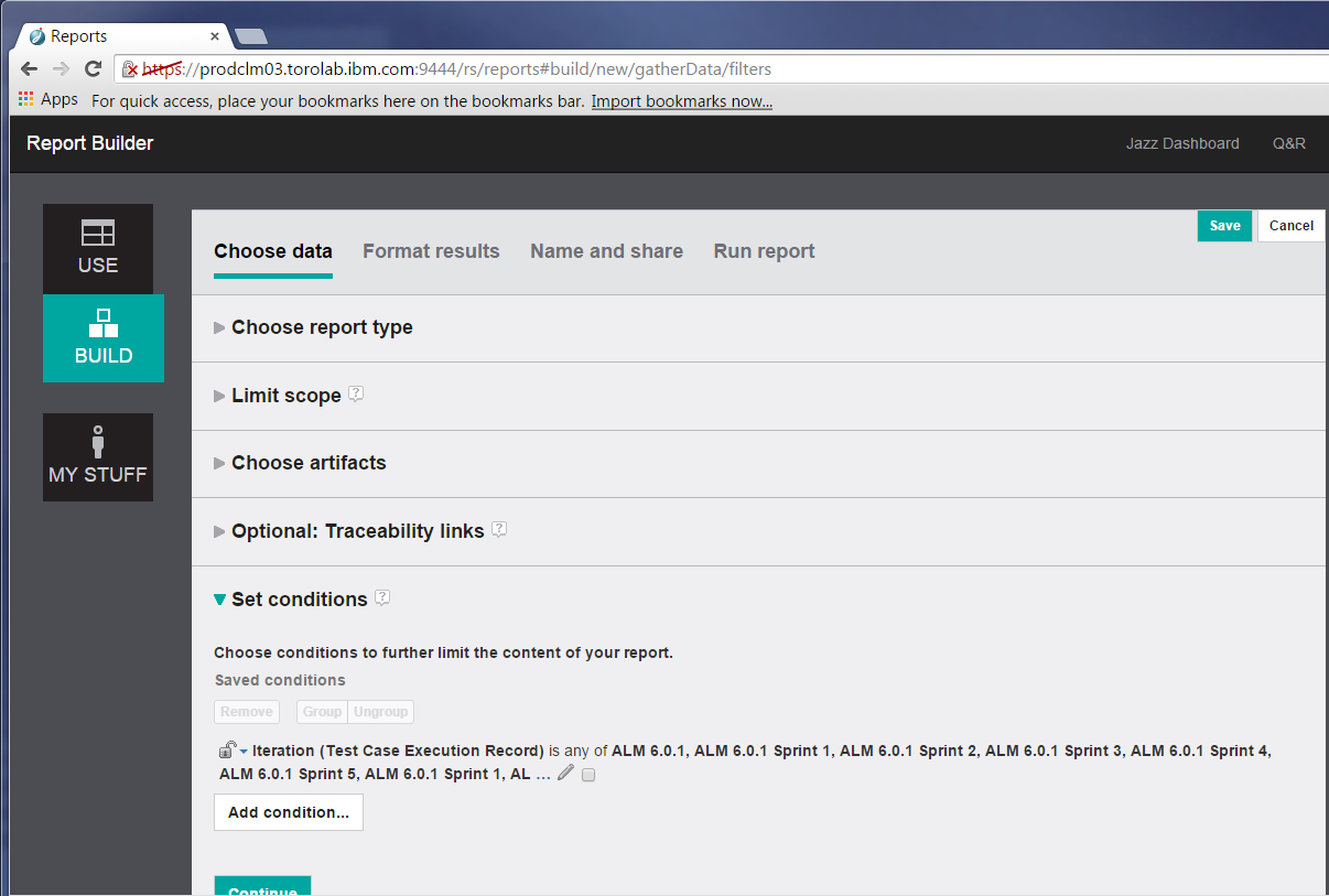
Next, we make sure the report includes only results from a specific release. Let’s add a condition on the Test Case Execution Record to include only those whose iteration is from the 6.0.1 release.
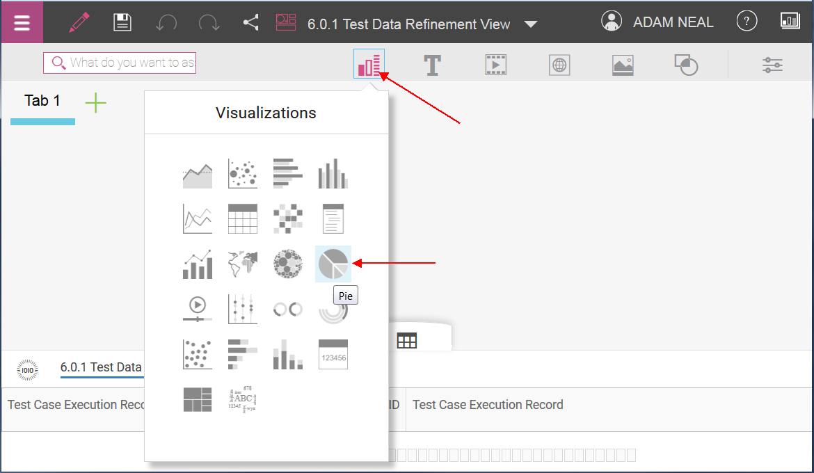
Here we can click the ‘Add attribute columns’ to choose the attributes of the different artifact types (Test Case Execution Record, Test Result, Work Item) we want to load into Watson Analytics.
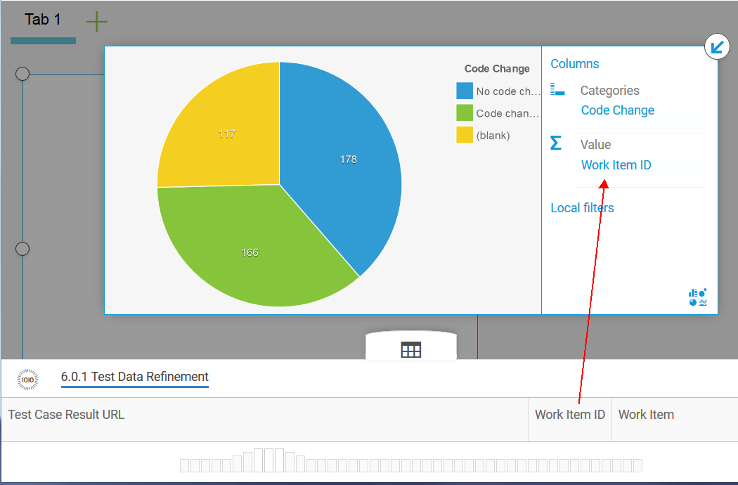
Note: Consider including the ID value of artifacts. While they may make Watson Analytics suggest some odd exploration questions for the data, it is useful for counting artifacts, as described later in this article.
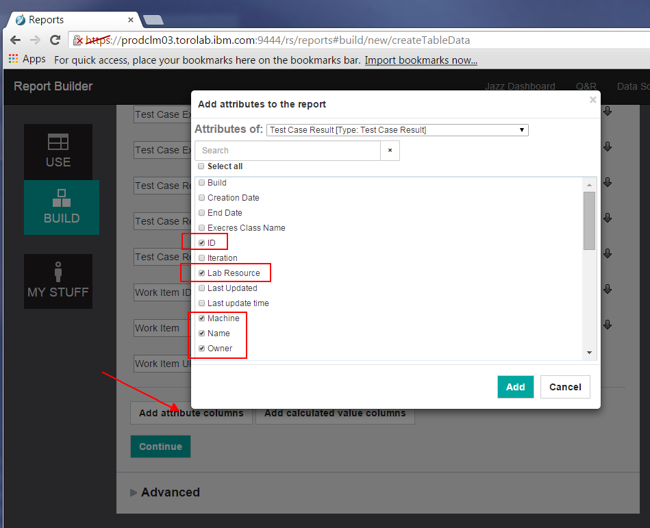
Explore the different attributes that you can include in your report. For example, we are not sure if Machine or Lab Resource will provide useful information, but we select it anyway to see what is there. In Watson Analytics we can refine our data set to remove columns that don’t have useful data.
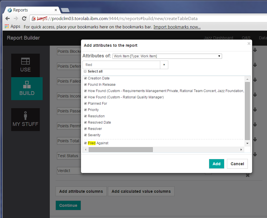
For work items, I chose to include these fields, and maybe a few more (such as Creator and Project):
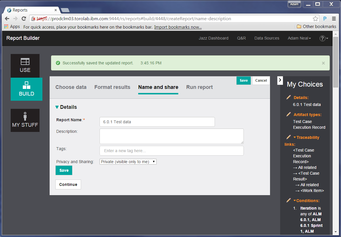
Click Continue again to name your report and specify other details.
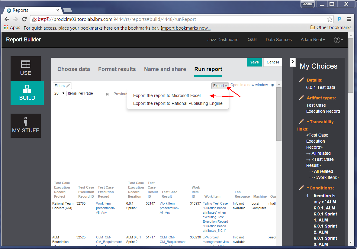
Finally, to run the report, click Continue. We will see a preview of the report, truncated to whatever the administrator has set as the maximum size. From this page we can export the results to a Microsoft Excel spreadsheet.
Click the link to download a static spreadsheet:
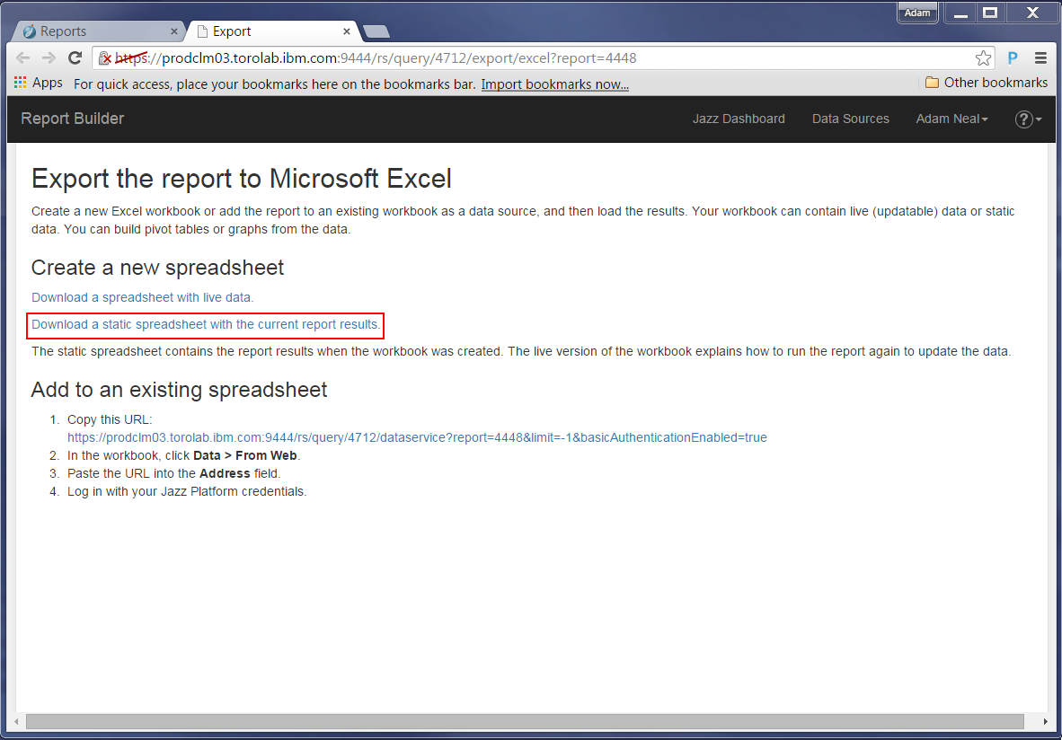
Now you have a file you can download. Save this file to disk and in the next step we will prepare to import it into Watson Analytics.
Tip: Your browser locale is used to format the results. To ensure that Excel recognizes the dates, set your browser locale to match the regional date and time settings defined by your operating system. For example, if your operating system expects M/D/Y, then a browser locale of English (US) will format the dates correctly.
Importing your report into Watson Analytics
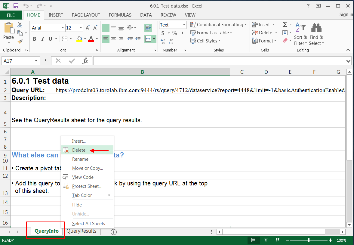
Open the spreadsheet that you exported in the previous section. Right-click on the first sheet name and delete that sheet.
Next, ensure that dates are in a recognized format. In our data set, we included resolution and creation dates. We found that Watson Analytics won’t recoginze dates unless Excel does as well, and Excel did not recognize these as dates without explicit instruction. Therefore, you might need to convert those fields to dates:
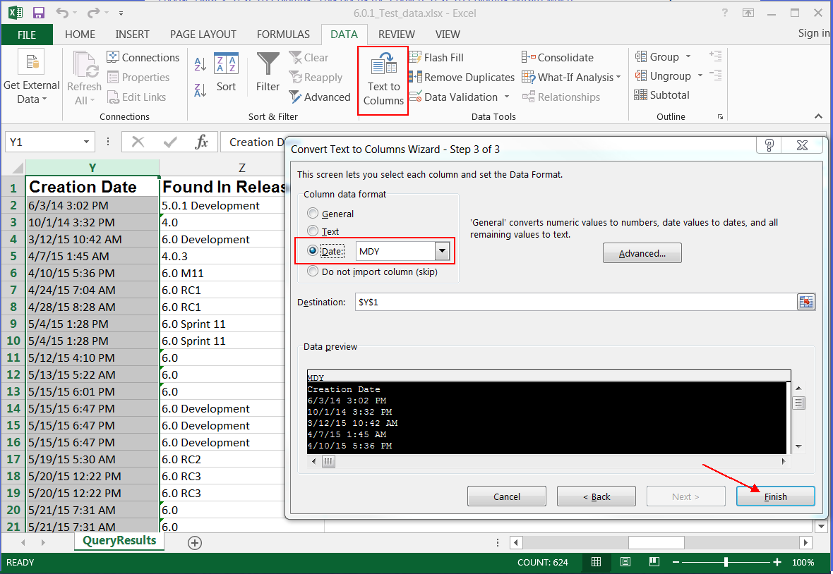
Note: If these are recognized as dates, they are right justified in the worksheet. Repeat for any other date fields.
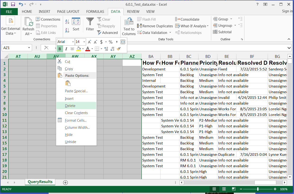
Remove any empty columns from the report by selecting them and choosing Delete.
Save and close your spreadsheet.
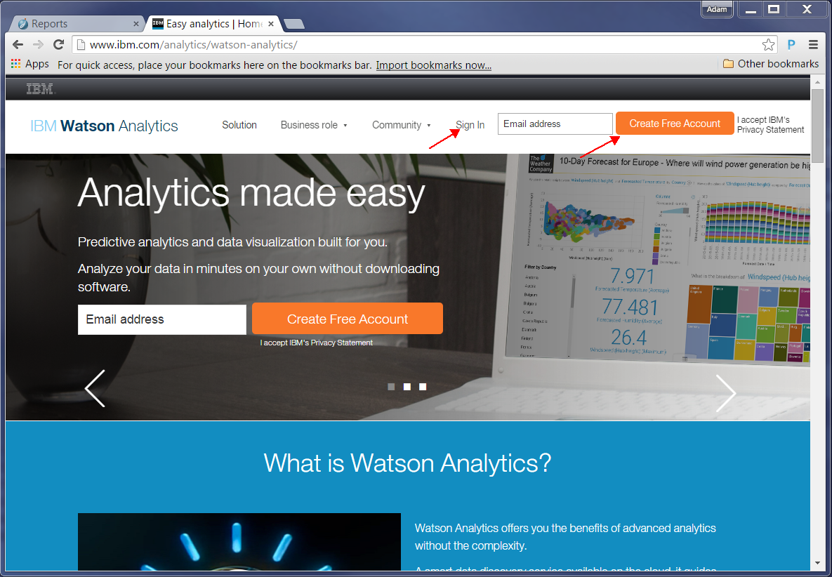
Now we can go to https://watson.analytics.ibmcloud.com to import our data. If you do not already have an account at this site, create one. If you are an IBM employee, sign in with your intranet ID.
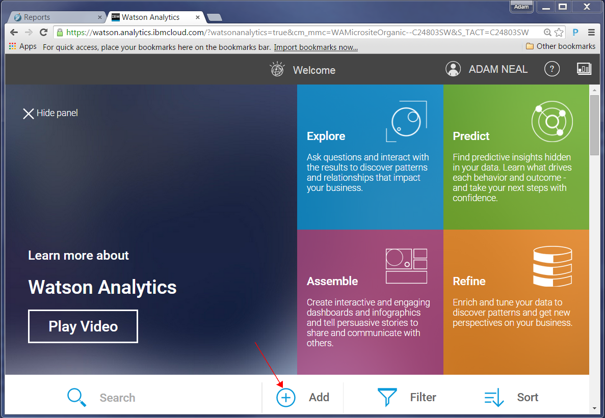
After you sign in, explore this page, which lists videos you can watch to help understand what you can do. To proceed with our report, we click Add.
Drag your report (a .xlsx file) to the “Drop file or browse” section, or click that section and then browse to the file.
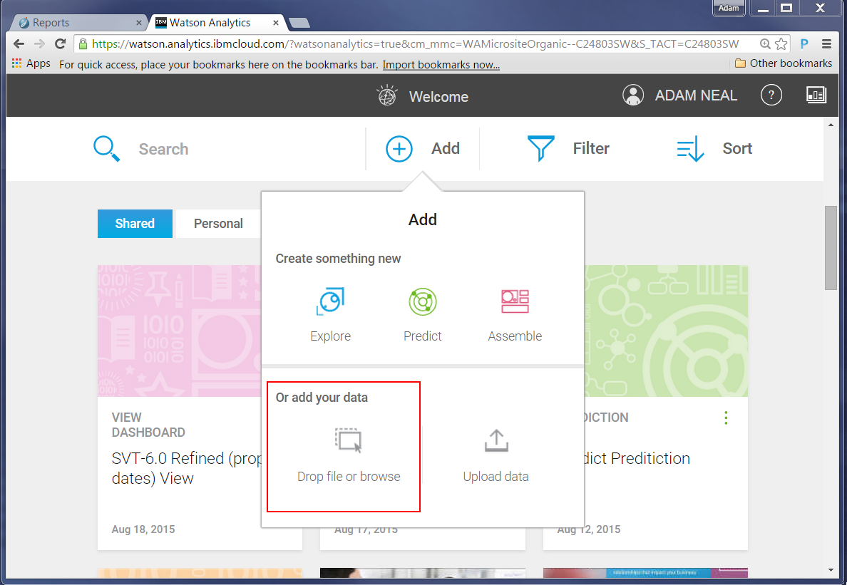
Note: Watson Analytics also supports .csv files.
After you drop or select the file, Watson Analytics starts procesing the data. When finished, a new tile will be added:
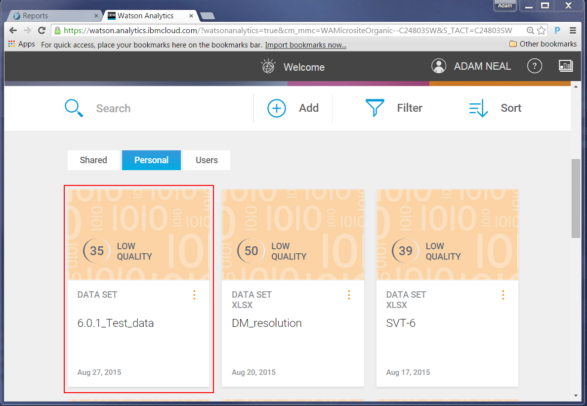
Now we can explore our data set. Note that the quality score does not reflect the quality of the data; it identifies how well the entire set of data lends itself to predictive analysis. For more information on data loading and data quality, follow this link: Forum Discussion
Exploring and assembling data in Watson Analytics
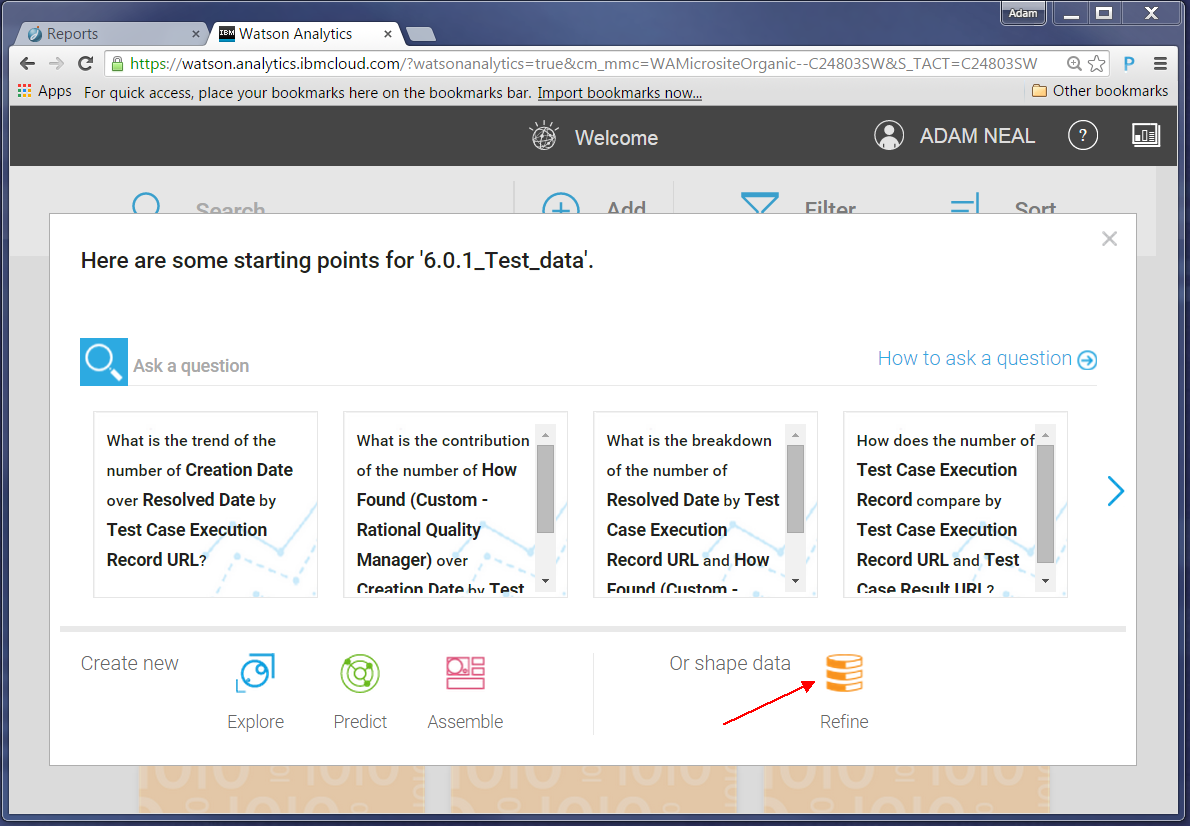
Now we can explore the data. In our example, we want to analyze data about defects which cause code changes versus those that do not. First, we must to refine our data set to create this grouping: click on your data set, shown in the preceding screen shot, and choose to refine the data:
To create a group, complete the following steps:
Click the Data group button.
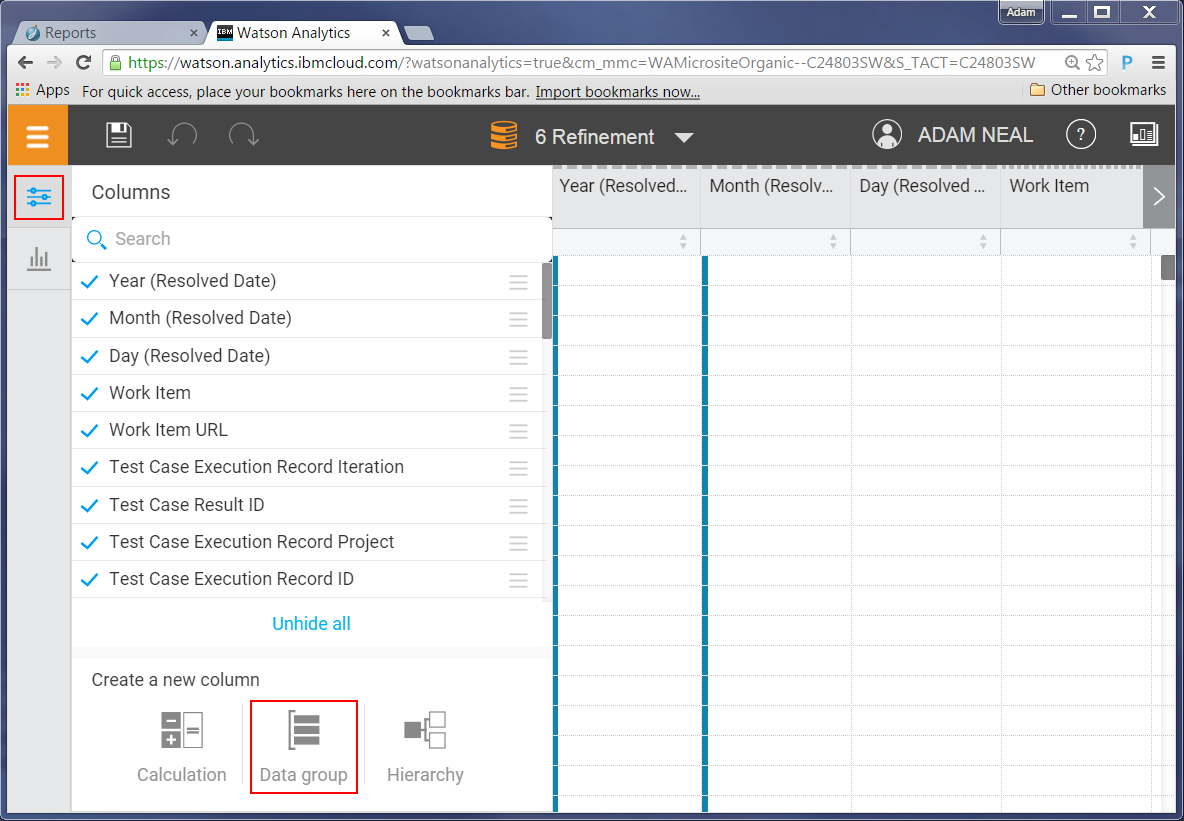
Click on the ‘Column’ value (in this data set its default value is set to Year) to change it to the column we want to group.

A list of possible columns is presented. In our case we want to group different “resolution” states, so we choose the resolution column. It will then show you the unique values in that column, which you can then start grouping.
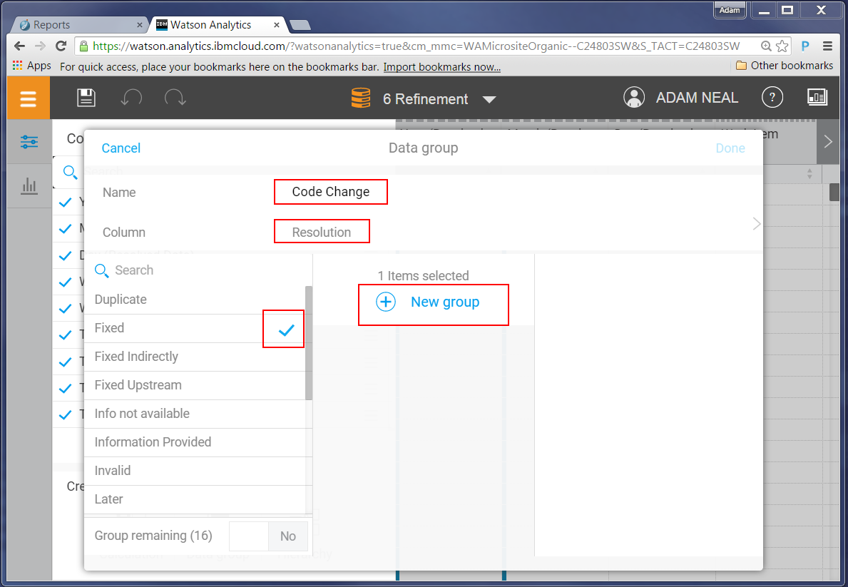
Only defects resolved as ‘Fixed’ will result in change sets being delivered into the system. All others do not (for example, duplicate, fixed indirectly, works for me, invalid). In this interface you can create a group for code change and non code change resolution types, plus an extra group for states that do not apply; for example, ‘Information not available’ implies the defect has not yet been resolved, so they should not be counted in either group.
Tip: Another useful grouping for us is by priority and severity. Our project data revealed that certain teams have unique names for priorities and severities. By creating a data group for this data, we could normalize the data inconsistencies. For example, we found “S1-Blocker” and “Blocker” defined by deferent teams to mean the same thing, using a group, we could call both values “Blocker” in the final result set.
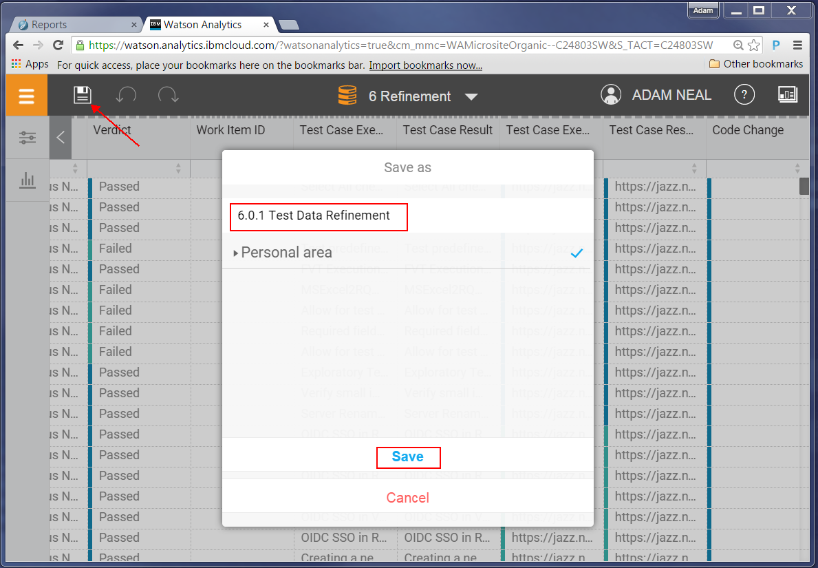
After you refine your data save it.
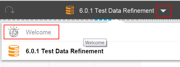
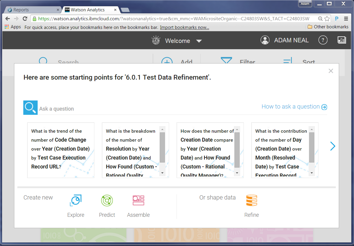
Now you can explore the data, and start creating graphs. Go to the Welcome page:
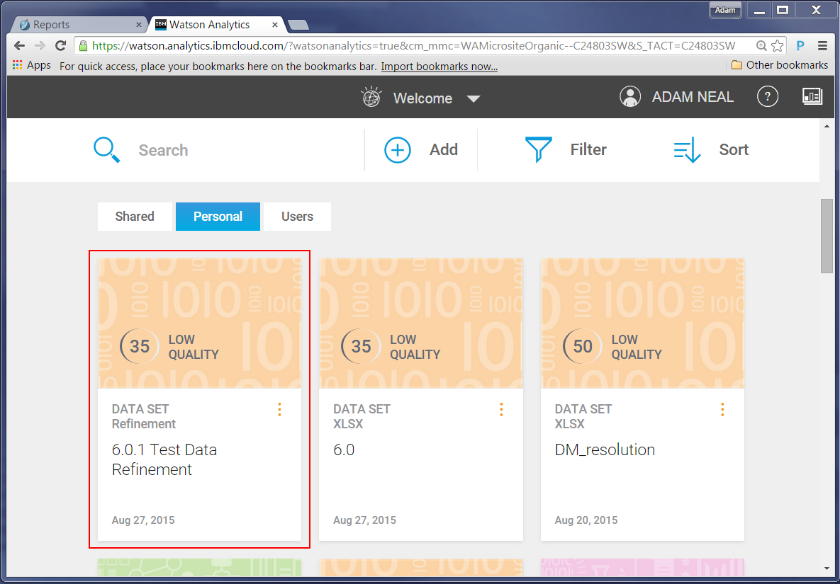
Select your refined data set.
We had planned on creating some specific graphs, but that first generated question peaked our interest. We decided to follow it and see what it showed.
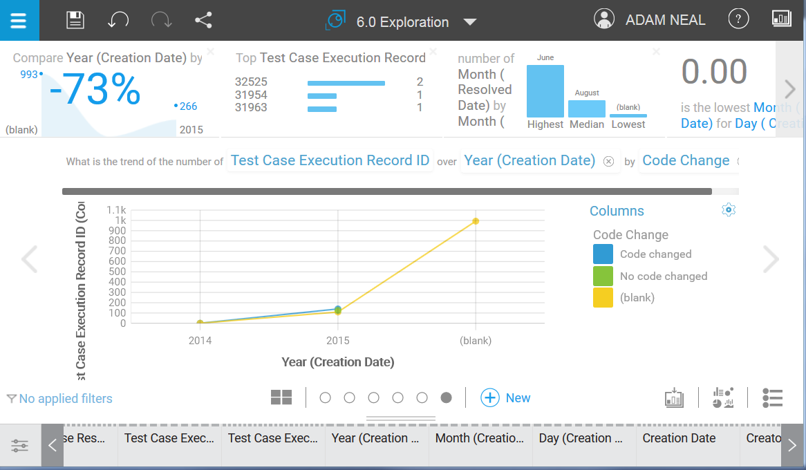
It was the idea of this question that was the most interesting; the trend of code change defects. The actual values Watson Analytics chose didn’t provide the correct meaning for us however, so we needed to tweak it.
- On the X axis, there are only 4 months of data for version 6.0.1, so let’s change the X axis to show months. Along the bottom of the page, the columns of data from the report are displayed, and some are automatically generated by Watson.
- Because we are interested in resolved defects, we are interested in their resoloution date, not their creation date. Let’s change the Y axis to show the month in which the defect was resolved.
- The Y axis shows the number of Test Case Execution Records that have resolved defects; we want to see the actual number of resolved defects, so let’s change this to count the number of Workitem IDs.
- Let’s exclude the ‘(blank)‘ entry on the X axis. In this example, it is a count of all the rows that didn’t have a value in the work item date field (i.e. test artifacts), and does not have any useful meaning for us. To exclude it, right-click and select Exclude.
Here is our graph after our changes:
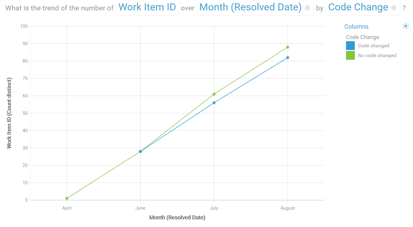
From this graph we can see that the trend of resolution for defects being created by our tests (automated and manual) is showing more defects being resolved without code changes.
This graph inspired us to look for other potential insights into the data:
- The ratio of code change defects to non code change defects
- The breakdown of code change defects per project
- The breakdown of code change defects per user
- The breakdown of code change defects per test scenario
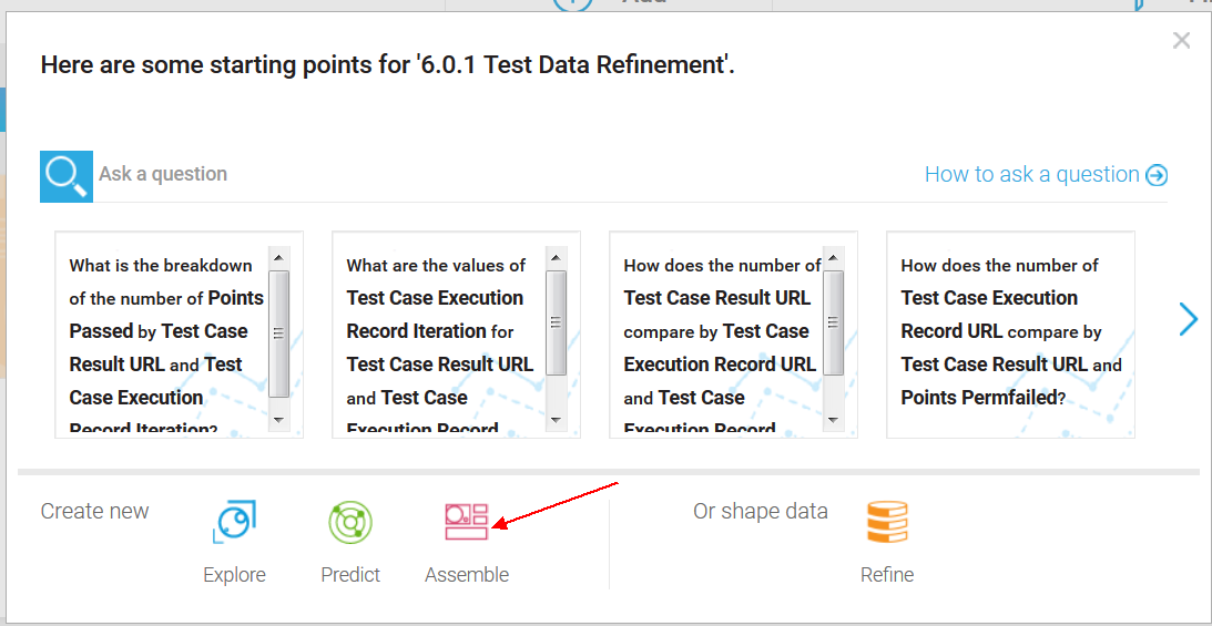
We can either ask these questions in the Explore section of Watson Analytics, or we can go to the Assemble section to create a dashboard to explore more graphs and see their interactions.
Creating a dashboard
Let’s return to the welcome page, and click our data set, and then click Assemble.
For our example, let’s select the default Tabbed template for our dashboard, and use the Freeform layout. We will then create a graph that shows the ratio of code-change to non-code-change defects.
To populate the graph, drag and drop from the report columns at the bottom of the page (which also contain any new groups you created during your ‘refining’ of the data set in Watson Analytics) into the appropriate columns area of the graph.
Note: The ‘(blank)’ values correspond to open defects. We want to see the code change defects, so let’s exclude the blank values from the results. In the legend for the graph, right-click the value and select Exclude.
Tip: Use the ID or URL field when populating a summation field of a graph to count the number of artifacts. Note that URLs are preferred for cross repository analysis as IDs can be reused by artifacts in different instances of the same tool (e.g. multiple RTC repositories can have a work item with ID 1). At the time of writing this article, we needed to use IDs due to a bug in Watson Analytics, which is now fixed.
After creating a few graphs of workitem counts, our dashboard looks like:
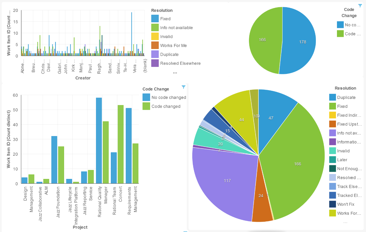
Right away, we can see the following information:
- The breakdown of who is creating defects and how they are being resolved.
- The overall ratio of code change to non-code change defects for the current status of our projects, at the time the report was created.
- The breakdown by the resolution types.
- The breakdown of code change vs non code change defects by project area (for example, Rational Team Concert, Rational Quality Manager, DOORs Next Generation (Requirments Management), etc).
A powerful feature of the dashboard, is the dynamic interaction between graphs. For example, to focus on the non-code change defects, click that item in the legend of one of the graphs (in this example, the pie chart in the upper right). This transforms the other graphs to show only the data about non-code-change defects. The Resolution pie graph in the lower right updates to show only states that are not related to code changes.
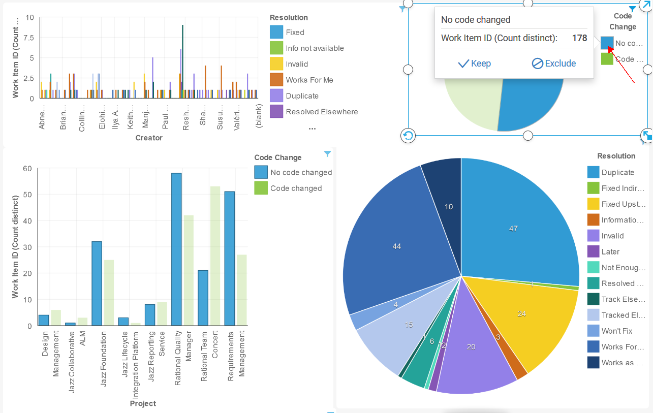
What we can see at a glance is:
- Rational Quality Manager is resolving the most non-code change defects
- Across all projects, the highest number of resolution states are, in order, Duplicate, Works for Me, and Fixed Upstream.
With this information we have started to investigate why these numbers are they way they are, and what we can do to reduce them in order to increase productivity and efficiency of our test and development teams. These results have also spawned many other questions that our test teams want to answer.
Now you have seen some examples of the data and questions you can investigate. We have really just scratched the surface of the kind of data we hope to uncover. But with scratching the surface we uncover other areas to explore.
About the author
Adam R. Neal is the Analytics Architect for the Jazz Reporting Service component of the Collaborative Configuration Management tool suite. He can be contacted at Adam_Neal@ca.ibm.com .
© Copyright 2015 IBM