| Description | |
|---|---|
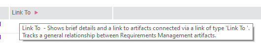
| Artifacts |
Change artifact type from the grid view You can now change the artifact type from the grid view. Previously, you had to use the artifact editor to change the artifact type. Image of the editable artifact type field from the grid: 
|
|
Keyboard shortcut toggles the sidebar on the Artifacts page On the Artifacts page, if the focus is on a cell, text field, or rich-text field, you can press Alt+Shift+M to toggle the left sidebar. |
|
|
Some sidebar settings persist across artifacts of the same format When viewing an artifact, if you change certain properties of the right sidebar or its sections, these settings persist when you open other artifacts of the same format:
Artifacts in a module can have different formats. The format of the artifact that you select determines if the sections in the sidebar are expanded or collapsed. However, the width of the module sidebar and its state (expanded or collapsed) depend on the format of the module, and therefore don’t change based on the format of the selected artifact. |
|
|
The view columns are preserved when you switch to folders On the Artifacts page, the columns that you set manually, or by selecting a view, are preserved when you switch to folders. The columns change in the following situations:
|
|
|
Yellow row highlight for new and copied artifacts cleared automatically
The yellow row highlight for copied and new artifacts in the grid is now cleared automatically.
|
|
| Audit history |
Folder in which an artifact is created is now part of the creation event
When you create an artifact and view the audit history, the folder where the artifact is created is now shown as part of the creation event. For example, artifact A is created in a folder F, gets recorded as a single event in audit history rather than two separate events. |
| Configurations |
Change set dependency calculations for module contents are modified for improved performance
When a change set containing module attributes or structural changes is delivered to another stream, a larger set of dependent change sets are automatically included. |
|
Created and last modified dates added to the list of change sets in a stream
On the Change Sets tab of a stream, you can now view when a change set was created and when it was last modified. To see the time, hover over the date in the Created or Last Modified field. You can also sort the data by date when you click its column header. Image of change sets in a stream: 
|
|
|
Explore artifacts in a configuration When you view a configuration (stream, baseline, or change set) from any of the component or configuration pages, you can now view artifacts in that configuration context by clicking the Explore Configuration button on the toolbar or the Explore Configuration item on the context menu. Image of the Explore Stream button on the toolbar: 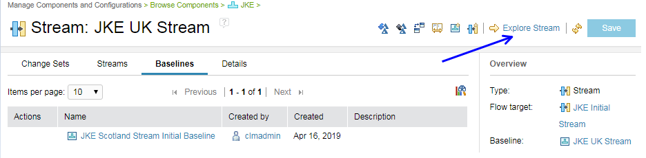 Image of the Explore Stream item on the stream context menu: 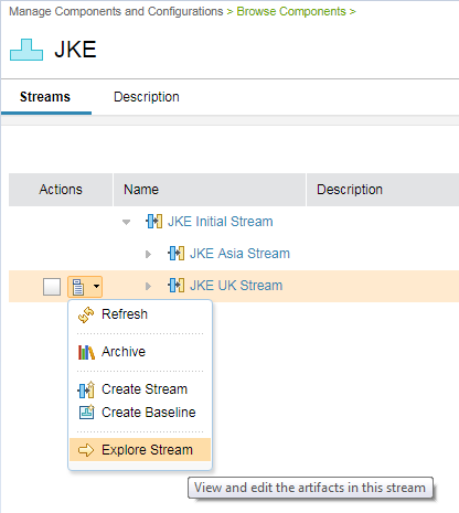
|
|
|
Initial stream is expanded on the components page
On the Browse Components page, the initial stream is expanded one level so you can immediately see its structure. Previously, the content of the initial stream was collapsed. Image of the expanded initial stream: 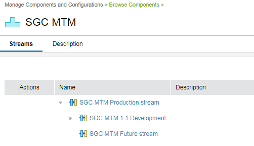
|
|
|
New streams automatically inherit the change management constraints of their parent stream If you work with many streams, setting the change management options for every stream might be time consuming. To simplify the task, newly created streams inherit the change management constraints of their parent stream. Image of the change management options of a stream: 
|
|
|
You can view work items linked to change sets in a stream In the context of a stream, you can now view the work items linked to change sets. Previously, you had to open each change set to find the work item links. Image of the work items linked to a change set in a stream: 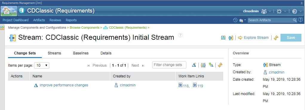 To see more information about the work item, hover over the link. Image of the work item details when you hover over the link: 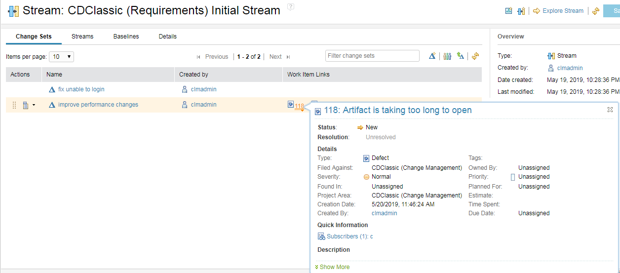
|
|
| Installation |
ELM launchpad reorganized
The ELM launchpad has been reorganized as follows:

|
| Links |
New tooltips describe the link column
When you hover over the heading for a link column, a tooltip describes the link type. The tooltip is also shown when you hover over link types in the Configure Columns to Display dialog box. |
|
Suspect Links is replaced with Link Validity
Suspect links is now replaced with link validity in non-configuration enabled projects. The link validity feature was previously used for configuration enabled projects while suspect links were used for non-configuration enabled projects. Suspect link information is not migrated to 7.0 projects. If you use suspect links in previous versions, ensure that you clear all suspicion status before you migrate to 7.0. |
|
|
The "Create link" dialog remembers the last selected module when switching back and forth between folders and modules
When you create a link to an artifact, the Create Link dialog box displays the last module you selected when switching back and forth between folders and modules. This information is remembered only within your session. |
|
| Modules |
Changing the artifact type of a module artifact from the selected artifact pane
You can now change the artifact type of a module artifact right from the selected artifact pane. Previously, you had to first open the module artifact to change the type. |
|
Module Find indicates how many artifacts were searched
When the module search operation doesn't find any matches, a message indicates how many artifacts were searched. Image of the Module Find dialog box: 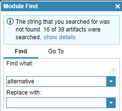
|
|
|
Modules and Collections pages no longer show the base artifacts folder
On the Modules and Collections pages, the content folder with base artifacts is no longer in the folder hierarchy. When you create modules or collections, the base artifacts folder is not in the list of folders in the New Artifact dialog box. Modules can't contain other modules or collections, so they are not base artifacts. |
|
|
The position of a module is maintained after adding and removing filters
When you add and then remove filters in a module, the position of the artifacts in the list is maintained as much as possible. For example, if the artifact 879 is the first item in a module, it remains at the top of the viewport after you add or remove a filter. If the artifact 879 is filtered out, the first artifact in the module is at the top of the viewport. |
|
|
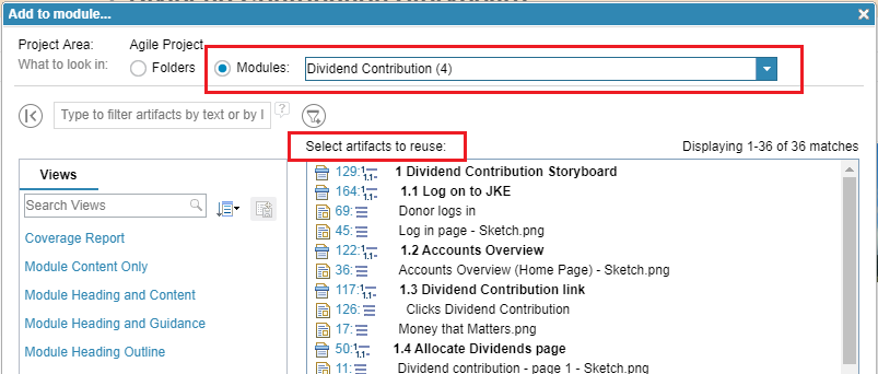
You can insert an existing artifact from another module When inserting an existing artifact into a module, you can now choose the artifact from another module. The artifact will be reused in the module you add it to. This action is similar to copying and pasting artifacts between modules because the base artifact is what is added to the module. Image of the Add to module dialog box: |
|
| Product name change |
Rational DOORS Next Generation was renamed
In this release, IBM Rational DOORS Next Generation was renamed to IBM Engineering Requirements Management DOORS Next (DOORS Next). For details, see Renaming the IBM Continuous Engineering Portfolio. |
| ReqIF |
Automatic type mapping for ReqIF imports
You can now use the type mapping feature in DOORS Next, which automatically attempts to map identical type elements from DOORS into one instance of each identical type. This feature helps to remove or reduce type duplication when you import artifacts in DOORS Next. Type mapping will occur for the Artifact Attributes and Attribute Data Types type elements, but not for the Artifact Types type elements, and can be applied to all ReqIF packages that are imported from DOORS. |
|
Provision of tag-based deltas for imported artifacts
You can now use the ReqIF import feature that allows tags to be applied on repository bindings or artifacts, which might be deleted on the exporting side of a ReqIF exchange. This feature helps you to identify artifacts that are not present in a subsequent import while receiving consecutive packages from a ReqIF collaborator. Artifacts that are missing in the import are potentially deleted on the opposite side of the ReqIF exchange. |
|
| ReqPro migration |
Rational ReqPro migration
Rational RequisitePro has reached end of life and is not supported from the 7.0 release. |
| Reviews |
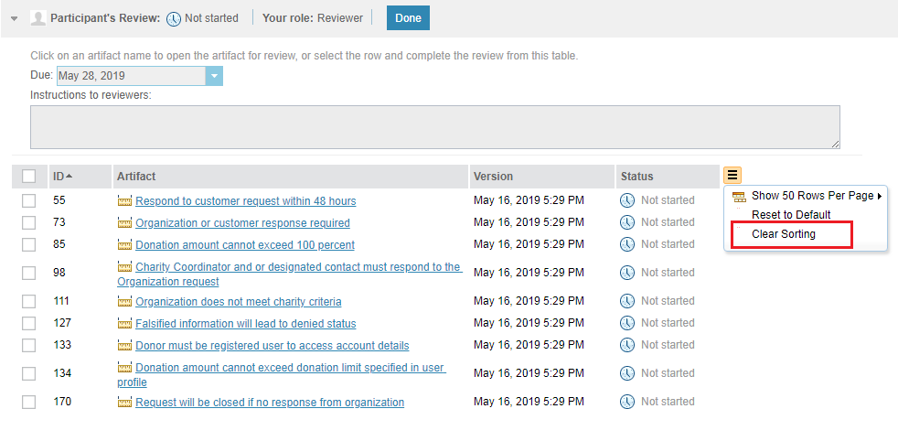
Clear Sorting button moved to the More Actions menu In the review editor, the More Actions menu is now aligned with the table header, and it includes the Clear Sorting button. To remove sorting of the data in the table, go to More Actions > Clear Sorting. Image of the More Actions menu in the review editor:
 |
|
Page size and grouping options are now available in the More Actions menu On the Reviews page, the More Action menu now includes two new options, which makes it consistent with the Configure Page Setting menu. Image of the More Action menu on the reviews page: 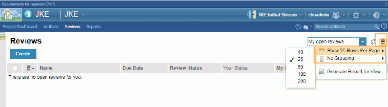
|
|
| RRCx viewer |
RRCx viewer is no longer supplied
Starting this release, the RRCx viewer is not supplied. You must convert all RRCx artifacts to diagrams before migration. You cannot see the previous diagram in the history. |
| Tags |
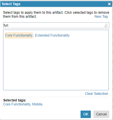
New filtering capability When you add tags to artifacts, you can now filter the existing tags to find which ones contain the characters that you specify. Image of filtering tags:
 |
| TRS feeds |
TRS feeds version 1 are no longer used
TRS feeds version 1 that were used for suspect links are no longer used in DOORS Next as suspect links are replaced with link validity. |
| Usability enhancements |
Improved pages for empty collections and modules The pages for empty collections and modules were updated to be consistent with pages for other empty results: the message is more noticeable and centered on the page. Image of an empty collection page: 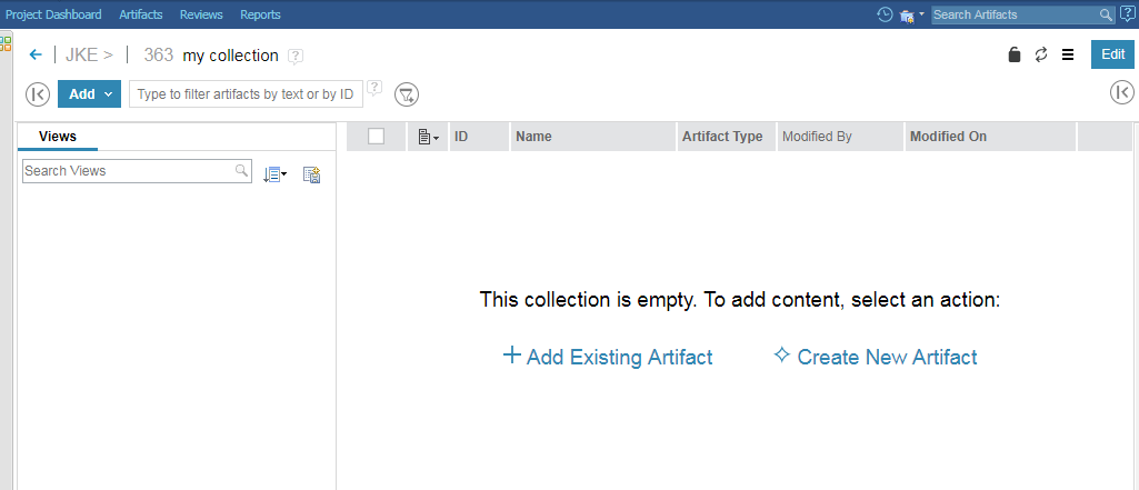 Image of an empty module page:  Image of an empty module page when an artifact was copied: 
|
|
Improved scroll bars on the Manage Project Properties and Component Properties pages While you scroll the content of the Manage Project Properties or Component Properties page, the Save and Cancel buttons remain available. Image of properties page: 
|
|
|
Improvements to the Shift + Up Arrow and Shift + Down Arrow selections in the grid
The following two improvements are available both in the artifacts and in the module grid:
|
|
|
New look for product and component banners
The product banners for IBM Engineering Lifecycle Management (ELM) products and components are updated to align with IBM's open-source Carbon design theme. This modern theme provides a consistent look across IBM products. The login window is also updated, but still works the same way. If you extend the UI in ELM applications, you can learn more about the Carbon guidelines at https://www.carbondesignsystem.com/. Image of the product banner for Jazz Team Server:  Image of the login window: 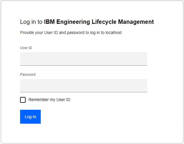
|
|
| Dashboards and work items are no longer publicly available, so some links may be invalid. We now provide similar information through other means. Learn more here. |