Work item editor presentations
Summary
This article describes the concept and configuration to further customize the work item editor for new and existing work item types in both the Web UI and Eclipse client, particularly: Editor Presentations, Quick Information Presentations and Query Editor Presentations. For work item customization follow Work Item Customization, and for extensibility follow the wiki at Contributing Attribute Presentations.
The first part of this article covers the structure of Editor Presentations, followed by a how-to for the Eclipse and Web UI clients. The last part describes Query Editor Presentations and Quick Information Presentations.
Overview
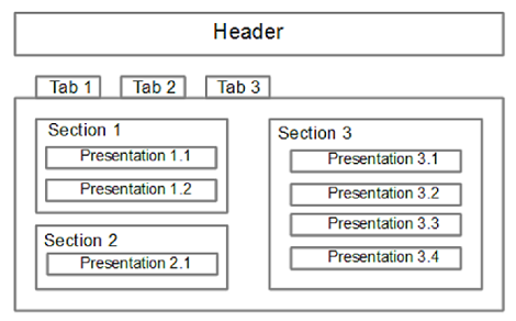
Editor presentations define the editor layouts to display work items in the available clients. The layout structure has four basic elements: Tab(s), Header, Section(s) and Presentation(s); as shown in Figure 1. Tabs have a certain layout and contain Sections which are configured to show up in a specific layout slot. A Section then contains Presentations. A Presentation represents a work item attribute, e.g., Priority, or additional information about the current state of the work item, e.g., Team Area, which is not an attribute, but is computed out of other attributes. These elements are described on the following sections.
Some elements can be further customized through some pre-defined parameters as explained in Properties.
Editor
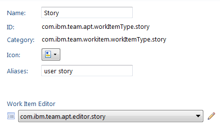
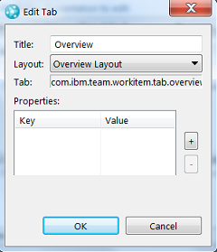
The topmost element is the Editor, which contains an optional Header and Tab(s). It has an ID which is used to bind from a Work Item Type. For instance, Figure 2 shows how a Story is bound to an Editor.
Header
This is an optional element within the Editor Presentation to display a header all the time (regardless of the current visible Tab). It is identified by its ID and we can only have one on each Editor Presentation. In terms of behavior it is very similar to a Section, except that it lays Presentations horizontally.
Tabs
A Tab helps to organize the pieces of data to display in an Editor. It has an ID, a title and a layout.
The layout of a tab is divided into different parts, called slots. Every section of the Tab is configured to show up in a slot. It is possible to configure several Sections into one slot, but this is not supported by all layouts. Which layout should be used is configured in the Tab, the slot is however configured in the Section.
The next section describes the available layouts. These have emerged from the real needs of the Jazz team.
Overview Layout
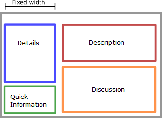
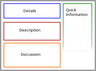
This layout has four slots. Each slot can have only one section. The layout has originated from the Overview tab of the default editor and is not very flexible, however it provides a generic overview for an editor. Notice how the Web UI, as in Figure 3 and Figure 4, shows the slots in slightly different positions tending to put them one below the other but preserving the structure.
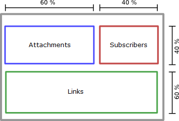
Links Layout
This layout has two rows. The top row has two slots horizontally distributed 60% to 40%. The bottom row has one slot filling the whole space. Vertically the rows are distributed 40% to 60%.
Custom Attributes Layout
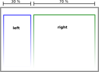
This layout is one of the more flexible. It can have several sections in each slot. If there are no sections in one slot, the sections in the other slot will extend the full width. The slots are horizontally distributed 30% to 70%.
Approvals Layout and History Layout
These layouts have no slots to configure and can only contain one section which fills the available space. They are not intended to be reused as the same functionality can be achieved with the Custom Attributes layout.
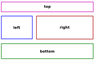
H Layout
This is similar to the Links layout but has an additional slot at the top.
Sections
A section has an ID, a title and is configured to show up in a layout slot of the containing Tab. The available slots depend on the layout of that tab. Sections are the only elements that contain Presentations and these are displayed one after the other. Note: Headers are considered a Section, but its elements are displayed horizontally.
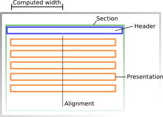
Presentations
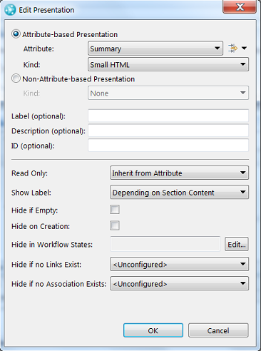
Presentations are used to display an attribute or other additional information related to the work item, i.e., non-attributed-based. A presentation has always a kind which represents the look and capabilities of a presentation, e.g., string kind for editing a string attribute. It is possible to only specify the attribute on a presentation, in which case the default kind for the type of attribute is used.
The clients behave slightly different, while working with an editor. The Web UI provides the ability to customize in a WYSIWYG editor, whereas the Eclipse client is a more hierarchical approach.
The ID of the presentation is optional, but may be necessary for special functionality, e.g., linking from Quick Information.
Non-attribute-based: These Kinds are not based on attributes but represent a certain aspect of the work item, e.g., Team Area, Attachments, Links, Subscribers, History, Approvals, Quick Information.
Attribute-based: These are based on an attribute of the work item. Table 2 summarizes some of the available presentation kinds grouped by purpose.
| Purpose | Available Kinds |
|---|---|
| Basic types | String, Integer, Boolean, HTML, Text, Wiki. Since 4.0.1: Decimal. |
| Enumeration types | Combo box, radio buttons, String list. |
| Reference types | Contributor, Category, Release, Iteration, Team Area and Team Area list, Project Area and Project Area list, Process Area and Process Area list, Work Item and Work Item list. |
Properties
Some elements may be further customized through pre-defined properties. These are entered as key-value pairs as shown in Figure 9, with the exception of attribute-based on the Eclipse client which are embedded in the editor as shown in Figure 10.
The next section describes the available properties for each of the elements within the Editor Presentations. For Tab properties refer to Table 3, Section properties refer to Table 4 and Presentation properties refer to Table 5.
| Property | Description |
|---|---|
| hideIfEmpty | if set to ‘true’ the presentation will only be visible if its value is different from the null value of the attribute. |
| Property | Description |
|---|---|
| noHeader | if set to ‘true’, the section will display no header. If the property is not set, the section has a header. |
| autocollect | if set to ‘true’, the section will collect all work item attributes that are not configured to show up elsewhere and display them with their default presentation. This feature is only available in the Eclipse UI and is used on the ‘Custom’ tab in the default editor. A tab can then use the hideIfEmpty property to only show up if any attribute was collected, and no other section declared on the tab. |
| width | can be used together with autocollect to indicate that only attributes with a specific size are displayed. Possible values are small or wide. Every attribute ‘knows’ whether it is ‘small’ or ‘wide’. |
| expanded | if set to ‘false’, the section will initially be collapsed. If the property is not set, the section will show up expanded. |
| Property | Applies to | Since Version | Description |
|---|---|---|---|
| readonly | if set to ‘true’ the presentation will be displayed in a readonly look and feel. | ||
| labelVisible | specify whether the label of the presentation is visible. This overwrites the default behavior where the label is visible except when the presentation is the only one in the section. | ||
| hideIfEmpty | if set to ‘true’ the presentation will only be visible if its value is different from the null value of the attribute. | ||
| hideIfCreation | if set to ‘true’ the presentation will not be visible on creation. | ||
| hideIfInState | as value use the comma-separated list of workflow states (ID of the state) where the presentation should not be visible. | ||
| hideIfEndpointEmpty | as value use the ID of the link type endpoint. The presentation will only be visible if the work item has links for this endpoint. | ||
| hideIfNoProjectLink | 4.0 | as value use the ID of the project link. The presentation will only be visible if the work item has links for this project. | |
| timeout | E-Signature | specify the timeout in seconds after which the E-Signature presentation will clear the password. This is only available to the E-Signature presentation. The default is 120. | |
| allowAnyValue | Enumeration | 4.0 | whether to allow to add new literals. |
| warningMessage | Owned By, Resolved By | 4.0 | displays a warning if the member does not belong to the Team Area/Project. |
How-to: Editor Presentations
The following section describes some of the steps to create an editor presentation using the Web UI and Eclipse clients. On this section we will create an Editor Presentation. This is usually done in a hierarchical way. For instance, we will initially add a Editor Presentation, then a reuse a Header, then create a Tab with a Section and at the end adding Presentations.
Editor Presentations on Web UI
- Go to
 Project Admin UI in the Web Client
 - To add an Editor Presentation, click right next to the available Editor Presentations and provide an ID.
- To add a Header: click and select an existing one. Remember: we can either add elements or reuse existing ones. For this scenario we will reuse the header in order to provide a consistent look in our Work Items. Note: when we edit a shared element, the editor displays a warning, stating that all instances using that shared element will be affected.
- To create a Tab: click button. Enter a title and ID, select a layout and click . The added tab appears in the editor outlining the available slots according to the selected layout.
- To create a Section: click on . Enter a title and ID, select a slot and click . The section is added to the selected slot. You can update its slot by dragging the element into a new slot.
- To create a Presentation: click on and select the type attribute-based. Select the attribute and its kind; (optional) a label, description and ID.
- Finally, once we have customized our Editor Presentation, we need to bind it to a work item type. Go to and select your Editor Presentation in the drop-down in a Work Item Type.
Editor Presentations on Eclipse client
- Go to
 Project Area Editor in the Eclipse UI
 - To add an Editor Presentation, click right next to the available Editor Presentations and provide an ID.
- To add a Header: click and select an existing one. The navigation buttons are enabled/disabled depending on the selected element and general Editor rules, for example, Add Header… is disabled when an Editor already contains a Header.
Remember: we can either add elements or reuse existing ones. For this scenario we will reuse the header in order to provide a consistent look in our Work Items. Note: when we edit a shared element, the editor displays a warning, stating that all instances using that shared element will be affected. - To create a Tab: click button. Enter a title and ID, select a layout and click .
- To create a Section: select previous Tab and click on . Enter a title and ID, select a slot and click .
- Now we can add Presentations to display Work Item information; select a Section and click on and select the type attribute-based. Select the attribute and its kind; (optional) a label, description and ID.
- Finally, once we have customized our Editor Presentation, we need to bind it to a work item type. Go to and select your Editor Presentation in the drop-down in a Work Item Type.
Query Editor Presentations
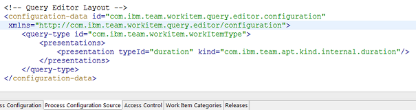
This Editor associates work item attributes with Presentations for query parameters. This configuration aspect can only be configured on the Process Configuration Source page as shown in Figure 13. It is an advanced configuration aspect, that only needs to be changed when an attribute should use a different Presentation in the Query Editors.
Quick Information Presentations
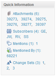
The Quick Information Editor provides a concise view of information related to a Work Item. For example, Figure 14 displays links to the available Attachments, Subscribers, Mentions.
The configuration of the Quick Information Presentation is only available via the Eclipse UI under . Which configuration should be used is specified with the ‘quickinformationConfiguration’ property within the Non-Attribute-based Presentation. A Quick Information kind has a title, a kind, a link target and sometimes an endpoint. The link target is the ID of a presentation. Clicking on a title link in Quick Information will open the tab containing the specified presentation. An endpoint is necessary for kinds that show links (Workitem, Reference and Enumerating Reference kind). The following kinds are available:
- Abbreviation Reference: A reference presentation that lists short abbreviations with access to menu and hover.
- Approvals: A presentation that lists approvals, reviews and verifications.
- Attachments: A presentation that lists attachments.
- Collector: A presentation that shows the number of entries.
- Enumerating Reference: A reference presentation that enumerates references with direct access to menu and hover.
- Hidden: A presentation to hide entries.
- Potential Duplicates: A presentation that shows potential duplicates of the current work item (Eclipse client only).
- Reference: A generic presentation for link types to show references.
- Subscriber: A presentation that lists users subscribed to the work item.
- Workitem: A presentation for link types that point to work items.
For more information
About the Authors
The authors are developers in the Tracking and Planning team working on the Work Item component of Rational Team Concert. For additional information about the topic presented in the article add your comments or questions directly in the discussion part, or visit our Jazz.net Forum.