| Description | |
|---|---|
| Report Builder |
Multiple Y axes within a chart for easier viewing When viewing bar or line graphs that have very different value ranges, the graph with the smaller value range is drawn like a straight line closest to the X axis. Sometimes it can be hard to see the trend and variation of the line graph. To enhance the visualization in these cases, you can now use a second Y axis with a different scale for most of the existing charts (except the pie chart). Try the second Y axis to magnify the graph items with the smaller value range. Alternatively, you can move the group of graphs with the larger value range to the second Y scale and leave the graphs with the smaller value range using the standard Y axis. When the chart orientation is vertical, the second Y axis is located on the right side of the chart. When the chart orientation is horizontal, the second Y axis is located at the top. The graph items that use the second Y axis are shown with a different color in the legend, in the value string of the tooltip of the bar and line graph, and the bar label in the bar chart. Image of a bar chart with a second Y axis: 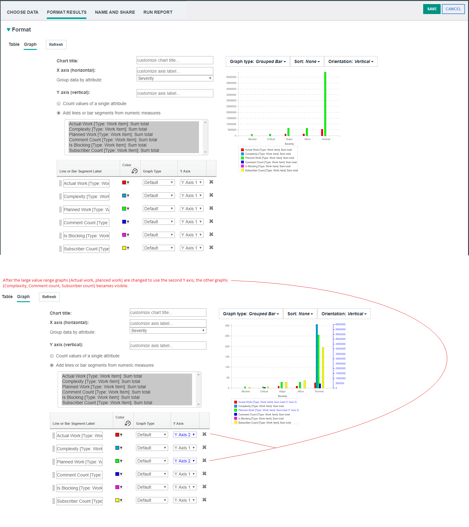 Image of a line chart with a second Y axis: 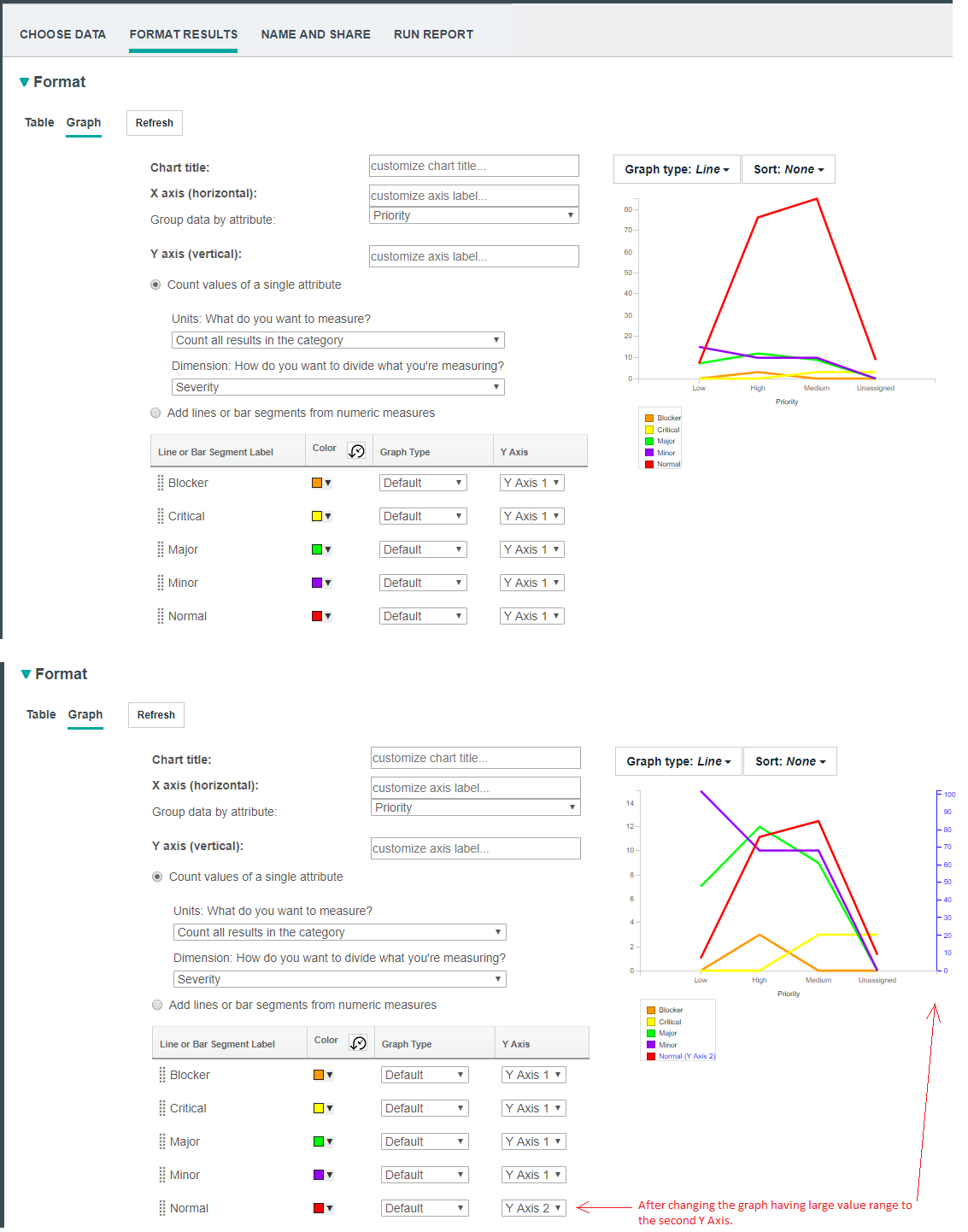 Image of a stacked bar chart with a second Y axis: 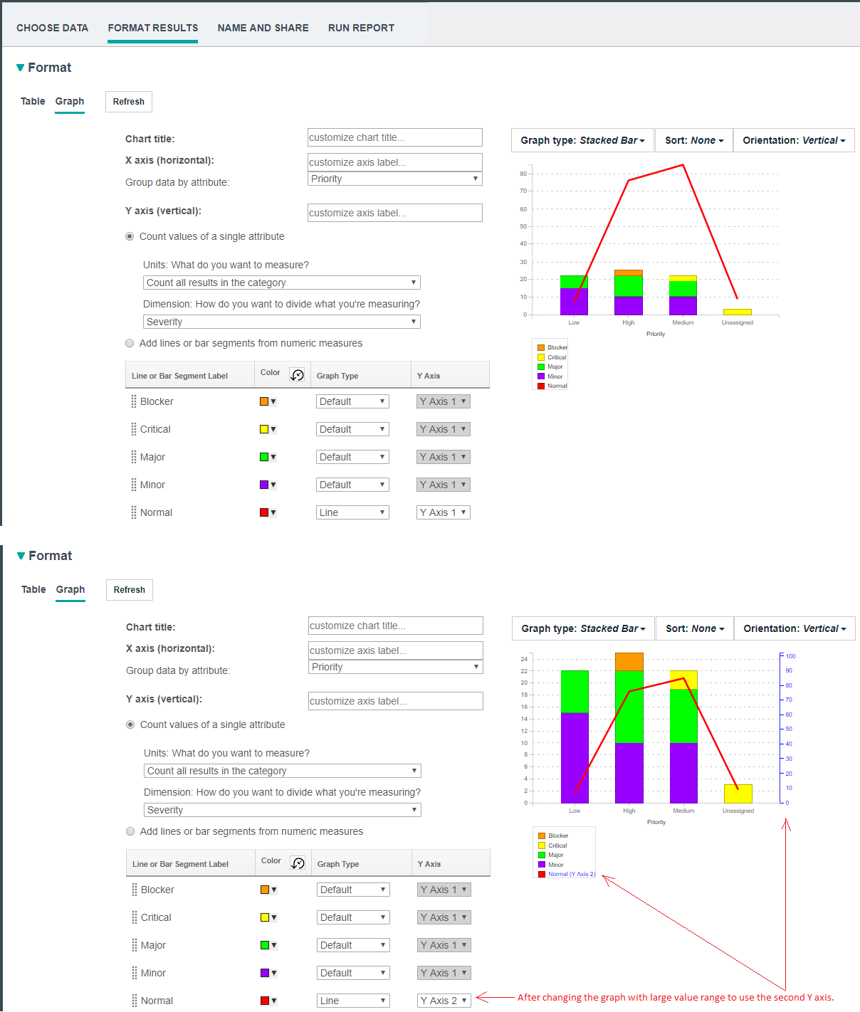 Image of a bar chart with a second Y axis: 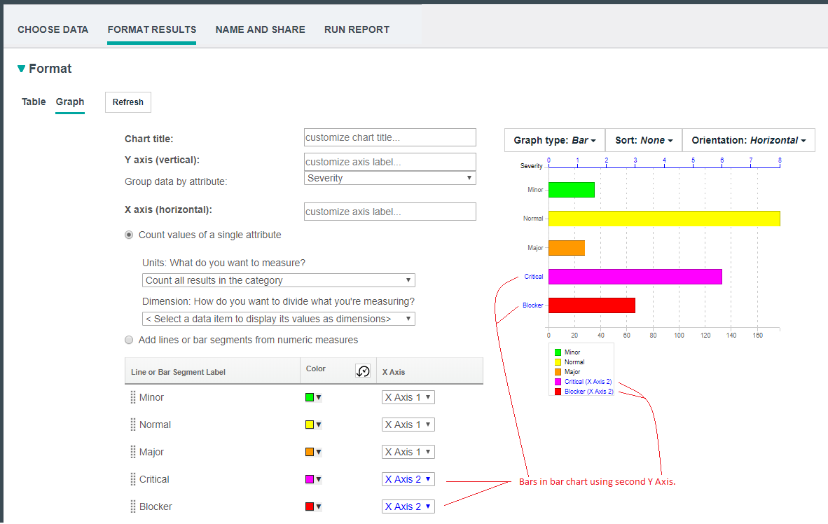 |
|
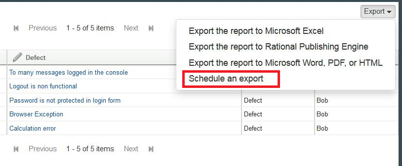
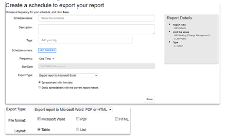
Scheduling a report to run
To schedule a report, click Export > Schedule an export. |